filmov
tv
Creating a stacked and grouped bar chart - Qlik Sense

Показать описание
This video shows you how to create a stacked and grouped bar chart. In this example, we create a Bar Chart showing sum of Sales stacked by Category., Bars are grouped by Month and year, then sorted by month. The purpose of this bar chart is to be able to compare the sales for a single month across different years.
#Qlik #Barchart #visualizations
#Qlik #Barchart #visualizations
 0:02:12
Creating a stacked and grouped bar chart - Qlik Sense
 0:11:05
Excel Column Chart - Stacked and Clustered combination graph
 0:02:15
How to create a Clustered Stacked Column Chart in Excel
 0:03:28
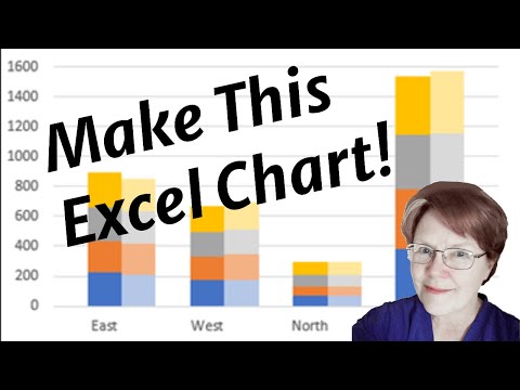
Make a Clustered Stacked Chart in Excel
 0:03:18
Combine stacked and clustered bar chart in Excel
 0:05:27
Excel Visualization | How To Combine Clustered and Stacked Bar Charts
 0:01:14
How to create a Dual Axis & Stacked Grouped Bar Charts in Tableau
 0:00:36
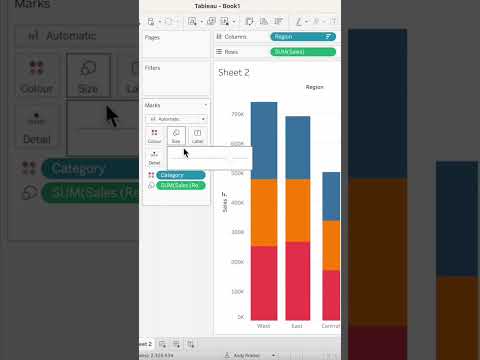
How to create a Stacked Side-by-side Bar Charts in Tableau
 0:09:24
019. How to create a Clustered Stacked Column Chart in Excel
 0:00:57
How to create a Grouped Bar Charts Stacked with Dates in Tableau
 0:01:00
Add totals to a vertical stacked bar chart #excel
 0:02:56
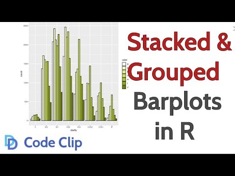
How to Make Stacked and Grouped Bar Plots in R
 0:13:51
Combination Stacked & Clustered Column Chart in Excel - 2 Examples
 0:08:09
Clustered Stacked Bar Chart In Excel
 0:03:51
Draw Stacked Bars within Grouped Barplot in R (Example) | ggplot2 Barchart | facet_grid() & aes(...
 0:02:42
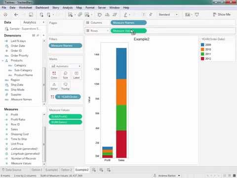
How to Create a Stacked Bar Chart Using Multiple Measures in Tableau
 0:09:23
How To Create A Clustered Stacked Bar Chart In Excel
 0:10:15
Stacked, clustered and 100% chart (think-cell tutorials)
 0:00:39
#Tableau - Proportional Stacked Bar Chart
 0:01:00
Quickly create a Stacked Bar Chart in Excel
 0:17:28
How To Create A Clustered Stacked Column Chart In Excel
 0:07:01
How-to Create a Stacked and Unstacked Column Chart in Excel
 0:04:49
Domo Help: Using a Stacked AND Grouped bar chart
 0:07:42
Power BI Clustered and Stacked Column Chart
Комментарии