filmov
tv
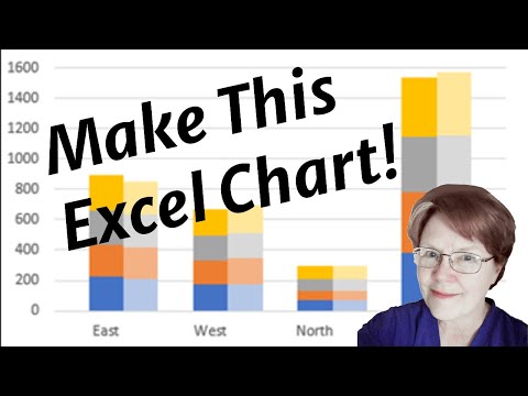
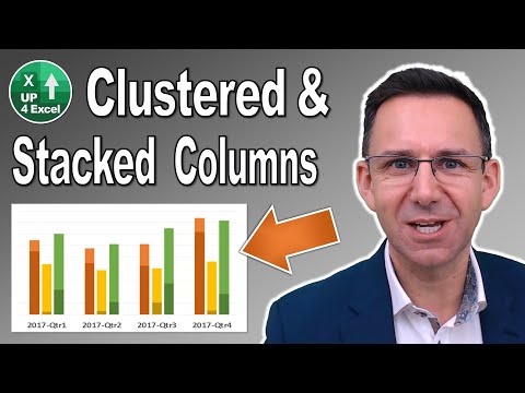
Combination Stacked & Clustered Column Chart in Excel - 2 Examples

Показать описание
In this video I demonstrate how to combine a stacked and clustered column chart. The video takes you through two examples, reflecting the different ways your data may be laid out.
Table of Contents:
00:00 - Example 1
07:41 - Example 2
------------------------
 0:05:27
Excel Visualization | How To Combine Clustered and Stacked Bar Charts
 0:11:05
Excel Column Chart - Stacked and Clustered combination graph
 0:13:51
Combination Stacked & Clustered Column Chart in Excel - 2 Examples
 0:03:18
Combine stacked and clustered bar chart in Excel
 0:03:28
Make a Clustered Stacked Chart in Excel
 0:09:24
019. How to create a Clustered Stacked Column Chart in Excel
 0:08:09
Clustered Stacked Bar Chart In Excel
 0:17:28
How To Create A Clustered Stacked Column Chart In Excel
 0:07:01
How-to Create a Stacked and Unstacked Column Chart in Excel
 0:07:42
Power BI Clustered and Stacked Column Chart
 0:07:19
COMBINE CLUSTERED AND STACKED COLUMN CHART/BAR CHART INTO ONE VISUAL WITH LINE VALUES IN POWER BI
 0:02:15
How to create a Clustered Stacked Column Chart in Excel
 0:08:29
Clustered Stacked Bar Chart In Excel | How to create a Clustered Stacked Column Chart in Excel
 0:03:06
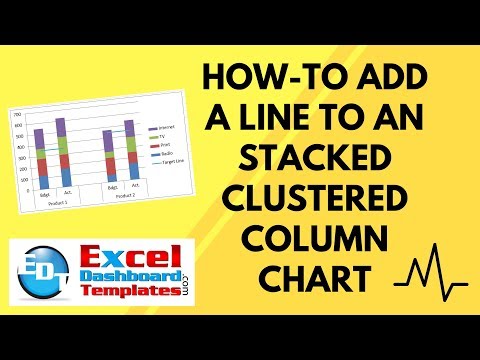
How-to Add a Line to an Stacked Clustered Column Chart in Excel
 0:05:25
Excel 2010 - Combination Chart Hacks
 0:05:49
Powerpoint & Excel: Creating a Stacked Clustered Column/Bar Chart
 0:09:25
How to combine Clustered Column Chart and Stacked Chart in Power BI | Customised Bar/Stack chart
 0:08:59
How-to Easily Create a Clustered Stacked Column Chart in Excel
 0:08:29
How to create a Clustered Stacked Column Chart in Excel
 0:03:54
Create a Clustered Stacked Column Pivot Chart in Excel
 0:01:42
Stacked column chart
 0:04:02
Combo Chart in Power BI | Stacked/Clustered Column & Line Chart in Power BI | #12
 0:02:38
How to Create Combined Clustered and Stacked Bar Chart in Excel
 0:07:36
Power BI Combo Chart | Using Line & Clustered Column Chart | Bar & Line Chart Combination
Комментарии