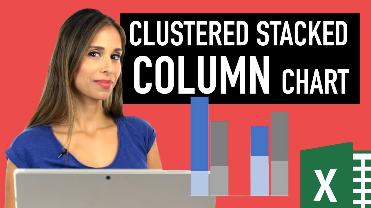
Excel Column Chart - Stacked and Clustered combination graph
preview_player
Показать описание

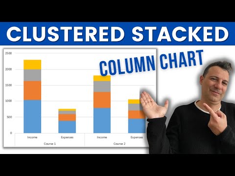
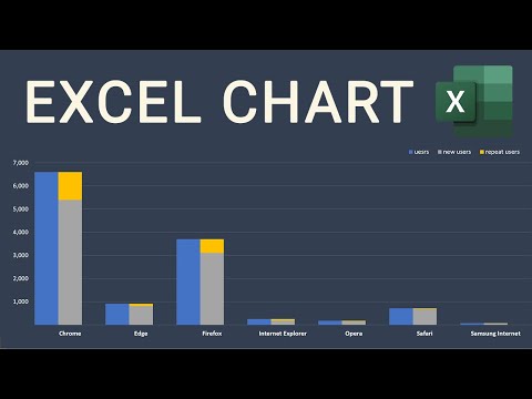
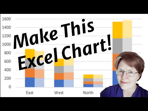
Easy steps to create a clustered stacked column chart in Excel - this chart is both stacked and clustered. This type of chart is not available in the standard Excel chart selection. With a few steps, you'll learn how to create this from scratch.

One way of creating a clustered and stacked column chart combination is to use both the primary and secondary Y-axis. One problem you'll run into is that they will likely have a different minimum and maximum which will show the wrong visualization. You need to ensure that both the primary and secondary y-axis have the same minimum and maximum in a dynamic way (without manually fixing these values). I show you the trick on how you can set this up.

👉 What You'll Discover:
- Step-by-step guide to creating a clustered stacked column chart.
- How to manipulate data for clear visualization.
- Tips for using primary and secondary axes effectively.
- Dynamic adjustments for changing data sets.
- Cosmetic enhancements for clearer, more professional charts.

📈 Perfect for:
- Excel users of all levels, especially those in data analysis and reporting.
- Anyone looking to enhance their Excel charting skills.
- Those who need to present data in an engaging, easily understandable format.

🔑 Key Takeaways:
- Simplify complex Excel charting tasks.
- Ensure your data stands out with advanced formatting techniques.
- Learn to automate and dynamically update your charts.

Links to related videos:

🚩Let’s connect on social:

Note: This description contains affiliate links, which means at no additional cost to you, we will receive a small commission if you make a purchase using the links. This helps support the channel and allows us to continue to make videos like this. Thank you for your support!

#Excel
Рекомендации по теме
Комментарии
Автор

This video helped me two times in less than four months. Microsoft office developers should really add a stacked bar chart.

mobink
Автор

I was so glad when I saw your face when I did a YouTube search on this very topic! I was struggling to get cluster stacked charts to work and I was going about it the wrong way! You've been a constant reliable source for my Excel development and I think you for all that you do.

Scott
Автор

Once again, a Big salute to my beloved Excel Teacher, no words to praise your teaching method.I Pray the almighty to give good health, to my beloved/beautiful Teacher to do more Excel Videos in future for the benefit of all the Excel learners/users/addicts.--Big Royal Salute.

gopalakrishnarao
Автор

Really excellent! Saved my bacon on a deadline! You are very smart with Excel, Leila!

TheRon
Автор

Hi Leila, I'm a PICU doctor with zero computer skills! I've been trying to make the routine data we collect "sing"! Your videos have been invaluable - Thank You...

roshp
Автор

Thank you so much for the video @Lelia Gharanti. Can you show us how to fix the secondary bar chart (5) overlapping the primary bar chart (4) in stacking? I did two of inv values. Still didn’t work

sallyho
Автор

I think I am in love - brilliant video.

mikepike
Автор

One of the best YouTube channel to learn excel . The way you explain it is simply awesome .Could you please upload some videos for array function ?

ExcelFormulasHacks
Автор

Ah. MAY. Zing. Fantastic solution to this problem which has been plaguing me all morning!!

MixBernstein
Автор

YOU'RE MY ANGEL.. I JUST SPENT 1 HR TO DO WHAT YOU JUST SHOWED ME.. THANK YOU

valerianverdy
Автор

Using Mac Excel...It wouldn't allow me to change the series chart type for inv.Value to line because the secondary axis already has multiple series with chart type defined as clustered column (like you showed). The error says "Some chart types cannot be combined with other chart types. Select a different chart type." There aren't any other chart types that work, and choosing the "combo" option just makes one axis column and the other whole axis (all series) line. That makes me think it's restricting to 1 chart type per axis--so I'm not sure how you did it unless this is a Mac-specific limitation. It worked to instead match the axes manually like you mentioned.

It could also be that this method doesn't work for horizontal bar charts? I couldn't get any of the columns to line up in the same order across categories--but it worked when I switched back to vertical bars.

I'm also curious if there's a way to do this with "true" stacked columns so that you can show accurate labels for each of the sections of the column. i.e. Doing it this way, you can only show labels for the small portion (new apps) and the total (all apps), but not the large portion (existing apps).

dukie
Автор

This is way too awesome. Thanks Leila. Appreciate it.

luqmananuar
Автор

BIG THANKS for all of your great videos!! I have learned so much!! Really very useful ideas and tools, thanks!!

theviewerisgone
Автор

This was so helpful!! I have used this multiple times

rchltrrs
Автор

So you have an explanation of "activating" charts? I've never heard of this before. Excellent video as we've come to expect from you.

cathyb
Автор

OMG thank you! This saved me such a headache.

johnryan
Автор

Thank you so much!!! I wrecked my brain to figure out this graph for my boss.

neebomar
Автор

Is it possible to add labels to both stacks and the total? I haven't been able to figure this out and have been manually adding a label to the second stack.

KaitlinCostello-lc
Автор

Great demonstration .. Really helped me a lot ...

sanjaydatta
Автор

Hi awesome explanation but if I want to show data values with percentages as well how do i do that in same chart pls help

MoonShine-bscl