filmov
tv
Make a Clustered Stacked Chart in Excel

Показать описание
🔵 Excel doesn't have a Clustered Stacked chart type, but you can build one yourself, with a cluster for each region, and a stack for each year. This short video shows how to set up your Excel data, and build the chart. Then, make a couple of quick formatting changes, to get a clustered stacked chart.
💡 Related Links 💡
🔴 Related Excel Videos 🔴
⏰ Video Timeline ⏰
00:00 Introduction
00:19 Cluster Stack Chart
00:40 Data Layout
01:52 Make the Chart
02:32 Format Chart
02:58 Change Colours
Instructor: Debra Dalgleish, Contextures Inc.
#ContexturesExcelTips
VIDEO TRANSCRIPT
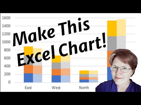
In this workbook, I have: sales data for two years, for four different regions, broken down by season.
I'd like to create a chart like this one, that shows each of the regions, with a stack for each year and the seasons broken down within each stack.
This chart that I want to create is like a combination of a cluster column chart, and a stack column chart.
So we've got clusters for the regions and stacks for the years.
There's nothing built into Excel that will do that so I'm going to copy my data to a blank sheet, then change the way it's arranged.
To start I'll copy the columns with data (I want to leave the original data unchanged)
Copy that, go to a blank sheet and paste it.
To get the data ready for the chart, I'm going to add some blank rows. I want a blank row before the first region and then a blank row after each region.
A quick way to rearrange my data is to put some numbers down column A.
I've got four regions and I need three rows for each region, so I'll select and copy this, then paste it twice.
I want a blank row at the very top, so I'll type a zero here.
I'm going to select those numbers and all the data that I have, and then sort those A to Z, so data A to Z.
Now there's my blank at the top, and each region has its data in one row and then two blank rows after that.
All I have to do now is select the second year of data and drag it down one row.
So, we've got blanks, two rows of data, another blank, and this is how we need it to create our cluster stack column chart.
I'm going to select starting in cell B2 above the region headings here;
select all the headings and down to the last row that I've got numbered there, so I want to include that blank after South,
and then I'm going to insert my chart.
Go to the Insert tab, and I want a column chart, a stacked one.
Click that, and there's the chart.
Because we've got these blank rows, we've got East has its first year of data and then its second year, and then there's a blank where the third row is empty, and the same for each of the other regions.
Now to make these look more clustered, I'll do a little formatting.
Click one of the segments, and on the Format tab, Format Selection, and I want a gap of some little number, so I'll put 20 here and now it's looking more clustered.
There's a bigger space between the regions than there is between the stacks for each region.
The final thing you could do to make this look nicer, is to match up the colours.
Right now, winter for both years is blue, but you could make this a different shade of orange.
So if I go to Format and choose a lighter orange here and do the same for the grey and for the yellow, and now you have a cluster stack chart and you can compare year to year totals for each region
 0:03:28
Make a Clustered Stacked Chart in Excel
 0:11:05
Excel Column Chart - Stacked and Clustered combination graph
 0:05:27
Excel Visualization | How To Combine Clustered and Stacked Bar Charts
 0:02:15
How to create a Clustered Stacked Column Chart in Excel
 0:08:09
Clustered Stacked Bar Chart In Excel
 0:09:24
019. How to create a Clustered Stacked Column Chart in Excel
 0:17:28
How To Create A Clustered Stacked Column Chart In Excel
 0:13:51
Combination Stacked & Clustered Column Chart in Excel - 2 Examples
 0:03:18
Combine stacked and clustered bar chart in Excel
 0:08:59
How-to Easily Create a Clustered Stacked Column Chart in Excel
 0:03:54
Create a Clustered Stacked Column Pivot Chart in Excel
 0:08:29
Clustered Stacked Bar Chart In Excel | How to create a Clustered Stacked Column Chart in Excel
 0:10:15
Stacked, clustered and 100% chart (think-cell tutorials)
 0:09:17
How to Make a Clustered Stacked and Multiple Unstacked Chart in Excel
 0:09:23
How To Create A Clustered Stacked Bar Chart In Excel
 0:17:18
How To Create A Clustered Stacked Column Chart In Excel
 0:07:19
COMBINE CLUSTERED AND STACKED COLUMN CHART/BAR CHART INTO ONE VISUAL WITH LINE VALUES IN POWER BI
 0:07:01
How-to Create a Stacked and Unstacked Column Chart in Excel
 0:11:12
How to Make a Clustered Stacked and Multiple Unstacked Chart in Excel 2019
 0:08:29
How to create a Clustered Stacked Column Chart in Excel
 0:07:42
Power BI Clustered and Stacked Column Chart
 0:04:09
How-to Make an Excel Clustered Stacked Column Chart with Different Colors by Stack
 0:05:49
Powerpoint & Excel: Creating a Stacked Clustered Column/Bar Chart
 0:05:58
How to Create a Clustered Bar Graph With Multiple Data Points on Excel
Комментарии