filmov
tv
NEVER TOO SMALL Italian Transforming Tiny Studio Apartment - 44sqm/473sqft
Показать описание
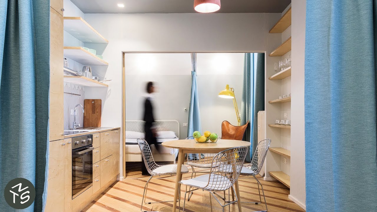
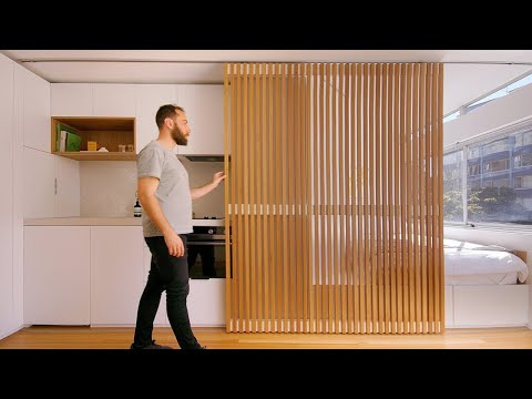
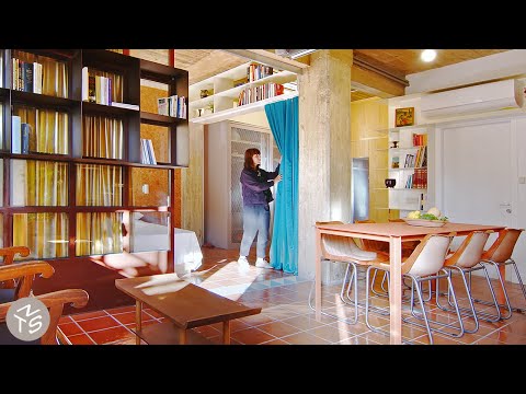
In order to maximise space in this small 44sqm apartment ATOMAA had to completely reimagine it’s floor plan, moving a troubling central bathroom that awkwardly split the home in two. This in turn allowed ATOMAA to expand the living and dining spaces, and introduce more natural light throughout the home. Using flexible sliding doors and curtains to facilitate the open transmission of light, and ease of movement throughout the home; yet still allow for privacy when needed. The addition of a laundry and a new, warmer & brighter material palette throughout leave this micro apartment almost unrecognizable compared to its previous form.
#smallapartment #architecture #interiordesign
Project Name: Abruzzi
Creator: Colin Chee
Camera: Alessandro Carpentiero Photography
Producer: Lindsay Barnard
Editor: Jessica Ruasol
Music: Final Steps by Be Still the Earth
#smallapartment #architecture #interiordesign
Project Name: Abruzzi
Creator: Colin Chee
Camera: Alessandro Carpentiero Photography
Producer: Lindsay Barnard
Editor: Jessica Ruasol
Music: Final Steps by Be Still the Earth
 0:06:22
NEVER TOO SMALL Italian Transforming Tiny Studio Apartment - 44sqm/473sqft
 0:06:05
NEVER TOO SMALL: Architects 70’s Italian Apartment Renovation, Verona 35sqm/376sqft
 0:06:14
NEVER TOO SMALL: 15th Century Small Apartment Redesign Italy - 36sqm/387sqft
 0:06:48
NEVER TOO SMALL Italian Micro Loft Apartment - 37sqm/398sqft
 0:07:16
NEVER TOO SMALL Italian Coast Multifunctional Apartment Conversion - 25sqm/270sqft
 0:07:25
NEVER TOO SMALL Waterside Italian Two Bedroom Tiny Apartment - 35sqm/376sqft
 0:07:53
NEVER TOO SMALL: Architect’s Colourful 50’s Small Apartment Italy 39sqm/429sqft
 0:07:12
NEVER TOO SMALL Flexible Milanese Micro Apartment - 30sqm/340sqft
 0:08:09
NEVER TOO SMALL: Transforming Multifunctional Brazilian Apartment , 56sqm/603sqft
 0:06:40
NEVER TOO SMALL Modular Milanese Micro Apartment - 34sqm/365sqft
 0:07:24
NEVER TOO SMALL: Architect’s Stylish Small Apartment Renovation Italy - 50sqm/538sqft
 0:04:22
NEVER TOO SMALL 24sqm/258sqft Micro Apartment - Boneca
 0:00:34
Simple #interiordesign in Italian Apartment
 0:07:41
NEVER TOO SMALL 40sqm/431sqft Small Apartment Design - Lycabettus Hill Studio
 0:07:22
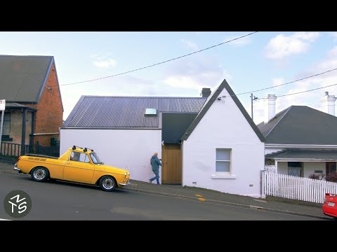
NEVER TOO SMALL Tasmanian Heritage Small Home - 44sqm/473sqft
 0:08:28
NEVER TOO SMALL Argentinian Small Mezzanine Apartment - 44sqm/474sqft
 0:07:58
NEVER TOO SMALL - Retro Chic Athens Small Apartment 48sqm/516sqft
 0:06:18
NEVER TOO SMALL 1800's Milanese Micro Loft Apartment - 14sqm/150sqft
 0:10:06
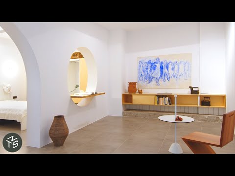
NEVER TOO SMALL: Colourful, Open Plan Apartment, Seville 58qm/624sqft
 0:08:48
NEVER TOO SMALL: Architect’s 19th Century Apartment Restoration, Barcelona - 60sqm/645sqft
 0:07:38
NEVER TOO SMALL: DIY Plant-filled Waterfront Loft, Amsterdam - 45sqm/484sqft
 0:08:09
NEVER TOO SMALL Mansfield Shipping Container Tiny Home - 30sqm/323sqft
 0:08:45
NEVER TOO SMALL Multigenerational Basement Apartment Athens - 55sqm/592sqft
 0:06:30
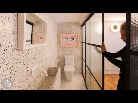
NEVER TOO SMALL: Vibrant Retro Inspired Small Apartment - Madrid 47sqm/506sqft
Комментарии