NEVER TOO SMALL: Architect’s 19th Century Apartment Restoration, Barcelona - 60sqm/645sqft

preview_player
Показать описание

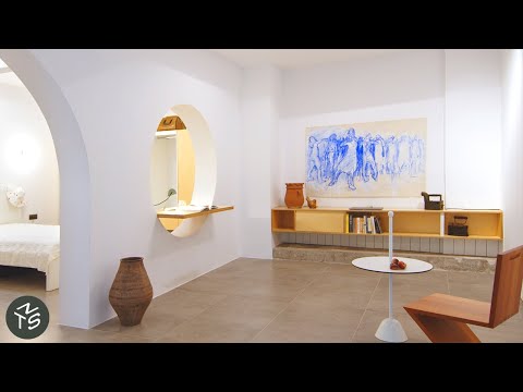
Drawn to the features of late 19th-century Barcelona modernist architecture in the apartment, architect and owner Carlota Siverio preserved elements such as the door, tiles and windows whilst adding modern touches that complement the overall design. By removing the coverings of the living room walls and stripping the ceiling, Siverio revealed exposed brickwork walls and a gorgeous structural vault ceiling, reminiscent of the period. A variety of colourful mosaic tiles were either restored or authentically re-created when too damaged. White melamine floor-to-ceiling storage cabinets concealing functional elements run throughout the apartment and seamlessly blend into the wall, allowing the heritage elements to be focal points. At the end of the apartment, the sunroom features era-appropriate terracotta 'rasilla' tiles and reconstructed windows that now open fully providing an outdoor extension of the living space.

#smallapartment #architecture #interiordesign

Ep 144
Project Name: Borrell

Produced by New Mac Video Agency
Creator: Colin Chee
Director: Nam Tran
Cinematographer: Andrew Davies
Producer: Lindsay Barnard
Editor: Sebastian TIbbs
Рекомендации по теме
Комментарии
Автор

It is not small but man, I don’t care. I am delighted that you showed this one. It is absolutely stunning. One of the best apartments I have ever seen. So functional. So cosy. So many beautifully restored elements. Bravo!

ldw
Автор

I love when people respect the history of the buildings, this is my favourite apartment far!! I'm in love

fermoreira_
Автор

Really like this one. Layout makes sense. Lots of light, lots of air. Turning the kitchen into a sun room was a stroke of genius.

ichabodnoodle
Автор

This apartment is a masterpiece! THAT FRONT DOOR and its hardware!

sumar
Автор

the sun room (or shall I call it sala del sol) is a stroke of pure genius. overall, the feeling is light and airy, uncluttered and simple, the flow seamless. Great design is at times, unpretentious and clean and simple

Lagaloggie
Автор

I’ve seen videos of $150, 000, 000 apartments, and this apartment has more beauty and craftsmanship than all those mega-luxury homes put together. I wish I could visit Barcelona just to experience the way you managed to sculpt the light into a beautiful masterpiece.

teddysdadcory
Автор

Carlota and her wife really created a mini heaven over there, what an incredibly lovely apartment! I love the contrast between old and new. The amount of eyecatchers is just right, creating a really tranquil environment.

TheFlush
Автор

congratulations on the completion of this beautiful home. your home is a testament to a shared love for history, architecture, and the beauty of the past and present coming together. your sunroom is easily one of my favorite spaces i've ever seen in this series.

earthshipvoice
Автор

this is one of my favourites ever. they've been so careful to preserve the essence while modernising almost everything. the light is stunning and the design makes very good use of that.

i would love to see a making-of of this channel

nottexe
Автор

This has to be one of the most beautiful spaces I have ever seen. Absolutely stunning. And I really love all the built in storage that seems to disappear in the spaces. Let’s the historic features shine

valerieann
Автор

It's a hard work to restore old windows and doors! It looks amazing

alinakowalski
Автор

From time to time I watch videos showing very expensive apartments in NY worth 50 million dollars. 95 percent of them look terrible. Yet this one is so pretty. Wow.

patricedecourcy
Автор

This is one of the best so far. Not only is the layout very intelligent, providing space for each function without being cramped, but the actual renovation is beautiful.

minutestomidnight
Автор

Please, may we see more examples of compact living in climates with long winters, and clients who have winter gear: big parkas, skis, boots, snowshoes, bicycles with studded tires, etc. Winter creates challenges for compact space design because the gear is so bulky. And places that have winter and also summer require extra clothing and storage space for the off-season. I'd like to see those kind of design challenges. Places like Australia or Spain, that have consistent climates, are easy to design for. Places like Canada or Iceland or Finland, are more challenging. Can we see more from there?

hyleslie
Автор

What a beautiful apartment, and I LOVE how they kept the unfinished wall and ceiling structure, and how they organised everything. Wonderful.

orla
Автор

A lovely combination of old and modern, with clever unobtrusive storage.

sianthesheep
Автор

Such a good work! At first I noticed the lack of wall decoration but then I really enjoyed how the "empty" walls helped to highlight the stunning floor tiles!

studiofare
Автор

the exposed ceiling, the kitchen stone, the flooring... love this..

phunk
Автор

Beautiful home. It's well-designed, rustic, modern, elegant... what a gem. The restoration and preservation efforts were not lost on me. Customization is definitely the way to go.

philiq
Автор

I love all the changes they did! I love all the features they restored! The sun room and study look amazing! I'm in love!!

gracefulkimberella