filmov
tv
NEVER TOO SMALL 40sqm/431sqft Small Apartment Design - Lycabettus Hill Studio

Показать описание
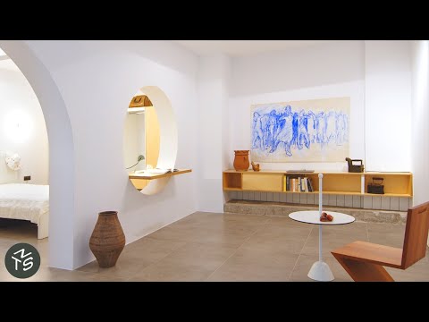
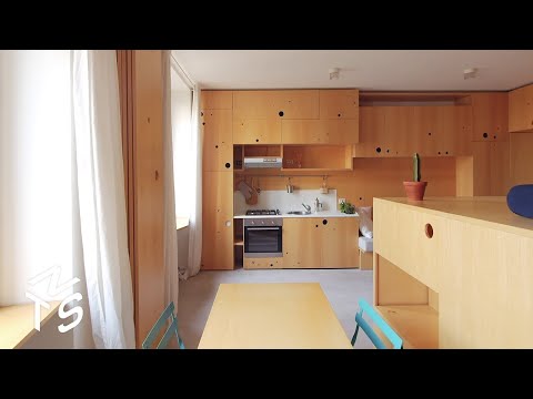
Almost completely submerged underground, this once dark and congested storage space was gutted by SOUTH architecture and transformed into a bright, comfortable and fully equipped studio apartment. The addition of a sculptural partition wall allowed SOUTH to create distinct functional living areas whilst also enhancing the flow of natural light throughout. The clever inclusion of an arched circular opening between the living room and bedroom doubles as both a desk and vanity, while unique, custom-designed furniture in the living room, bedroom and kitchen further defines the spaces and adds to their functionality.
#housetour #architecture #design
Project Name: Lycabettus Hill
Produced by New Mac Video Agency
Creator: Colin Chee
Director/Camera Operator: Alina Lefa and Xenofan Varardos
Producer: Lindsay Barnard
Editor: Colin Chee
Music: Still in Motion By One Man Band
NEVER TOO SMALL 40sqm/431sqft Small Apartment Design - Lycabettus Hill Studio
NEVER TOO SMALL: Garage to Beach Studio Transformation, Australia 40sqm/431sqft
NEVER TOO SMALL Tiny Mediterranean Villa With Pool - 40sqm/430sqft
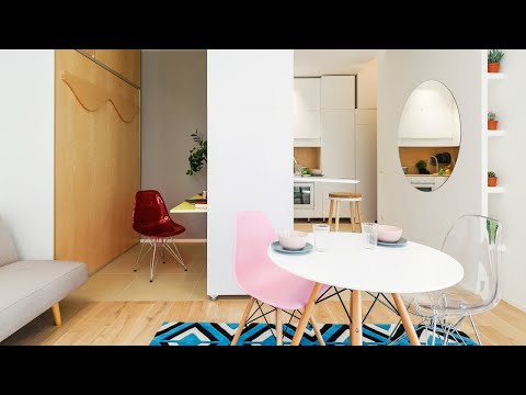
NEVER TOO SMALL Italian Micro Loft Apartment - 37sqm/398sqft
Tiny Apartment In Hong Kong | Micro Studio Apartment Tour | Never Too Small
NEVER TOO SMALL Buenos Aires Architect’s micro apartment - 32sqm/344sqft
NEVER TOO SMALL 1800's Milanese Micro Loft Apartment - 14sqm/150sqft
NEVER TOO SMALL Vibrant Small Athens Apartment 50sqm/538sqf
NEVER TOO SMALL Flexible Milanese Micro Apartment - 30sqm/340sqft
NEVER TOO SMALL Italian Transforming Tiny Studio Apartment - 44sqm/473sqft
NEVER TOO SMALL Argentinian Small Mezzanine Apartment - 44sqm/474sqft
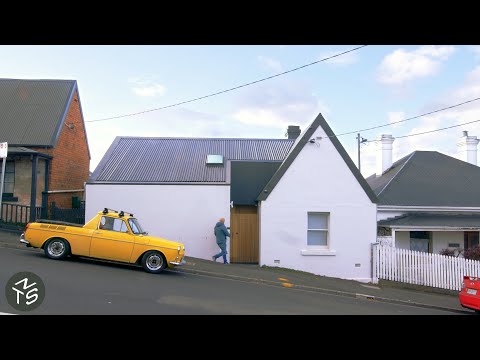
NEVER TOO SMALL Tasmanian Heritage Small Home - 44sqm/473sqft
NEVER TOO SMALL Sci-Fi Apartment Hong Kong - 59sqm/635sqft
NEVER TOO SMALL Buenos Aires Multi-purpose Small Apartment - 42sqm/452sqft
NEVER TOO SMALL Argentinian Small Corner Terrace Apartment - 25sqm/269sqft
NEVER TOO SMALL Melbourne Flexible Small Apartment - 55sqm/592sqft
NEVER TOO SMALL: Scandi Style Small Apartment - 50sqm/538sqft
NEVER TOO SMALL Waterside Italian Two Bedroom Tiny Apartment - 35sqm/376sqft
NEVER TOO SMALL Hong Kong City Escape Small Apartment -52sqm/559sqft
NEVER TOO SMALL Modular Milanese Micro Apartment - 34sqm/365sqft
NEVER TOO SMALL: Brazilian Tiny House Farm Retreat - Brasília 57sqm/613sqft
NEVER TOO SMALL Melbourne Hotel Small Apartment Conversion - 50sqm/538sqft
Tiny Apartment in Victoria Canada | Micro Studio Apartment Tour | Never Too Small
NEVER TOO SMALL Melbourne Sustainable Small Apartment - 51sqm/548sqft
Комментарии
 0:07:41
 0:10:08
 0:07:38
 0:06:48
 0:02:57
 0:06:35
 0:06:18
 0:07:29
 0:07:12
 0:06:22
 0:08:28
 0:07:22
 0:07:44
 0:06:53
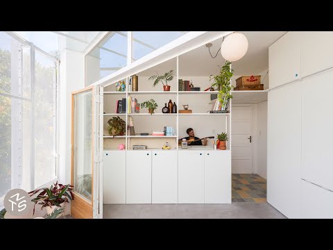 0:07:08
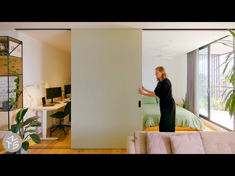 0:08:08
 0:07:15
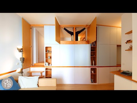 0:07:25
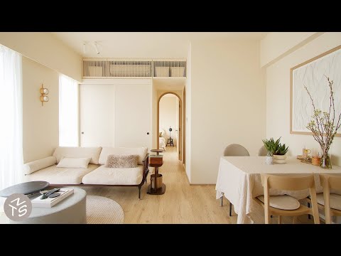 0:07:35
 0:06:40
 0:08:19
 0:05:49
 0:02:47
 0:06:21