filmov
tv
NEVER TOO SMALL: Vibrant Retro Inspired Small Apartment - Madrid 47sqm/506sqft

Показать описание
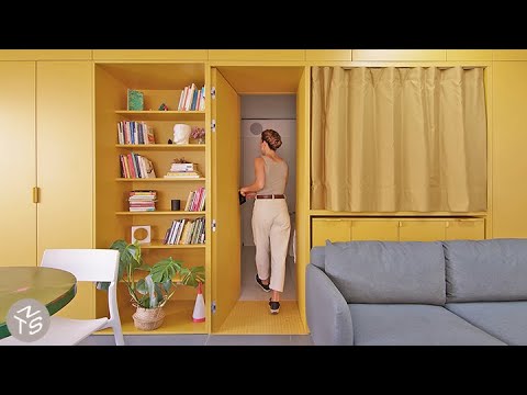
Inspired by the vibrant colours and geometric lines of Italian homes in the 1960’s, the team at gon architects redesigned this small one bedroom apartment located in one of the busiest squares in Madrid. Previously featuring exposed timber and walls that both enclosed and darkened the space, gon architects demolished the interior walls, allowing the perimeter of the now open space to be lined with floor to ceiling cabinetry. This cabinetry contains the apartment's kitchen, office, and storage space, as well as forming a unique wall that allows the bedroom to be either closed off, or opened up to the rest of the home. A projector within the bedroom ‘walls’ storage can be pointed into the living space or the bedroom as desired. Large, wide tiles make the home feel continuous leading to a wall sized door that opens directly onto the terrace and an outdoor bathtub, fully connecting the interior and exterior.
#smallapartment #architecture #interiordesign
Eps 114
Project Name: Casa Gialla
Architect: gon architects
Produced by New Mac Video Agency
Creator: Colin Chee
Director: Nam Tran
Cinematographer: Mattiue Torres
Producer: Lindsay Barnard
Editor: Yasmin Bright
Music: Sleepless on the Internet by Tomer Brauch
 0:06:30
NEVER TOO SMALL: Vibrant Retro Inspired Small Apartment - Madrid 47sqm/506sqft
 0:07:29
NEVER TOO SMALL Vibrant Small Athens Apartment 50sqm/538sqf
 0:08:48
NEVER TOO SMALL: Architect’s 19th Century Apartment Restoration, Barcelona - 60sqm/645sqft
 0:06:40
NEVER TOO SMALL: Mid-Century Retro Studio Apartment Sydney 26sqm/280sqft
 0:07:58
NEVER TOO SMALL - Retro Chic Athens Small Apartment 48sqm/516sqft
 0:07:49
NEVER TOO SMALL: Architect’s 90's Inspired Apartment, Paris 57sqm/614sqft
 0:11:01
NEVER TOO SMALL: Colourful Art Deco Micro Apartment, Sydney 27sqm/290sqft
 0:08:12
NEVER TOO SMALL: Ceramicist’s Vintage Furniture Apartment, Warsaw 33sqm/355sqft
 0:10:06
NEVER TOO SMALL: Colourful, Open Plan Apartment, Seville 58qm/624sqft
 0:07:35
NEVER TOO SMALL: Architect’s Tranquil Minimalist Apartment, Sydney 42sqm/452sqft
 0:07:53
NEVER TOO SMALL: Architect’s Colourful 50’s Small Apartment Italy 39sqm/429sqft
 0:05:44
NEVER TOO SMALL: Stargazing Off Grid Tiny House, Australia - 19sqm/204sqft
 0:08:45
NEVER TOO SMALL: Narrow, Light-filled Paris Apartment Renovation, 42sqm/452sqft
 0:07:42
NEVER TOO SMALL London Heritage Loft Apartment Conversion 54sqm/581sqft
 0:07:38
NEVER TOO SMALL: DIY Plant-filled Waterfront Loft, Amsterdam - 45sqm/484sqft
 0:07:37
NTS Renters: Japanese YouTuber’s DIY Rental, Tokyo 58sqm/624sqft
 0:06:28
NEVER TOO SMALL: Berlin Designer Open Plan Micro Apartment - 36sqm/388sqft
 0:08:20
NEVER TOO SMALL Furniture Designer’s Small Barcelona Apartment - 44sqm/484sqf
 0:07:44
NEVER TOO SMALL Sci-Fi Apartment Hong Kong - 59sqm/635sqft
 0:07:22
NEVER TOO SMALL Tasmanian Heritage Small Home - 44sqm/473sqft
 0:07:59
NEVER TOO SMALL: Artist’s Tiny Beach Shack Australia - 30sqm/323sqf
 0:07:02
NEVER TOO SMALL: Paris Architect’s 14th Century Apartment Makeover- 50sqm/538sqft
 0:07:34
NEVER TOO SMALL: Furniture Dealer’s Mid-Century Attic Apartment, Barcelona - 34sqm/366sqft
 0:07:34
NEVER TOO SMALL: Family of 5’s Multifunctional Micro Apartment, Manila 28 sqm/301sqft
Комментарии