filmov
tv
NEVER TOO SMALL 1800's Milanese Micro Loft Apartment - 14sqm/150sqft

Показать описание
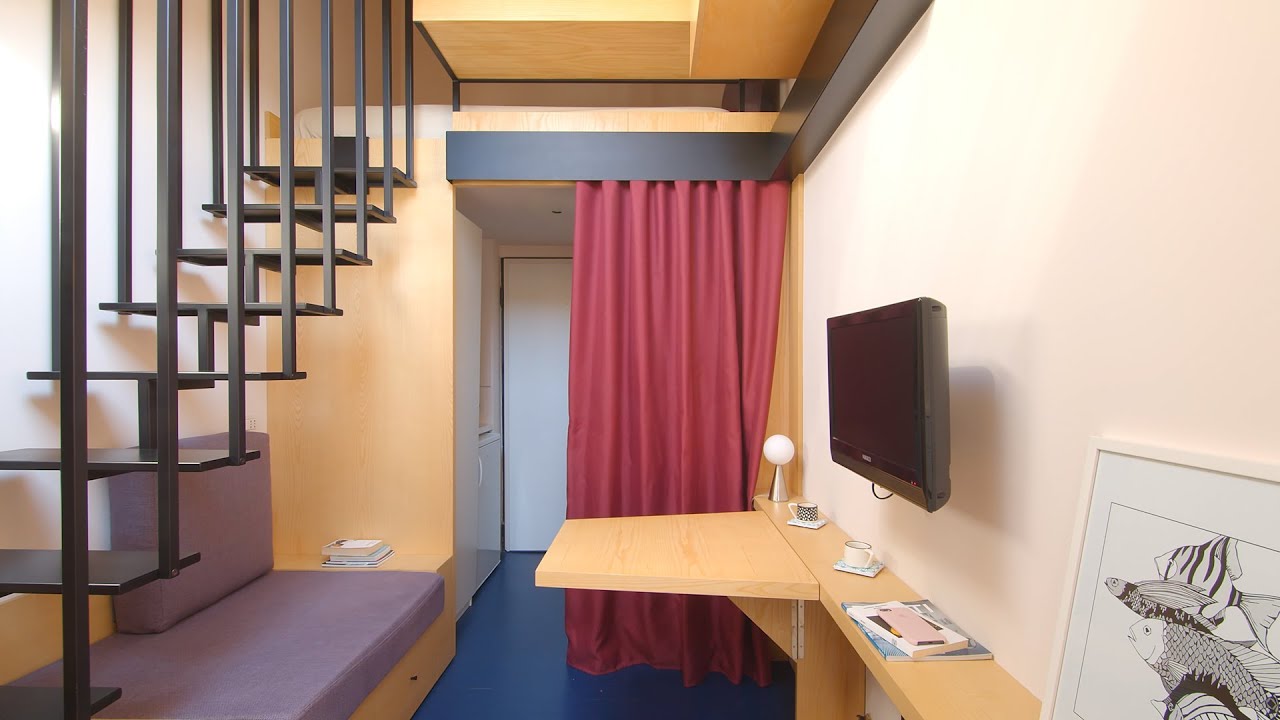
Hidden on the top floor attic space of a historic 1800’s building is the aptly named, Chambre de Bonne (maid’s room in French) designed by nonestudio. Inspired by yacht design, nonestudio redesigned this tiny 10sqm (+ 4sqm loft) home in eastern Milan as a seamless and versatile space; using a continuous wooden lining throughout to connect the home's surfaces and create a series of flexible living spaces.
#smallapartment #architecture #interiordesign
Project Name: Chambre de Bonne
Creator: Colin Chee
Director/Camera: Alessandro Carpentiero Photography
Producer: Lindsay Barnard
Editor: Colin Chee
Music: Compass by Some Were At Sea
In Video Credits:
Interview: Giulia Menestrina
Produced by: Newmac
Director/Camera: Alessandro Carpentiero Photography
Creator: Colin Chee
Producer: Lindsay Barnard
Editor: Colin Chee
Music:
Compass by Some Were At Sea
NEVER TOO SMALL 1800's Milanese Micro Loft Apartment - 14sqm/150sqft
NEVER TOO SMALL Flexible Milanese Micro Apartment - 30sqm/340sqft
NEVER TOO SMALL Modular Milanese Micro Apartment - 34sqm/365sqft
NEVER TOO SMALL Waterside Italian Two Bedroom Tiny Apartment - 35sqm/376sqft
NEVER TOO SMALL Italian Micro Loft Apartment - 37sqm/398sqft
NEVER TOO SMALL Sydney Small Basement Apartment - 49sqm/527sqft
Micro Apartment 18sqm ( Beautiful Tiny Apartment) | Space Saving Ideas | Never Too Small
NEVER TOO SMALL - 29m2/318sqf - Boho Japanese Micro London Apartment
NEVER TOO SMALL Flexible Small Seaside Apartment - 49sqm/527sqft
NEVER TOO SMALL Melbourne Sustainable Small Apartment - 51sqm/548sqft
NEVER TOO SMALL 36sqm/387sqft Small Apartment - Man Cave, Garage Loft
NEVER TOO SMALL Italian Transforming Tiny Studio Apartment - 44sqm/473sqft
Tiny Apartment 17sqm ( Micro Apartment 183sqft ) | Apartment Tour | Never Too Small
NEVER TOO SMALL: Architect’s Stylish Small Apartment Renovation Italy - 50sqm/538sqft
NEVER TOO SMALL Buenos Aires Architect’s micro apartment - 32sqm/344sqft
Tiny Apartment 18sqm In Paris France | Micro Studio Apartment Tour | Never Think Too Small
Tiny Apartment in Montmartre France | Micro Studio Apartment Tour | Never Too Small
NEVER TOO SMALL Buenos Aires Multi-purpose Small Apartment - 42sqm/452sqft
18sqm Tiny Apartment ( Micro Apartment 194sqft ) | Space Saving Ideas | Never Too Small
Tiny NYC Apartment 240sqft | Micro Studio Apartment Tour | Never Too Small
TINY APARTMENT 194sqft ( MICRO APARTMENT 18sqm ) | Space Saving Design Ideas | NEVER TOO SMALL
TINY APARTMENT 17.5sqm ( MICRO APARTMENT 188sqft ) | Space Saving Ideas | NEVER TOO SMALL
NEVER TOO SMALL Sci-Fi Apartment Hong Kong - 59sqm/635sqft
NEVER TOO SMALL FOR STUDENTS 8sqm/86sqft Micro Apartment
Комментарии
 0:06:18
 0:07:12
 0:06:40
 0:07:25
 0:06:48
 0:07:27
 0:03:40
 0:09:34
 0:07:26
 0:06:21
 0:05:28
 0:06:22
 0:04:33
 0:07:24
 0:06:35
 0:02:23
 0:02:47
 0:06:53
 0:03:28
 0:02:51
 0:03:39
 0:03:35
 0:07:44
 0:02:09