filmov
tv
NEVER TOO SMALL: 15th Century Small Apartment Redesign Italy - 36sqm/387sqft

Показать описание
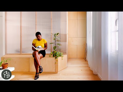
Located in the center of the historical Italian city of Mantua, the unique looking Monolocale EFFE apartment is characterised by an original fresco mural on its walls, discovered under decade old layers of paint by architecture and design firm Archiplanstudio, during the renovation. Originally part of a larger apartment, Archiplanstudio knocked down the wall between the original bedrooms creating a separate entrance, a new bathroom, kitchen and dining area all built around a central sleeping cube added to the middle of the apartment. The open living area includes the dining space, with an expandable dining table and floating bench seat integrated into the wall of the sleeping cube. The simple but fully equipped kitchen with light gray cabinets and brass finishes, includes a wall mounted induction hob that can be placed on the counter when needed, freeing up much needed counter space. The clever custom-made bench set along the window functions as a generous low shelf with storage space beneath, as well as additional seating for guests.
#smallapartment #architecture #interiordesign
Project Name: Monolocale EFFE
Produced by New Mac Video Agency
Creator: Colin Chee
Director: Nam Tran
CineAlessandro Carpentiero
Producer: Lindsay Barnard
Editor: Sebastian Tibbs
Music: When Skies Meet Shores by We Dream of Eden and Please Send Rain by We Dream of Eden
 0:06:14
NEVER TOO SMALL: 15th Century Small Apartment Redesign Italy - 36sqm/387sqft
 0:07:53
NEVER TOO SMALL: Architect’s Colourful 50’s Small Apartment Italy 39sqm/429sqft
 0:06:30
NEVER TOO SMALL: Vibrant Retro Inspired Small Apartment - Madrid 47sqm/506sqft
 0:06:53
NEVER TOO SMALL: Interior Architect's DIY Studio Apartment, Antwerp - 51sqm/548sqft
 0:07:34
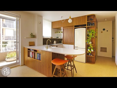
NEVER TOO SMALL: Furniture Dealer’s Mid-Century Attic Apartment, Barcelona - 34sqm/366sqft
 0:06:40
NEVER TOO SMALL: Mid-Century Retro Studio Apartment Sydney 26sqm/280sqft
 0:06:40
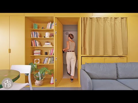
NEVER TOO SMALL Modular Milanese Micro Apartment - 34sqm/365sqft
 0:06:46
NEVER TOO SMALL: Sustainable Passive Eco Tree House, Australia - 54sqm/581sqft
 0:06:48
NEVER TOO SMALL: Architect’s DIY Beachside Apartment: Sydney 51sqm/549sqf
 0:07:02
NEVER TOO SMALL: Paris Architect’s 14th Century Apartment Makeover- 50sqm/538sqft
 0:06:10
NEVER TOO SMALL: Adaptable Small Apartment for Family of Five Paris - 50sqm/538sqft
 0:06:22
NEVER TOO SMALL Italian Transforming Tiny Studio Apartment - 44sqm/473sqft
 0:06:38
NEVER TOO SMALL: Calm and Narrow Minimalist Apartment, Buenos Aires - 30sqm/323sqft
 0:06:33
NEVER TOO SMALL: Tokyo Architect’s Tranquil Small Apartment 46sqm/495sqf
 0:06:48
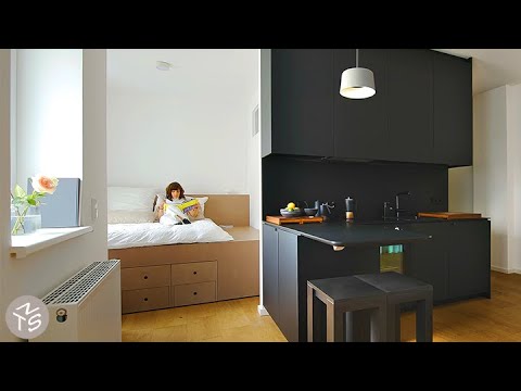
NTS RENTERS: Interior Designers’ DIY Loft Apartment, Taipei 57sqm/613sqft
 0:06:44
NEVER TOO SMALL: Iconic Tokyo Architect’s Tiny House - 19sqm/194sqft
 0:06:13
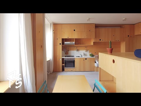
NEVER TOO SMALL: Architect/Artist’s Art Filled Studio Apartment, Poland - 29sqm/312sqft
 0:06:59
NEVER TOO SMALL: Gelato Bar Inspired Tiny Apartment, Paris 29sqm/312sqft
 0:07:59
NEVER TOO SMALL: Artist’s Tiny Beach Shack Australia - 30sqm/323sqf
 0:06:28
NEVER TOO SMALL: Berlin Designer Open Plan Micro Apartment - 36sqm/388sqft
 0:06:39
NEVER TOO SMALL: Paris Architect/Book Lover's Cozy Tiny Apartment - 25sqm/270sqft
 0:07:48
NEVER TOO SMALL Shaker Style Compact Apartment Auckland - 27sqm/291sqft
 0:06:21
NEVER TOO SMALL: Cinema Inspired Small Apartment, Madrid - 33sqm/355sqft
 0:06:39
NEVER TOO SMALL: Flexible Minimalist Micro Apartment, Sydney - 27sqm/291sqft
Комментарии