filmov
tv
🧇 Interactive Waffle Charts -- Excel Charting Skills

Показать описание
In this Excel tutorial, we are going to learn how to create interactive waffle charts to compare the amount of tickets sold for a concert by month and ticket type.
We will use a combination of Excel design elements, formulas, conditional formatting and data validation to achieve this.
DOWNLOAD THE WORKBOOK ⬇️
*******************************
Chapters:
00:00 - Introduction
00:25 - What are Waffle Charts?
02:18 - Set up the Dashboard
05:46 - Create the Waffle Grid
10:27 - Set up the Calculations Worksheet
15:59 - Create the Data Validation Dropdown List
16:37 - Convert Values to Percentages
19:40 - Link to the Data Validation Dropdown List
20:16 - Create the Filter
22:24 - Create Running Totals
23:22 - Add Conditional Formatting Rules
29:56 - Create Dynamic Chart Labels
********************************
🔗LINKS to related videos
📊Create a DYNAMIC Chart Title
🎯Add a DYNAMIC Target Line to an Excel Chart
🥩Highlight the MIN and MAX Values in a Chart
************************************************
🤝Let's CONNECT on social:
 0:32:22
🧇 Interactive Waffle Charts -- Excel Charting Skills
 0:02:56
How to make a waffle chart in excel
 0:52:19
Create an Interactive Power BI with Waffle Chart and Global Shape Map | World Bank Data
 0:13:56
Easy Excel Waffle Charts..Better than Pies and Doughnuts!
 0:33:21
How to make Grid Chart in Excel | Create Waffle Chart Tutorial
 0:05:32
Stacked Bar Excel Waffle Charts - Quick and Easy!
 0:08:06
Excel Color Box Charts - Waffle Charts Made Easy!
 0:06:38
Make Waffle Charts in Excel... the EASY way | Excel Off The Grid
 0:09:57
Excel Waffle Charts that work everywhere (including Excel Online) | Excel Off The Grid
 0:08:53
Mind-Blowing Excel Hack: 3D Waffle Charts in Just Steps
 0:01:59
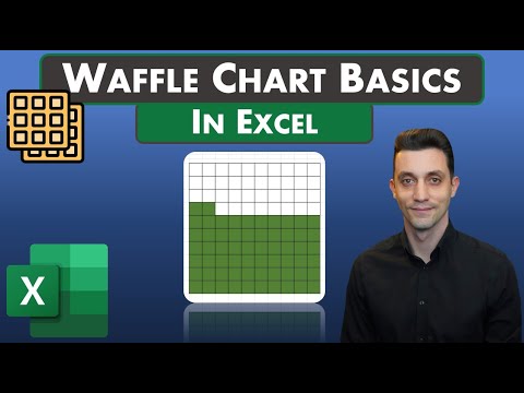
Excel Tips - Waffle Chart Basics
 0:15:28
Learn the best methods to create 3 types of Waffle Charts in Excel
 0:01:29
13. Waffle Charts | Data Visualization with Python | Tech2Teach
 0:30:42
Excel - Waffle Charts
 0:06:19
How to make a waffle chart in excel
 0:16:18
How to Create a Waffle Chart in Excel
 0:00:55
How to make a Waffle Chart in Excel
 0:00:56
Waffle chart with Football Icon in Excel #Shorts
 0:15:32
Create a Waffle Chart
 0:14:44
Creating a Waffle Chart in Tableau
 0:04:53
How to make a waffle chart in excel
 0:06:41
Impress your boss with Waffle Charts in Excel - Easy Recipe
 0:02:52
Making an Icon Waffle Chart in Microsoft Excel 🔥[SCREEN RECORDING]
 0:12:40
Waffle Chart in Excel with Scatterplot | Detailed Explanation
Комментарии