filmov
tv
13. Waffle Charts | Data Visualization with Python | Tech2Teach

Показать описание
In this video, we will learn about what some consider an advanced visualization
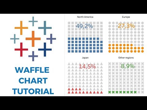
tool, namely the waffle chart. So what is a waffle chart? A waffle chart is a great
way to visualize data in relation to a whole or to highlight progress against a
given threshold. For example, say immigration from Scandinavia to Canada
is comprised only of immigration from Denmark, Norway, and Sweden, and we're
interested in visualizing the contribution of each of these countries
to the Scandinavian immigration to Canada. The main idea here is for a given
waffle chart whose desired height and width are defined, the contribution of
each country is transformed into a number of tiles that is proportional to
the country's contribution to the total, so that more the contribution the more
the tiles, resulting in what resembles a waffle when combined. Hence the name
waffle chart. Unfortunately Matplotlib does not have a built-in function to
create waffle charts. Therefore, in the lab session, I'll walk you through the
process of creating your own Python function to create a waffle chart, so
it's really important that you complete this module's lab session. And with this,
we conclude our video on waffle charts. I'll see you in the next video.
#DataVisualizationwithPython #Python #Datavisualzation
 0:01:29
 0:01:29
 0:09:27
 0:05:14
 0:21:43
 0:09:39
 0:19:54
 0:15:56
 0:19:46
 0:13:35
 0:03:50
 0:09:05
 0:12:55
 0:15:28
 0:15:32
 0:00:08
 0:11:02
 0:00:18
 0:07:19
 0:10:24
 0:06:41
 0:13:56
 0:02:15
 0:13:57