filmov
tv
Make Waffle Charts in Excel... the EASY way | Excel Off The Grid

Показать описание
★ Want to automate Excel? Check out our training academy ★
★ Check out the blog post★
★ About this video ★
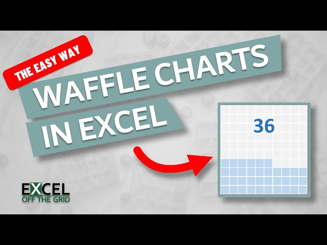
Waffle charts are like square pie charts. However, rather than slices of a pie, values are represented by the number of colored squares. They are commonly found on dashboards and newspaper articles because they are easy to read at a glance.
In this video, we look at how to make waffle charts in Excel using the easiest method possible.
0:00 Introduction
0:29 Waffle Charts in Excel
5:52 Conclusion
★ Download 30 most useful Excel VBA Macros ebook for FREE ★
★ Where to find Excel Off The Grid ★
#MsExcel
How to make a waffle chart in excel
Make Waffle Charts in Excel... the EASY way | Excel Off The Grid
Excel Tips - Waffle Chart Basics
Make waffle charts! (Excel & PowerPoint)
🧇 Interactive Waffle Charts -- Excel Charting Skills
Stacked Bar Excel Waffle Charts - Quick and Easy!
How to make a waffle chart in excel
Create Waffle Chart in Excel for Data Visualization
How to make a waffle chart in excel
Easy Excel Waffle Charts..Better than Pies and Doughnuts!
Excel Waffle Chart (Top-Down) -How to Create
Create a Waffle Chart in Excel 2016 for sales performance
Impress your boss with Waffle Charts in Excel - Easy Recipe
Excel's Magic: Waffle Chart through Conditional Formatting!
Learn the best methods to create 3 types of Waffle Charts in Excel
How to create a Waffle Chart in Excel
Create a Waffle Chart in Excel
Build a Stunning Waffle Chart in Excel | Step-by-step Guide
How to make Grid Chart in Excel | Create Waffle Chart Tutorial
Create dynamic waffle chart in excel
Excel Waffle Chart
Excel Waffle Chart (Bottom-Up) -How to Create
How to make a Waffle Chart in Excel
Excel tip how to make a waffle chart
Комментарии
 0:02:56
 0:06:38
 0:01:59
 0:04:43
 0:32:22
 0:05:32
 0:04:53
 0:00:52
 0:06:19
 0:13:56
 0:04:38
 0:11:02
 0:06:41
 0:07:55
 0:15:28
 0:11:25
 0:16:19
 0:08:48
 0:33:21
 0:09:03
 0:09:55
 0:04:15
 0:00:55
 0:00:59