filmov
tv
Don’t settle for a bad logo | Learn the 5 logo mistakes to avoid!

Показать описание
Bad logos. Not to throw any brands under the bus, but it’s fair to say that not every logo is a good-looking one.
In this video we’ll run through the 5 most common logo design mistakes, so you’ll know what NOT to do when creating yours (or updating an old one). And if you’re already guilty of one of these mistakes, don’t worry, we’ll also show you how to get your logo back on track!
Chapters:
00:00 - How to fix a bad logo
00:28 - How to fix an outdated logo
01:01 - How to fix logos that are too detailed
01:48 - Conflicting imagery
02:24 - How to fix logos that are vague or confusing
03:01 - How to fix an ugly logo
⬇️⬇️⬇️
⬇️⬇️⬇️
What is 99designs by Vista anyway? 🤔
We’re the global creative platform that makes it easy for clients and designers to work together online. Grow your business with the best freelance talent, and get a custom design that looks and feels professional. Because good design makes great business.
👩🎨️ Want to work with one of the designers featured in this video? Check them out below in order of appearance:
#99designs #LearnDesign #DesignBasics
You Should NEVER SETTLE – You Need To Hear This!
Never Settle | Bob Proctor
Don’t Settle For Bad Communication 🧠🫶🏻 #communication #relationship #relationshipadvice
Don't Settle For Less | Joel Osteen
Les Brown Motivation - DON'T SETTLE FOR LESS
Divorce Attorney Reveals The RED FLAGS You Should NEVER IGNORE In A Man! | Faith Jenkins
The 5 Signs Your Relationship Is Over | Mel Robbins
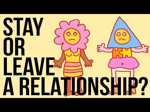
Stay in - or Leave - a Relationship?
Fired Hotel Employee: Don't Settle for a Bad Payout
Should You Settle In Your Love Life? | Matthew Hussey
Don't Settle for a Bad Marriage
Don’t settle for a bad logo | Learn the 5 logo mistakes to avoid!
Don't Settle For Bad Camp Coffee: Best Camping Coffee Maker Reviews
Don’t Settle For A Bad Communicator!
Why Women Should NEVER SETTLE In Dating & Relationships...
Don’t settle for a bad principal
Don’t give up, don’t settle for bad relationships, bad jobs, bad anything don’t settle!
NEVER SETTLE - Jordan Peterson (Best Motivational Speech)
Don't settle for negative traits in companionship. Embrace solitude until you find true love.#l...
Never feel bad for not wanting to settle
Don't Settle for a Bad Coach | UBC BizTech
Don’t settle for less than you deserve ❤️🔥 #motivation #highstandards
Bad Therapy! Don't Settle For less Than You Deserve
Don't settle for bad...
Комментарии
 0:02:34
 0:02:12
 0:00:38
 0:26:45
 0:08:37
 0:52:40
 0:05:13
 0:05:08
 0:06:12
 0:22:31
 0:00:10
 0:04:19
 0:11:55
 0:11:07
 0:32:26
 0:00:39
 0:00:25
 0:11:01
 0:00:13
 0:00:16
 0:01:22
 0:00:09
 1:04:01
 0:00:13