filmov
tv
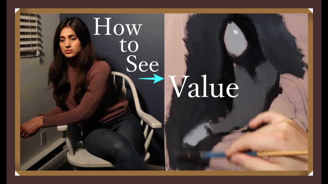
The Daily Yupari | LEARNING TO SEE VALUE - Painting a Value Study
Показать описание
In today's video we will be creating a small value study. No need to worry, this is certainly not going to be the finished painting. I find that creating these simple abstract value studies is incredibly useful for the final painting. It is useful because through its simplicity it actually answers one of the most complex questions of all. That is, how will all these shapes relate to one another in simple tone? Believe it or not, but that is my main struggle in my studio work.
Tomorrow we will return to the transfer drawing and correct some drawing mistakes directly on the transfer paper. After that we will prepare it for the transfer and begin work on the underpainting.
If you would like to be updated on new content on a regular basis please like/follow my Facebook page:
The materials used in this video are listed below,
Oil Paints
Lukas- Titanium White
Winsor & Newton- Lamp Black
Thinner/Brush Cleaner: Chelsea Classical Studio Citrus Essence
Panel: 12x12” Mdf panel gessoed with Liquiex Professional Acrylic Gesso (2 coats) and toned with a mixture of gesso and burnt umber acrylic paint.
Brushes Used:
Princeton Summit 2 Round 6100R
Master's Touch size 1 round
Princeton Select 2 Fan brush
 0:24:16
The Daily Yupari | LEARNING TO SEE VALUE - Painting a Value Study
 0:39:01
The Daily Yupari | Oil Painting for Beginners
 0:17:51
My Teacher's Amazing Artwork | The Daily Yupari
 0:27:54
The Daily Yupari | Portrait Painting for Beginners - Paint Along 1
 0:21:46
The Daily Yupari | TRANSFER TIME - Beginning the underpainting
 0:50:12
The Daily Yupari | Advancing the Portrait
 0:21:10
The Daily Yupari | Umber Sketch
 0:21:13
THE MAGIC OF FORM PAINTING - Painting a Nose | THE DAILY YUPARI
 0:18:36
The Daily Yupari | Starting our LARGEST PAINTING - Transfer Drawing
 0:48:22
The Daily Yupari | CONTINUING THIS PAINTING - Bonus Edition
 0:40:01
The Daily Yupari | BUILDING the FORMS - Underpainting Part 2
 0:44:43
The Daily Yupari | Most Beautiful Thing in Life
 0:14:53
Oil Painting Materials Guide & Studio Tour | The Daily Yupari
 0:51:31
The Daily Yupari | Developing the Face in Monochrome
 0:24:24
The Daily Yupari | Completing the Underpainting
 0:36:36
THE MAGIC OF FORM PAINTING - Painting Eyes | THE DAILY YUPARI
 0:23:52
The Daily Yupari | MORE OIL PAINT COLOR MIXING - Color Study 2
 0:27:07
The Daily Yupari | Portrait Painting for Beginners - Paint Along 2
 1:08:05
Portrait Painting Tutorial | All About Form - The Daily Yupari
 1:02:29
The Daily Yupari | BASIC PROPORTIONS & Block-In EXPLAINED
 0:37:16
The Daily Yupari | LET'S MIX COLORS - 1st Color Pass
 0:44:17
The Daily Yupari | BUILDING the FORMS - Underpainting Part 1
 0:37:19
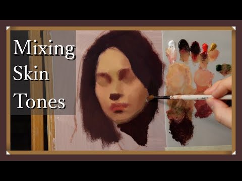
The Daily Yupari | MIXING OIL PAINT COLORS - Color Study 1
 0:24:59
The Daily Yupari | Developing The Forms - Paint Along 7
Комментарии