filmov
tv
🔸 The ONLY Colour Theory Video You Ever Need To Watch!

Показать описание
This video is a giant compilation of some of the most important tips, hacks and information that I've ever spoken about here at Satori Graphics, condensed down into a single video.
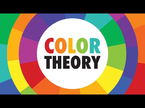
Colour is a very interesting and sometimes confusing part of graphic design. Colour can literally make or break a design, and so it is important to know how to use it as a tool in effective ways. From learning about the basics of the colour wheel, to advanced colour theory, colour tools and other things, this video really shows you how to master colour on your graphic design projects and artwork.
If you found todays video on mastering colour enjoyable or useful, let me know in the comments section and drop a like on your way out. Subscribe to stay updated to all of my uploads and until next time, design your future today, peace ✌️
Satori Graphics®
📌📌📌📌📌📌📌📌📌📌📌📌📌📌📌📌📌📌📌📌
⏯️ PLAYLISTS
********************************************************************
🐦 Join Me On Twitter!
📸 Here's My Instagram!
********************************************************************
©️ Copyright
The work is protected by copyright, produced by Satori Graphics®
This is applied to the video recording of itself as well as all artistic aspects including special protection on the final outcome. Legal steps will have to be taken if copyright is breeched. Music is used from the YouTube audio library and or sourced with permission from the author
0:00 Satori Colour Vids 2020-2023
0:13 Part 1: Before/After Colour
1:37 Part 1b: 2nd Design
3:00 Part 1c: 3rd Design
4:04 Part 2: Advanced Colour Theories
4:39 Part 2b: Saturation & Brightness Matter
5:52 Part 2c: Colour Physical Effects
7:32 Part 2d: Colour & Culture
8:29 Part 3: Tips For Colour Scheme Selection
9:40 Part 3b: Psychology Is Useful
10:12 Part 3c: New Example
10:55 Part 3d: Revisiting Design 1
11:37 Part 3e: Psychology & Colour Tools
13:01 Part 4: Adobe Illustrator Tips
15:17 Part 5: Colour In Logo Design
17:29 Part 5b: Choosing The Right Colour For A Logo
19:02 Part 5c: How Many Colours?
20:01 Part 5d: Colour To Stand Out
21:04 Part 6: Colour Tools
22:01 Part 6b Physical Colour Wheel
23:20 Part 6c: Recolour Tool
23:54 Part 6d: Pigment
25:08 Part 6e: Paletton
25:59 Part 6f: Photoshop Colour Tool trick
26:42 Part 7: Colour Wheel Basics
27:10 Part 7b: Colour Groups
Комментарии
 0:31:46
 0:08:54
 0:07:45
 0:07:45
 0:06:58
 0:29:14
 0:00:40
 0:07:14
 0:07:24
 0:00:53
 0:00:45
 0:10:45
 0:14:43
 0:00:51
 0:00:22
 0:11:52
 0:24:46
 0:04:17
 0:06:18
 0:00:22
 0:00:19
 0:09:21
 0:12:38
 0:00:35