filmov
tv
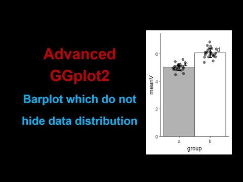
Advanced barplot: Barplot with overlayed points to visualise data distribution

Показать описание
#datavisualization #barplot #barcharts #ggplot2 #rprogramming
In this video, I discussed plotting barplot to visualise data summary as well data distribution.
I have explained how to summarise data and plot barplot and overlay jittered data points over those bars.
I have explained all the customisations required to make the plot more explanatory.
R code for this video is pasted below
Facebook page:
Mail Id:
youtube playlist:
# code ( pipe has to be removed because youtube do not accept angled bracket. )
a=rnorm(25,5,0.3)
b=rnorm(25,6,0.3)
group=rep(letters[1:2],each=25)
values=c(a,b)
boxplot(values~group)
library(dplyr)
df_sum = group_by(df,group)
df_sum= summarise(ds_sum,meanV=mean(values),sdV=sd(values))
df_sum
library(ggplot2)
ggplot(df_sum,aes(group,meanV))+
geom_col(fill= c("gray60","white"),color="gray20",width=1)+
geom_errorbar(aes(ymin=meanV-sdV,ymax=meanV+sdV),width=0.1,size=1)+
scale_y_continuous(expand=c(0,0))+
theme_classic()+
geom_jitter(data=df,mapping=aes(group,values),position=position_jitter(width=0.2),alpha=0.5,size=2)+
expand_limits(y=c(0,max(values)+0.3))+
geom_text(label=c("c","d"),vjust=-0.3,hjust=-2.3)
 0:16:00
Advanced barplot: Barplot with overlayed points to visualise data distribution
 0:05:27
Excel Visualization | How To Combine Clustered and Stacked Bar Charts
 0:04:33
Format Chart Columns in Excel with Series Overlap and Gap Width
 0:17:26
Using ggplot to create bar charts for 2 categorical variables. R programming for beginners.
 0:03:18
Combine stacked and clustered bar chart in Excel
 0:12:35
Advanced Bar Chart in R Tutorial: Grouped, Stacked, Circular (R Graph Gallery)
 0:13:49
Bar chart with differences in Excel
 0:01:04
How to create a graph that combines a bar chart with two or more lines in Tableau
 0:11:05
Excel Column Chart - Stacked and Clustered combination graph
 0:07:19
COMBINE CLUSTERED AND STACKED COLUMN CHART/BAR CHART INTO ONE VISUAL WITH LINE VALUES IN POWER BI
 0:03:17
Impress Your Boss with this Excel Actual v Target Chart Technique - Quick and Easy!
 0:24:56
How to create a grouped bar chart in R with ggplot2's geom_col and position_dodge functions (CC...
 0:02:17
How to Create a Combination Chart with Overlapping Bars & a Line
 0:16:25
Build Impressive Charts: It's NOT your usual Bar Chart (Infographics in Excel)
 0:06:17
How to Make STACKED Bar Charts in Excel (WK4c)
![[R Beginners]: Stacked](https://i.ytimg.com/vi/RPwJ6ExwPbg/hqdefault.jpg) 0:11:25
0:11:25
[R Beginners]: Stacked Bar Charts in R GGPLOT - code included in description
 0:09:01
How to make and enahnce nice labeled barplot using base R plotting
 0:02:16
How to create a Bi directional bar chart in Excel?
 0:16:22
How to create a relative abundance barplot with ggplot2
 0:05:32
How To Make A Multiple Bar Graph In Excel
 0:02:40
A Guide to Error Bars
 0:09:24
019. How to create a Clustered Stacked Column Chart in Excel
 0:13:19
How to make and enhance barplot with data labels, error bar and legend using R programming?
 0:10:34
Weekly Sales chart in Excel
Комментарии