filmov
tv
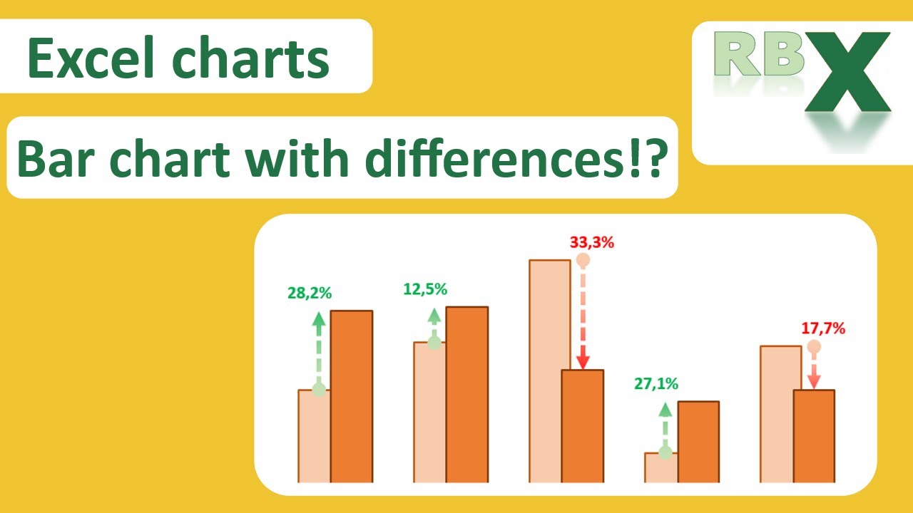
Bar chart with differences in Excel
Показать описание
In this video i will explain how to create a bar chart with two series and green and red arrows for the differences. Data labels will give the exact difference.
The basis for this bar chart is just a simple bar chart with 2 data series. By adding error bars we can create the arrows which indicates the differences between the 2 series. Error bars will only be positive and have specific values out off your data table. By changing the format of the error bars you can made them look noce like an arrow.
To position the data labels nice on top of the arrows there is a third and fourth data series needed. This data series have both the same values which equals the highest value of the original two data series. The third and fourth data series will be transparent so the bars are not visible. The are only added to place the data labels on top of it. Data labels have also a value from cell which is also in the data table.
This type of charts are very usefull to compare data for example of to different time periods. Differences are made visible and data labels are presenting the exact difference. This chrt will show you directly if figures have gone up or down compared to a certain time period.
0:00 - Intro
0:41 - Creating the data table
3:14 - Inserting the basic bar chart
3:34 - Formatting the chart
5:10 - Adding the error bars
6:17 - Formatting the error bars
8:16 - Adding data labels
8:48 - Add extra series for data labels
9:30 - Format the extra data series bars
11:38 - Format the data labels
 0:13:49
Bar chart with differences in Excel
 0:01:55
How a histogram is different than a bar chart?
 0:05:13
How To Choose The Right Graph (Types of Graphs and When To Use Them)
 0:05:50
How to Add Percentage in Column Chart in Excel | % Difference | % of Total | Display % and Value
 0:01:30
Reading bar charts: comparing two sets of data | Pre-Algebra | Khan Academy
 0:07:49
Bar Charts and Bar Graphs Explained
 0:02:47
What is a Bar Chart?
 0:09:52
Create A Column Chart That Shows Percentage Change In Excel - Part 1
 0:06:58
How to Make Bar Chart in Excel
 0:01:06
How to Add Individual Error Bars in Excel
 0:04:33
Format Chart Columns in Excel with Series Overlap and Gap Width
 0:24:10
Comparison Chart For Dashboards... Simple and Beautiful
 0:06:03
Create a Budget v Actual Chart
 0:03:12
Types of Graphs and when to use them
 0:00:57
11 types of Bar chart in Tableau
 0:07:09
Science of Data Visualization | Bar, scatter plot, line, histograms, pie, box plots, bubble chart
 0:08:13
Simple Bar Graph and Multiple Bar Graph using MS Excel (For Quantitative Data)
 0:11:33
Get Ahead With These 10 Advanced Excel Charts!
 0:02:16
How to create a Bi directional bar chart in Excel?
 0:12:08
Which is the best chart: Selecting among 14 types of charts Part I
 0:04:17
What is a Bar Chart? The Different Types of Bar Charts Explained
 0:03:18
Combine stacked and clustered bar chart in Excel
 0:01:36
Quickly Create A Year Over Year Comparison Bar Chart In Excel
 0:05:27
Excel Visualization | How To Combine Clustered and Stacked Bar Charts
Комментарии