filmov
tv
Excel Mastery: Stunning Comparison Bar Chart!

Показать описание
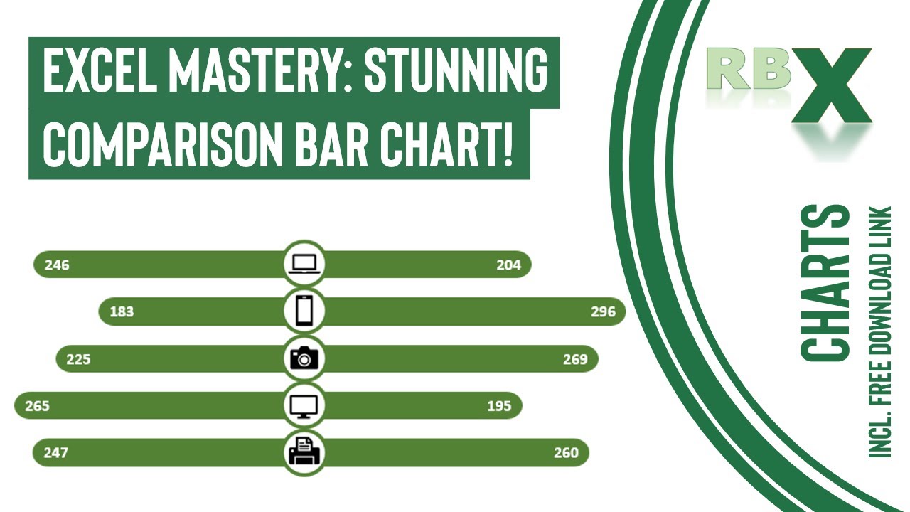
Unveiling Excel's Dynamic Comparison Bar Chart!
Join me in creating an exceptional comparison bar chart in Excel, showcasing an innovative design where bars extend from the center to both sides for easy comparison.
This step-by-step tutorial guides you through crafting this stunning chart. Utilizing a source table with two columns, we'll delve into creating helper columns crucial for constructing the chart. Learn how to form a stacked bar chart, including invisible series for the left, right, middle, and rounded edges, plus integrating a scatter plot to place images precisely within the bars.
Discover the art of formatting the chart, concealing unnecessary elements, and adding round edges for an elegant finish. Witness the strategic addition of scatter plots and images, revolutionizing the visual impact of your comparison bar chart.
Don't miss this insightful guide to creating a dynamic, picture-enhanced bar chart for effective side-by-side comparison!
0:00 - Intro
0:44 - The source table
2:19 - Inserting and formatting the bar chart
4:38 - Adding the round edges
5:24 - Adding the data labels
6:21 - Adding the scatter plot
9:02 - Creating the pictures
10:40 - Place pictures on your scatter plot
Комментарии
 0:11:41
 0:13:49
 0:16:47
 0:00:16
 0:00:57
 0:08:34
 0:00:22
 0:18:04
 0:00:29
 0:00:08
 0:16:07
 0:09:14
 0:00:15
 0:00:54
 0:11:33
 0:24:31
 0:00:52
 0:02:16
 0:11:05
 0:00:36
 0:04:41
 0:00:33
 0:19:16
 0:00:17