filmov
tv
Make Impressive McKinsey Visuals in Excel!

Показать описание
Make McKinsey Charts and Visuals in Excel from scratch.
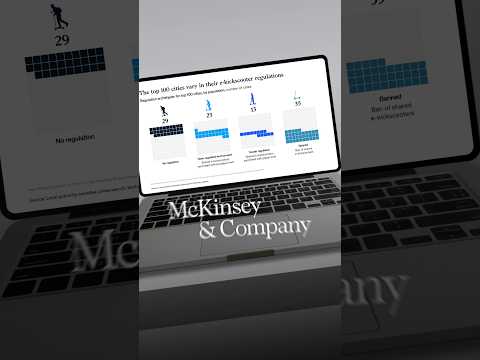
In this video, I make 3 McKinsey visuals in Excel. McKinsey & Company is the most prestigious consulting firm in the world, so they're known to make some of the best visuals in the industry. That’s why I want to show you how to replicate three of their most popular visuals, in Excel. First, we create a radial bar chart, which is like a mix of a pie chart and a bar chart. You can find this inside of the pie charts section in Excel. Specifically, next to a doughnut chart. Second, we make a bar chart to compare one column of numbers inside of the other. This is similar to a budget vs actuals chart. Lastly, we make a stacked bar chart to showcase the demographics in each step of the corporate ladder.
LEARN:
SOCIALS:
▬▬▬▬▬▬▬▬▬▬▬▬▬▬▬▬▬▬▬▬▬▬▬▬▬▬▬▬▬▬▬▬▬▬▬▬▬▬▬▬
Chapters:
0:00 - Radial Bar Chart Part 1
3:05 - Eyedropper Trick
4:07 - Radia Bar Chart Part 2
6:33 - Unnamed Bar Chart?
12:02 - Stacked Bar Chart
 0:16:47
Make Impressive McKinsey Visuals in Excel!
 0:00:58
How to build slides like McKinsey (the easy way)
 0:10:38
Fast & Easy! McKinsey Chart in Excel. Watch this...
 0:01:17
Making Impressive McKinsey Visuals in PowerPoint #powerpoint #ppt #slide #design #mckinsey
 0:01:40
Impressive McKinsey Visuals in PowerPoint #powerpoint #ppt #slide #design #mckinsey
 0:02:52
Impressive McKinsey Visuals in PowerPoint #powerpoint #ppt #slide #design #mckinsey
 0:02:22
Making Impressive McKinsey Visuals in PowerPoint #powerpoint #ppt #slide #design #mckinsey
 0:01:28
Making Impressive McKinsey Visuals in PowerPoint #powerpoint #ppt #slide #design #mckinsey
 0:02:04
Impressive McKinsey Visuals in PowerPoint. #powerpoint #ppt #slide #design #mckinsey
 0:10:50
Storytelling in PowerPoint: Learn McKinsey’s 3-Step Framework
 0:19:07
Make Beautiful Excel Charts Like The Economist (file included)
 0:02:02
Impressive McKinsey Visuals in PowerPoint. #powerpoint #ppt #slide #design #mckinsey
 0:01:20
Impressive McKinsey Visuals in PowerPoint.#powerpoint #ppt #slide #design #mckinsey
 0:02:28
Impressive McKinsey Visuals in PowerPoint #powerpoint #ppt #slide #design #mckinsey
 0:00:57
Create charts like McKinsey consultants (Part 1)
 0:01:17
Impressive McKinsey Visuals in PowerPoint #powerpoint #ppt #slide #design #mckinsey
 0:01:46
Impressive McKinsey Visuals in PowerPoint #powerpoint #ppt #slide #design #mckinsey
 0:02:31
Impressive McKinsey Visuals in PowerPoint #powerpoint #ppt #slide #design #mckinsey
 0:01:29
Impressive McKinsey Visuals in PowerPoint. #powerpoint #ppt #slide #design #mckinsey
 0:10:54
Build your own “McKinsey Style” Presentation (Full Tutorial)
 0:01:00
I found this McKinsey slide and made it better
 0:00:54
Create charts like McKinsey consultants (Part 2)
 0:01:00
Here’s how I improved this McKinsey slide
 0:00:16
How to crush your next presentation 👊
Комментарии