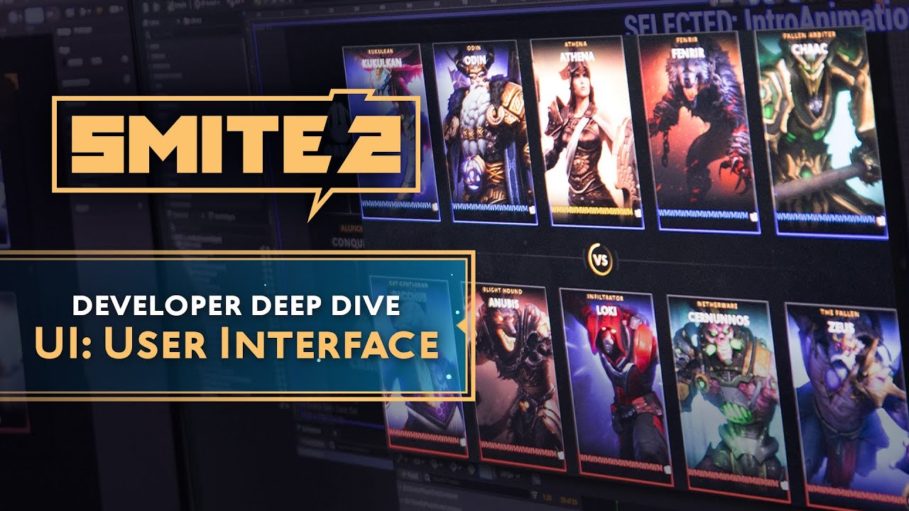
SMITE 2 – Developer Deep Dive: U.I. (User Interface)

preview_player
Показать описание
One of SMITE 2's biggest overhauls lies with the User Interface!

Sit down with our team in this deep dive to see just how much is changing and improving with the UI, and how our team gets to flex with the new tools!
#smite2 #userinterfacedesign

Get social with us at:

Become Godlike in SMITE, the free-to-play action MOBA featuring legendary mythological icons. Wield Thor’s hammer, turn your foes to stone as Medusa, or flex your divine power as one of 100+ playable Gods. No matter your skill level, SMITE has something for you!

Join over 40 million players around the world across PC, PlayStation 4, Xbox One, and Nintendo Switch - what are you waiting for? Go Ahead. Play God!
Рекомендации по теме
Комментарии
Автор

That layer in adobe called "bullshit" sends me

krazanas
Автор

My boy Fenrir looks so good I want to cry.

brewstin
Автор

Really like their focus on new players. Im an oldie so stuff will come easier to me than a brand new person with no experience in mobas. This is honestly smites last chance to hit the market strong. Lets hope they dont mess it up

kevinduron
Автор

Rumor has it that the UI Highlight bug will still exist somehow in this new UI

Digital__
Автор

Gameplay changes I found in this video:
Health potion: You can only have a max of 3 in a slot at a time now (dont know if this means you can have a health potion in each slot now)
Elixir of Intelligence: Gives 120 int, does not stack
Balors Eye: normal stats other than a whopping 30% magical pen
Anubis Passive tweak: he gains lifesteal and prots based on how low his hp is, 3% of each up to 8 stacks
Fenrir Confirmed: idk if hes been in previous deep dives but i only just now noticed him and his new jump animation looks cool. Kinda wish they gave him a visual rework like anhur though, he's always looked greasy to me

Nonco-
Автор

those new ability and item icons are clean af. nice job art team!

PicklechipGG
Автор

Shoutout to the artist, everything looks amazing. I LOVE that they’re redesigning ability icons and items. Just know that every small change is being noticed and appreciated!! Even the HP bar with those pulse effects.

lhrandom
Автор

Will card art no longer exist? Are we just going to have 3D characters on the loading screen?

familiasoarees
Автор

I like the look of the UI and the fact that smite 2 will retain the 2D art work of god icons instead of the 3D model's faces that were used before, but I think I prefer the God Icon to be a square instead of a rectangle.

Also I think fenrir's model is looking good, but fenrir walking with two legs during his ult is a bit weird lol

destebangm
Автор

The UI looks LEAGUES better than smite 1's and Fenrir is looking awesome so far!

bean-charlieartz
Автор

As a graphic designer, I appreciate these kind of videos

joakyduran
Автор

oou the gameplay is looking a lot better now

Sevarate.
Автор

I see there's a lot of passion for the game being put into working on Smite 2, that's good :)

TheRandomVile
Автор

I really appreciate that they are taking the time to actually refresh this game, and it does feel like they are putting love into it, i would like to leave this comment as a subjetive opinion rather than a critic since it may appear like it but hopefully it can be pros that can be put on the table or at least be used as a creative factor for the devs if they want.

I've been playing smite for almost a decade now and since the first days I've always liked the minimaslist/"brutalist" style of the UI, dont get me wrong the new ones look great and i like to see that they're putting their creativity into it, however filling up something too much can be overwhelming, flashy texts with gardients, unnecessary additional icons or a thick borders tend to make it feel crammed, i would like to see a customization implemented related to each panteon, for example a greek architecture UI keeping a minimalist 2D style an all white with pillars or for chinese red with gold, something leaving to personal preference pick rather than making it look futuristic or new, is a fact that the game needed an engine swap since it has so many layers that can't be changed without messing a lot of stuff up and we understand it, is not neccessary to give it a new game type of feeling since it will atract people on its own just driven by either curiosity on new game release or the best in my opinion nostalgia which will be a game changing factor the first days that will be 100% needed.

One of the few things Smite has always caught my attention on top of other MOBAs and is more of a personal liking, is the feeling that each ability you're using transmits, the sound and looks are very important for it and something that has changed drastically, not for bad but has been kind of forgotten is the hard deep bass sounds, i like to feel what im throwing and that it feels powerful, i remember back when Thoth was released I bought the hardest bass sounding headphones I could just to hear exagerated sound of the ult exploding my ears, and as I said is something of personal liking since I've always been into low deep bass frequencies since I have memory but is something liked by a lot of people and that gives this powerful personality to each ability, this is a factor that has dragged me towards Smite always some examples; Mercury ult, his punches, Anhur landing or his ult, Thanatos landing, Thoth ult, Nu wa ult, Wukong landing and those bass loudsy sounds and more if it comes alongside a more powerful look.

Everbody likes anime nowadays and there's this art style that I've always been into and has been popping off lately which is called "SAKUGA", is this kind of overwhelming groundshattering, groundshaking, sound barrier breaking style and since 2015 I've always wondered how Smite would feel with this kind of stuff implemented, landing somewhere and shattering the ground in layers without making it a game changing factor rather a visual thing would caught eyes easily and really makes you feel like an actual god is arriving, even taking in consideration atmosphere changes, sound breaking visuals that are not too flashy or even auras, I'm main Thanatos and the 2 has always given me that intimidation ability vibe, the way the aura goes in him is something really cool that i thought i would see more often and is an actual boost that you can appreciate visually and in some way fear, imagine a guy with a killing streak comes near you and you can see an aura around him or some kind of black low opacity flame like the 3k pot aura, not only does this would make it look really cool, it actually could drag your attention towards that player in some situations, even lighting their god model eyes in flames or white or make smoke come out of their mouths as just a visual thing would add so much personality and chances for add ons, let's call it "bloodlust" you can change your own bloodlust aura the same way you change pillars, border, icons ect.


Smite has always been my preference for what it makes you feel, I love mythology and the fact that is one of the main things is absolutely good, but it kind of feels forgotten, we are playing as gods, but is not something ive taken into consideration lately, it now just feels as characters, is not about the god choices that have been made so far, every god release has something in particular that makes it good, but i feel like it lacks something, more of a powerful/intimidating style or meaning, we can compare Zeus model to the rest, it looks intimidating and some gods playing cards really look cool, but is just that has been driven out of that almighty being feeling, don't get me wrong goofy skins are fantastic and I like all gods and skins releases in general but I would like to see more of a general depth into each skin release rather than just a creative choice of repeated visuals or color changes that just pack the god with skins that are either re colors or just a copy of other skin release art style and is totally okay, is understandable that everything takes time and effort, but the fewer the releases are the better they will become if a team is dedicated to it for some months without pressure.

I hope this helpful is some way even though they're probably just going to ignore all of this, and i wish you guys the best luck, the creative advantage this major game change will give is the most important part, and from now on is just looking ahead and keep making this game that we all love better.

josephcorazzari
Автор

1:20 hopefully your colorblind options are solid because if i'm out here looking for green/red to quickly determine the enemies items then I'm doomed

ktc
Автор

Love the bullshit layer, and XxWeedEnjoyer420xX Morgan Le Fay tag. 0:27

gunkjunk
Автор

They going the league route with percent scaling 1:52 i love it

DatBoiKobe
Автор

The UI changes look slick! I love the new artstyle of the abilities, though now it doesn't fit quite as well with the items artstyle, but those are probably changing as well.
But a very nice change that I could notice was the camera verticallity change when Fenrir, Anhur or Neith jumps! Together with the camera angle lookng like it's slightly lower, it makes it even more action-y! Love it

zewzit
Автор

Love that this gets highlighted. I feel like UI is something that you notice when it's not done well and you have a hard time understanding what the game is trying to communicate (if it communicates stuff at all). Conversely UI tends to fly under the radar when it's designed really well, so most of the time you probably won't pick up on a lot of helpful details and the smart decisions making a useful and effective UI. So, much appreciated 🙂

GenderNeutch
Автор

I remember when they tried updating the UI and completely made the game unplayable. I'm glad they can finally change it without breaking the game lmao

isaacjohnson