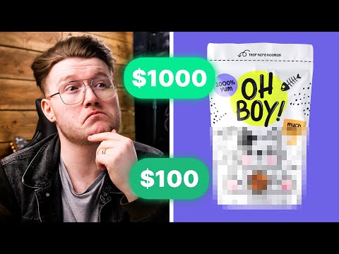
I Paid 5 Designers To Design The SAME Logo + PACKAGING... 💸

preview_player
Показать описание


This video has captions available in English, हिन्दी, Deutsch and Español!

If there's anything you would like me to cover in a video, then let me know by commenting down below!

📋 Timestamps

00:00 Intro
00:11 What is DesignBro?
00:42 The Brief
01:52 John89
03:54 Nick
06:34 Joanne
08:42 ink
10:47 Bartos
13:12 My Favourite
14:28 Outro

✏️ The Design Brief

Insight:
People might have different interests, but most of us have one thing in common -
our love for pets. So much that the vast majority of us have one or more pets in our
care. The good boy. The best girl. And we better feed them all. The good snack.The best food.

Tone of voice:
Funny, witty, doesn't take itself too seriously, meme-inspiring.

Product:
Pet/dog (probably organic, premium) food.

Brand:
OH BOY!

Emotional benefit:
'Oh Boy' is both 'excitement' and 'facepalm'. The owner and the pet's unconditional
love. The joy of seeing the human best friend return home for the first time. Every
time. Or the human's amused eye roll when seeing the gnawed couch back home.

Product packaging:
Ownable elements such as use of negative space (ie. for cutouts, making the
actual contents visible or animal distinct shapes); pouch packaging.

Product availability:
Launching on Amazon and select retail stores in the UK and Netherlands.
Рекомендации по теме
Комментарии
Автор

#1 & #2 are very cute
#3 looks like a high quality product
#4 has the best meme aspect
#5 is the most catchy one
I can’t decide which one is my favorite

anaivil
Автор

love these: "I paid designers to design the same thing" types of videos! keep them coming

Hitomii_
Автор

Great how they have done the transparent elements in the brief in clever ways within the illustrations. All solid designs but for me it is design 1 due to feel like will be super flexible moving forward. Great work.

JeffWhisky
Автор

I used to work in a higher end pet store and I can say with some confidence that the second design you showed with the "chew here" line would sell REALLY well. All of them are excellent but that one has my vote! Your fave is my second pick but again, all really good. I love seeing these types of videos!

WillowRoseArlen
Автор

Meme and premium don’t really work together. You’re not really going to get any memes with a “premium brand” through that brief. All of those brands work so well, and could see them as DTC brands on a subscription. Memes don’t always work for consumers - especially in supermarkets as the current demo for super markets is a lot older. They wouldn’t necessarily read the meme lines and understand them and you don’t buy something you don’t understand. So grading them on shelf appeal doesn’t really work here. Unless they’re a boutique shop.

AndSoWeLaughed
Автор

I would argue the black and white of the cat food was brilliant, because no other pet food company uses black and white. I believe it would stand out brilliantly. Great Value did some exploration on that front a few years back and it's been very successful for them.

RenoFencingMan
Автор

Totally digging the one by Ink. Matched up with your brief the best. I get hipster premium vibes from it.

studioriz
Автор

obsessed with the black and white one! it's so cute and neat! the "chew here" with the squiggly line is an awesome idea though :)

gyakutenryu
Автор

Love this series!! I find it interesting that none of the designer put organic on the packaging I think that’s what organic buyers look for first

daniemyers
Автор

i personally loved nick's the most! the memes on ink's feel a bit too dated and not as timeless but i love the vibe. i also love john's but it doesn't feel as premium (and i think it's more illustration-focused than holistically design focused personally)! i love all the different directions taken with interpreting the brand name!!!

yikes.
Автор

Black and white one is the only one I got premium from, the others were similar to store-brand designs ive seen, that doesnt mean they're bad at all. Logo 3 and 4 are stand outs, all others rank the same for me but still high!

hritov
Автор

Can you make a video breaking down how to request a design from the business owners point of view? What a brief should include, terminology we should know, etc.

DestinationFreedom
Автор

I would really like to see companies to implement this kinds of packaging in the dog & cat foods nowadays cus this is awesome mate! Great video

yahalloe
Автор

Im a cat person too so if I ever went to the store and saw the "feed me, peasant" one I'd get it in a heartbeat

LoverPig
Автор

It's interesting to me how contemporary packaging of this kind is usually only attempted by smaller indie companies, local brands rather than international or even inter-city-state etc ones. Instead the corporate branding for the larger, widely available products tend towards variations of the same idea, with only colour as their demarcation. Sad.

GuanoLad
Автор

Ink: has best meme aspect
*Clever way of making it transparent
*Looks both premium and playful
*Cat looks memeish and memorable
*Logo is nice and memorable

Others are more meh generic, professional or nice maybe, but not quite there with memes, which is main outstanding point

PersonManManManMan
Автор

they all look good. Made me realize how lacking I was when working as a graphic designer.

maimeeangel
Автор

Cats know a human is just a slave. But did you know rabbits are the same?

I am a designer too, and I haven't designed any of these. I voted based upon approachability.

The comments to my anonymous votes (didn't want to make an account) will make you laugh, but I am very serious when I say what I say in those comments.

Most of these designs are not approachable. Only the black and white design is. Yes, it is not colorful, but it makes SO MUCH SENSE compared to the others.

medicinemadisonofficial
Автор

*ink* got me. Lovely, playful, memie, funny. ❤️

rohanranjan
Автор

It’s number 3 for me for sure! I’ll choose a white bag over an orange one and that neon yellow - yes! Nice nice

beanhope