filmov
tv
I Paid 3 Designers On Fiverr To Design The Same Logo... 😬

Показать описание
Watch as professional logo designer, Will Paterson takes on an exciting experiment! He uses AI-generated design briefs to challenge three talented Fiverr designers. Dive into the world of design, innovation, and discover the outcomes of this unique face-off between machine intelligence and human creativity. Don't miss the reactions, reviews, and the final masterpieces!
🔗 Links
-
Full Brief for Float.
Description:
Float is a cutting-edge, artificially intelligent chatbot developed to provide seamless and personalised communication experiences. It uses advanced natural language processing and machine learning algorithms to engage with users and assist them in various tasks, ranging from customer support to virtual personal assistants.
Target Audience:
Float's target audience includes businesses of all sizes, tech-savvy individuals with a user ratio of around 80:20 Male:Female and a 25-45 approx. age range. The logo should resonate with both tech enthusiasts and professionals in various industries.
Words we associate with:
* Intelligent: The logo should convey the notion of advanced intelligence and smart solutions, reflecting the chatbot's ability to understand and respond effectively to user queries.
* Trustworthy: As Float deals with sensitive information, the logo should evoke a sense of trust, reliability, and security.
* Modern: We use cutting-edge technology so our brand should represent this.
* Innovative: The logo should have a contemporary feel, representing Float as a cutting-edge technology in the field of artificial intelligence.
What we need:
A word-mark logo that works as an icon, or a word-mark with a logo-mark.
Design Guidelines:
* Colour Palette: The preferred colour scheme should include a combination of vibrant and sophisticated colours, such as blues, purples, or greens, but feel free to experiment with other colours that align with the brand personality.
* Typography: The typography should be clean, modern, and easily readable, with a preference for sans-serif fonts.
* Icon: Incorporate an abstract or conceptual symbol/icon alongside the company name to represent Float visually. The symbol should be unique, simple, and scalable, allowing for easy recognition and versatility across various applications.
 0:33:56
I Paid 3 Designers On Fiverr To Design The SAME Website... 🥸 | Saptarshi Prakash
 0:14:32
I Paid 3 Designers On Fiverr To Design The Same Logo... 😬
 0:10:10
I Paid 3 Designers On Fiverr To Design My Logo...
 0:15:33
I Paid 3 Designers To Design The SAME Logo... and Here's What They Came Up With!
 0:13:54
I Paid 5 Designers On Fiverr To Design The SAME Logo... 🧐
 0:11:52
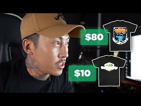
I Paid 3 Designers on Fiverr to Design a T-Shirt and I Also Designed It Myself Using Kittl (Review)
 0:19:19
I Paid 3 Designers to Animate my Logo on Fiverr
 0:06:15
I PAID 3 designers to make the same logo on Fiverr
 1:22:41
FF meetup #3 - Design systems
 0:01:00
I Paid 3 Designers On Fiverr to Make The Exact Same YouTube Thumbnail
 0:03:52
I Paid 3 Designers To Make The Same Thumbnail
 0:19:32
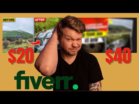
I paid 5 designers on Fiverr to create a cover for the same book
 0:13:22
I Paid 3 Designers on Fiverr to Design the Same Cover fiverr cover design
 0:25:52
I Paid 3 Different Designers On Fiverr For A New Logo
 0:26:02
I Paid Other Designers to Decorate My Space!
 0:07:06
I paid Sound Designers on FIVERR to design the SAME sound!
 0:15:22
I Paid 3 Different Fiverr Artists To Design New Logos
 0:07:18
I Paid Three Designers on Fiverr to Make My YouTube Thumbnail
 0:24:49
I Paid 5 Designers To Design THE SAME Logo... 🧐 (Interesting Results)
 0:14:23
I Paid 5 Logo Designers On Fiverr To Design The SAME Logo... 💰
 0:12:20
I Paid 5 Designers On Fiverr To Design The SAME Logo... Part 2 ($1,000)
 0:08:33
We Paid 3 Designers on Fiverr for the Same T-Shirt Design
 0:08:17
I Paid 5 Designers To Design The Same Logo
 0:15:16
I Paid 5 Designers To Design THE SAME Logo... 💸 (So Clean)
Комментарии