filmov
tv
How to create a GANTT CHART to track project and tasks in Power BI using the default Matrix Visual

Показать описание
Get Demo Files here
In this video were going to cover how to create your very own Gantt Chart to track your project tasks using only the Matrix Visual.
-
🚩 Support us to get perks such as demo files, early access and more!
MY FAVOURITE POWER BI BOOKS
MY GEAR
GET IN TOUCH
🌍 WHO IS SOLUTIONS ABROAD
Hi, my name is Fernan, the one-man band of Solutions Abroad. I work as a Data Scientist based in London, UK and have over 6 years of experience working in Business Intelligence. Solutions Abroad these days is dedicated to teaching the ins and outs of Power BI, through the power of YouTube.
If you want to learn more, I’ve conveniently created playlists to help you find the right topic for you.
🐎 First, watch this video about how a typical Power BI workflow looks like
🗺 Learn DAX to extend your Power BI calculations
📆 Stay up-to-date on all the features Power BI releases monthly
🧪 Get certified as a Microsoft Data Analyst Associate
💡 Learn Power BI Features to improve your dashboards
📊 WHAT IS POWER BI?
Power BI is a business analytics tool by Microsoft. It creates a working environment suited for normal users, meaning tasks such as data extraction, cleansing, analysis and storytelling; these are made easily-accessible to citizen-users, and extendable for technical users. At face value it provides visually-stunning, interactive dashboards, but it’s built on top of so much more.
🔻 Get started with Power BI Desktop for FREE
#PowerBI #DataAnalytics #BusinessIntelligence
 0:07:44
How to Make Gantt Chart in Excel
 0:08:14
Gantt Chart Excel Tutorial - How to make a Basic Gantt Chart in Microsoft Excel
 0:15:59
How to Make the BEST Gantt Chart in Excel (looks like Microsoft Project!)
 0:02:36
Gantt Chart Excel Tutorial - How to make a Basic Gantt Chart in Microsoft Excel 2016
 0:06:37
How to create a Gantt Chart in Excel
 0:00:12
Gantt Excel - Fastest Way to Create a Gantt Chart
 0:02:14
How To Make Gantt Chart In Excel - Full Guide
 0:10:02
How to Create a Gantt Chart in 9 Easy Steps
 0:17:13
Make This Awesome Gantt Chart in Excel (for Project Management)
 0:11:20
How to Quickly Make a Gantt Chart in Excel
 0:10:41
How to Create a Gantt Chart in Google Sheets
 0:05:29
Easy way to make Gantt Chart in Excel
 0:09:23
How to Create a Gantt Chart in Microsoft Project (Microsoft Project for Beginners)
 0:03:56
How to Create a Basic Gantt Chart in Microsoft Project 2022
 0:07:16
How To Create A Gantt Chart With A Progress Bar To Show Percentage Completion Of Tasks In Excel
 0:09:36
TECH-005 - Create a quick and simple Time Line (Gantt Chart) in Excel
 0:07:02
How to Make a Gantt Chart Using Excel [EASIEST GANTT CHART METHOD]
 0:16:29
PROJECT MANAGEMENT in Power BI? Create a GANTT CHART from a bar chart | NO CUSTOM VISUAL solution
 0:01:00
How to Create a Gantt Chart in Excel
 0:05:51
How To Create The BEST Gantt Chart In Excel 2024
 0:08:28
How to Create a Gantt Chart in Excel in 10 Minutes! (FREE Download Included!)
 0:01:00
Gantt Chart in Excel | 60 Seconds Tutorial #shorts
 3:18:01
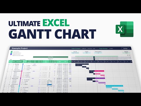
How to create Ultimate Excel Gantt Chart for Project Management (with Smart Dependency Engine)
 0:02:37
Creating a Gantt chart using a Bar Chart
Комментарии