filmov
tv
Excel Combo Chart: How to Add a Secondary Axis

Показать описание
This tutorial explains how to create an Excel combo chart (aka dual axis chart) with a secondary vertical axis to visualize two different types of data on the same chart.
____________________________________________
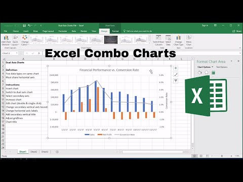
Learning how to build an Excel combo chart (or dual axis chart) is a powerful skill that can help you simplify complex stories around data.
The benefit of a combo chart, compared with a regular chart, is that we can visualize two different data sets on the same chart - for instance - financial ($ denominated) data as well as website conversion rates (% denominated), by adding a secondary vertical axis.
The prerequisite to building an Excel combo chart is that you need to have the right data to visualize. You will have a different type of data on each vertical axis (one on the left and one on the right) but these two types of data will share the horizontal axis.
What this means is that the two types of data need to share the something in common - usually that they happen during the same time (on the horizontal axis) - in order to build an Excel combo chart.
As long as you have the right data, you can add a secondary axis (vertically) and visualize your two data sets one one chart!
By the end of this video you will feel confident creating & adapting dual axis charts and visualizing different types of data. If you have a question - leave me a question in the comments and I'll get back to you!
#excelcombochart #dualaxischart #secondaryaxisexcel
____________________________________________
Learning how to build an Excel combo chart (or dual axis chart) is a powerful skill that can help you simplify complex stories around data.
The benefit of a combo chart, compared with a regular chart, is that we can visualize two different data sets on the same chart - for instance - financial ($ denominated) data as well as website conversion rates (% denominated), by adding a secondary vertical axis.
The prerequisite to building an Excel combo chart is that you need to have the right data to visualize. You will have a different type of data on each vertical axis (one on the left and one on the right) but these two types of data will share the horizontal axis.
What this means is that the two types of data need to share the something in common - usually that they happen during the same time (on the horizontal axis) - in order to build an Excel combo chart.
As long as you have the right data, you can add a secondary axis (vertically) and visualize your two data sets one one chart!
By the end of this video you will feel confident creating & adapting dual axis charts and visualizing different types of data. If you have a question - leave me a question in the comments and I'll get back to you!
#excelcombochart #dualaxischart #secondaryaxisexcel

How to Make Combo Charts in Excel

3 minute Combo Chart with Excel for Mac
Excel Combo Chart: How to Add a Secondary Axis

How to Create Combo Chart in Microsoft Excel

Excel Combo charts - Beginner to Advanced - Combination graphs in Excel

Excel Combo Chart: How to Add a Secondary Axis | combo chart in excel | combo chart

How To Combine A Line And Column Chart In Excel

Make a Combination Column and Line Chart in Excel 2016 or later

How to Make a Simple Bookkeeping Template in Excel

How To Create Excel Combo Chart with Multiple Lines on Secondary Vertical Axis

Excel Column Chart - Stacked and Clustered combination graph

Excel Charts & Graphs: Learn the Basics for a Quick Start

📊📈 How to make a combined bar and line graph in Excel (Combo chart) in 3 minutes

How to create a Combo Chart in Excel - secondary vertical axis chart

MS Excel - Pie, Bar, Column & Line Chart

How to insert a combo chart

Weekly Sales chart in Excel

Combine stacked and clustered bar chart in Excel

Combo Chart with 2D Stacked Column and Scatter Chart in Excel 2016

Create a combo chart or two-axis chart in Excel 2016 by Chris Menard

Discover Easy Ways to Make an Excel Combo Chart

Excel Charts and Graphs Tutorial

Combination Stacked & Clustered Column Chart in Excel - 2 Examples

Make an AWESOME Dynamic Chart with Checkboxes in Excel ✔ (No VBA)
Комментарии