filmov
tv
Power BI: Correlation Analysis of Sales and Marketing Data to Identify Most Effective Method

Показать описание
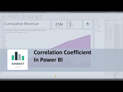
The video discusses how to use Power BI to analyze sales and marketing data using correlation analysis. The purpose is to identify the most effective marketing method to enhance sales. The video begins by explaining that the company is currently using electronic media, print media, and social media for marketing. To get started, the data is imported into Power BI using the "get data" feature, and sheet one is selected in the navigator window.
Next, a title is added to the dashboard using a text box, and a scatter chart is added to analyze the relationship between electronic media marketing and sales. The sales field is added to the Y axis, the electronic media field is added to the X axis, and the month field is added to the values area. A copy of the scatter chart is created, and the print media field is replaced with the electronic media field in the X axis. Another copy of the scatter chart is created, and the social media field is used in place of the print media field in the X axis.
After creating the scatter charts, the video explains how to use the quick measure button in the home tab to calculate the correlation coefficient between electronic media marketing and sales. The month field is added to the category, sales field is added to Measure Y, and electronic media field is added to Measure X. This provides the correlation between electronic media marketing and sales data, which is added to the dashboard and changed to a gauge visual.
The video explains how to create a new measure to correct the maximum value for the gauge visual, which should be one instead of 1.4. The same process is used to calculate the correlation between print media and sales and social media marketing and sales. Each correlation measure is added to the dashboard and changed to a gauge visual, with the max field added to the maximum value area.
Finally, the video concludes by discussing the results of the analysis. The scatter charts show that social media marketing is the most effective method of marketing, with the highest correlation between social media marketing and sales. A trend line can be added to the scatter chart to forecast sales from social media marketing, which shows that sales can be increased by spending more on social media marketing.
Overall, the video provides a step-by-step guide for using Power BI to analyze sales and marketing data, with a focus on correlation analysis to identify the most effective marketing method.
#PowerBI
#DataAnalysis
#MarketingAnalytics
#SalesEnhancement
#CorrelationAnalysis
#SocialMediaMarketing
#PrintMediaMarketing
#ElectronicMediaMarketing
#TrendAnalysis
#DataVisualization
#BusinessIntelligence
#DashboardDesign
#DataInsights
#MarketingStrategy
#MarketingTrends
#DigitalMarketing.
 0:06:41
Power BI: Correlation Analysis of Sales and Marketing Data to Identify Most Effective Method
 0:12:00
DAX Fridays! #136: Correlation in Power BI
 0:14:45
Building a Native Correlation Plot in Power BI
 0:14:05
Correlation in Power BI Using DAX
 0:10:31
PREDICT THE FUTURE with LINEAR REGRESSION / How to use LINEST function / Beginners Guide to Power BI
 0:15:34
Power BI Quick Tip: Performing Correlation Analysis Using Correlation Matrix
 0:11:47
How to Use Correlation Plot to Improve Story Telling and Analysis in Power BI
 0:06:34
Correlation Coefficient in Power BI
 0:13:52
Implementing linear regression in Power BI
 0:14:13
How To Bring In Summary Statistics and Correlation Tables In Power BI Using Python
 0:05:40
Correlation analysis
 0:01:26
Analyzing Sales Commissions With Power BI
 0:16:00
How to create a CORRELATION MATRIX in Power BI using the Python Visual
 0:09:33
Showing actuals and forecasts in the same chart with Power BI
 0:04:25
IMPORTANT - Correlation vs Causation | Microsoft Power BI Desktop for Business
 0:05:35
Correlation Matrix in Power BI using Python Script | Temidayo Omoniyi
 0:04:09
Power BI - How to Fix Your Scatter Chart
 0:17:43
How To Visualize Correlations In Python And Port Over Into Power BI
 0:11:25
Statistics and Correlation Tables in Power BI with Python
 0:05:55
5 How to Create Correlation Plot in Power BI | AI and Power BI
 0:42:50
Beginner to PRO Data Analysis with Power BI - Full Length Course (with sample files!)
 0:07:09
Add Trend Line to Scatter Chart in Microsoft POWER BI | Linear Regression in POWER BI | Examples
 0:00:57
4 Problems Power BI Solves for You #shorts
 0:09:10
How to do Simple Linear Regression in Power BI | Diana Arciniega
Комментарии