filmov
tv
Power BI - How to Fix Your Scatter Chart
Показать описание
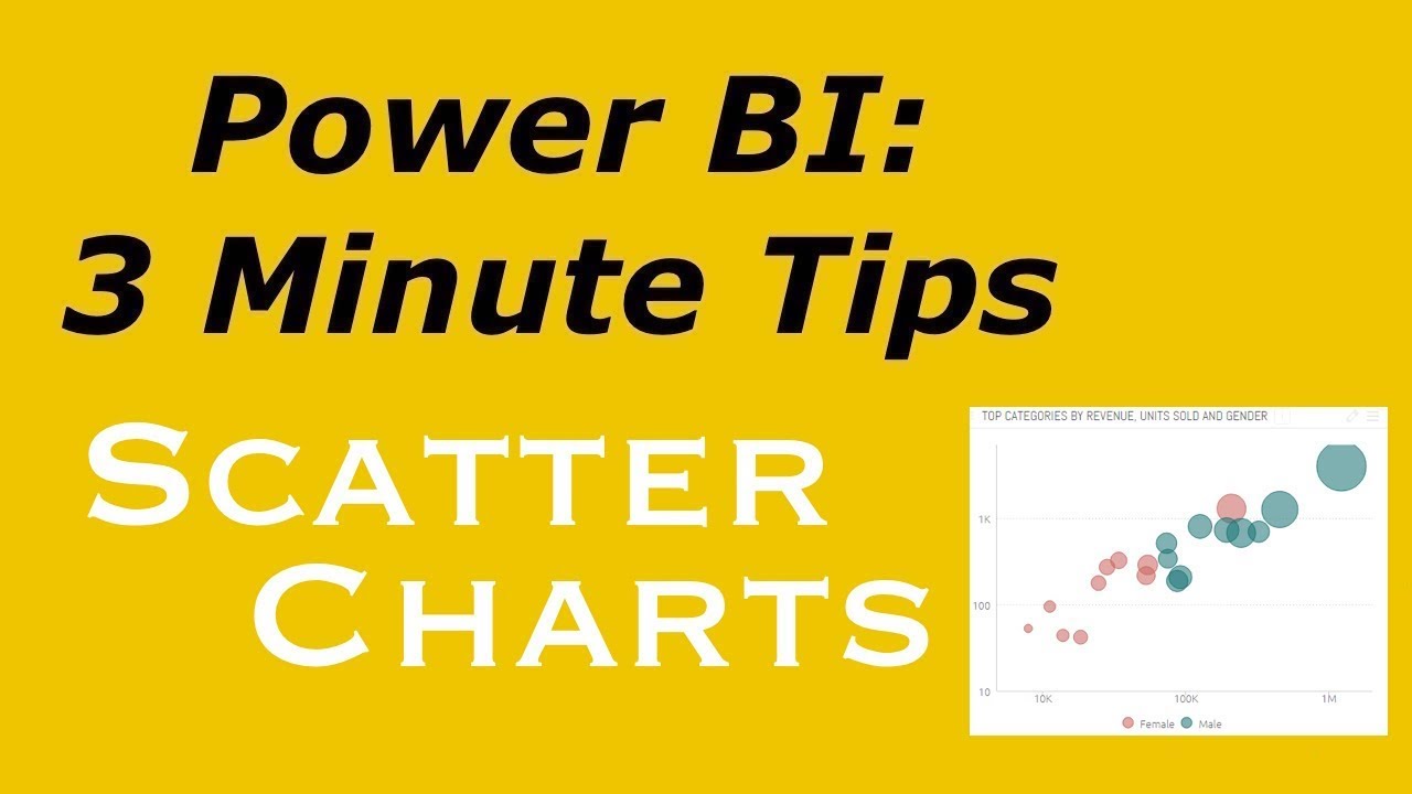
Scatter charts cause all sorts of problems in Power BI. In this video, I will show you how to create scatter charts so easily that you never have to worry about them again.
To enroll in my introductory or advanced Power BI courses:
To enroll in my introductory or advanced Power BI courses:
 0:12:32
Power BI Tutorial for Beginners
 0:23:03
Power BI Tutorial For Beginners | Create Your First Dashboard Now (Practice Files included)
 3:02:18
Hands-On Power BI Tutorial 📊 Beginner to Pro [Full Course] 2023 Edition⚡
 0:11:15
Your first 10 minutes of Power BI - A no-nonsense getting started tutorial for beginners
 0:13:41
10 Steps to Optimize Your Data Model in Power BI
 0:54:12
How to Get Started with Power BI
 0:41:07
How to Build Power BI Reports from Start to Finish
 0:27:53
How to use Microsoft Power BI - Tutorial for Beginners
 0:07:33
Power BI: Workaround Cluster Column Chart | Enhance Bar chart to Next Level
 0:01:34
What is Power BI?
 0:20:22
5 DESIGN TRICKS that Make EVERY Power BI Report Look GREAT!
 0:16:21
Power BI Tips and Tricks
 0:14:27
Les BASES De Power BI Pour Débutant
 0:09:07
Should You Learn Power Bi? Everything You Need To Know
 0:25:57
Power BI Tutorial für Anfänger in 25 Minuten! (Deutsch / German)
 0:00:59
Power BI Report in less than 1 MINUTE! #powerbi #short
 0:42:50
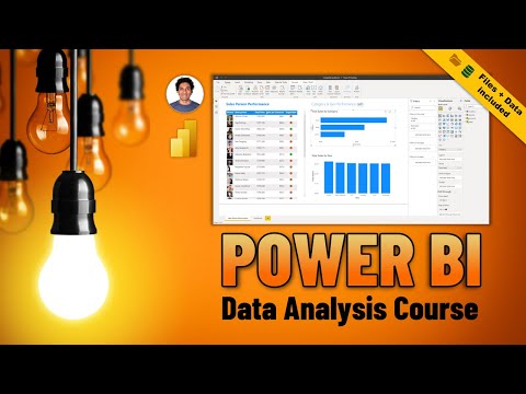
Beginner to PRO Data Analysis with Power BI - Full Length Course (with sample files!)
 0:42:37
Full Power BI Guided Project | Microsoft Power BI for Beginners
 8:20:12
Power BI Full Course Tutorial (8+ Hours)
 0:25:39
3 Hacks to Work Faster in Power BI
 0:11:02
Dynamically Enable and Disable Slicers in Power BI
 0:05:18
Getting Started with the Power BI Desktop
 0:15:31
HOT TAKE on the New Power BI List Slicer
 1:12:45
Complete Project with Power BI, Power Apps, Power Automate and Dataverse
Комментарии