filmov
tv
Excel 2013 Statistical Analysis #20: Standard Deviation: How Fairly Does Mean Represent Data Points?

Показать описание
Topics in this video are about Variation, Dispersion, Spread in the Data and Standard Deviation:
1. (00:09) Three data sets and charts of each to illustrate the concept of Variability, or Dispersion, or Spread in the Data.
2. (00:20) Set 1 (Hours Worked per Week Data), we ask the question: How fairly does the mean represent its data points?
3. (02:37) Set 2 (Seattle and Burien Gas Prices), we ask the question: How volatile are Prices?
4. (03:17) Set 3 (Supplier Days To Fill Order Data), we ask the question: How reliable is a Supplier?
5. (04:37) Calculate Range: Max - Min
6. (05:50) Calculate Interquartile range: Quartile 3 – Quartile 1 = Middle 50% of the values
7. (07:17) Variance and Standard Deviation Math Formulas for populations and samples.
8. (08:13) Calculate Sample Standard Deviation Long Hand and with STDEV.S for Data Set 3 (Supplier Days To Fill Order Data), were we ask the question: How reliable is a Supplier?
9. (16:45) Alternative Formula for Sample Standard Deviation
10. (17:05) Mean Absolute Error Formula
11. (17:20) Calculate Sample Standard Deviation with STDEV.S for Data Set 1, (Hours Worked per Week Data) were we ask the question: How fairly does the mean represent its data points?
12. (18:06) Calculate Sample Standard Deviation with STDEV.S for Set 2 (Seattle and Burien Gas Prices), were we ask the question: How volatile are Prices?
13. (19:25) Coefficient of Variation
14. (23:25) Using Descriptive Statistics feature to quickly calculate Numerical Measures like Mean, Median, Mode, Standard Deviation and more
15. (24:52) X-Y Scatter Chart to Visually Portray Variation or Dispersion or Spread in the Data.
16. (25:09) Summary of topics in video
 0:29:59
Excel 2013 Statistical Analysis #20: Standard Deviation: How Fairly Does Mean Represent Data Points?
 0:41:36
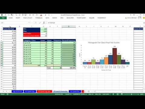
Excel 2013 Statistical Analysis #8: Frequency Distributions, Histograms, Skew, Quantitative Variable
 0:32:08
Excel 2013 Statistical Analysis #31: Create Discrete Probability Distribution, Calculate Mean and SD
 2:22:43
Excel 2013 Statistical Analysis #01: Using Excel Efficiently For Statistical Analysis (100 Examples)
 0:09:01
Excel 2013 Statistical Analysis #37: Introduction to Continuous Probability Distributions
 0:09:41
Excel 2013 Statistical Analysis #32: Expected Value Standard & Deviation Discrete Prob. Distribu...
 0:07:02
Excel 2013 Statistical Analysis #15: Create Dot Plot in Excel Using COUNTIFS and REPT functions
 0:17:29
Excel 2013 Statistical Analysis #67: Hypothesis Testing for Population Differences Sigma NOT Known
 0:15:13
Excel 2013 Statistical Analysis #40: Normal (Bell) Probability Distribution Area Chart, X & Z Va...
 0:37:51
Excel 2013 Statistical Analysis #33: Binomial Probability Distributions: Tables, Charts, Functions
 0:33:18
Excel 2013 Statistical Analysis #28: Multiplication Law of Probability AND Events (16 Examples)
 0:07:01
Excel 2013 Statistical Analysis #52: Determine Sample Size for Sample Mean & Sample Proportion
 0:11:14
Excel 2013 Statistical Analysis #51: Confidence Intervals for Pbar Sample Proportion
 0:15:05
Excel 2013 Statistical Analysis #38: Uniform Probability Distribution
 0:23:45
Excel 2013 Statistical Analysis #34: POSSION Distribution and POISSON.DIST Function
 0:07:22
Excel 2013 Statistical Analysis #13: Scatter Chart & Trendline, X Y Data, 2 Quantitative Variabl...
 0:10:10
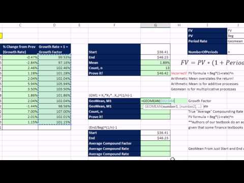
Excel 2013 Statistical Analysis #18: Geometric Mean, Average Compounding Rate GEOMEAN & RRI
 0:20:17
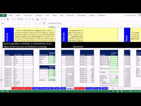
Excel 2013 Statistical Analysis #5 Data Categorical, Quantitative, Nominal, Ordinal, Interval, Ratio
 0:16:40
Excel 2013 Statistical Analysis #30: Bayes’ Theorem to Calculate Posterior Probabilities
 0:30:11
Excel 2013 Statistical Analysis #72: Chi-Square Test For 2 or More Population Proportions (Formulas)
 0:00:29
Conditional Formatting in Excel | Highlight Marks Pass/Fail #shorts #excel
 0:05:01
Excel 2013 Statistical Analysis #21: SKEW Function and Asymmetry in a Distribution of Data Points
 0:08:39
Excel 2013 Statistical Analysis #41: Answering Probability Questions With NORM.DIST Function
 0:20:55
Excel 2013 Statistical Analysis #19: Location: Percentile, Quartile, Rank and Percentile Rank
Комментарии