filmov
tv
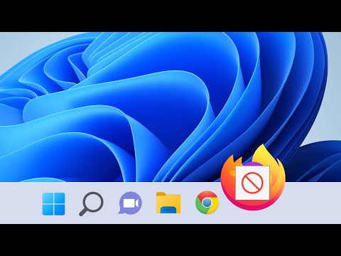
Why People Hated Windows 8

Показать описание
Thank you World of Warships for sponsoring this video.
During registration use the code FIRE to get for free:
-200 Doubloons
-1M Credits
-Tier 5 - USS Texas
-20x Restless Fire Camouflage
-7 Days Premium Account
The promo code is only for new players during the registration.
With its release in 2012, Microsoft's latest operating system, Windows 8, ended up becoming one of the most hated and controversial products that they had ever made, but why?
It wasn’t just a matter of some public opinion; the failure of Windows 8 was actually much worse than it looked. Strictly talking numbers, Windows 8 actually did worse than Windows Vista, despite even having the advantage of being released during the holiday season.
Now with several more versions of windows succeeding it, it’s almost as if Windows 8 has become one of those products that Microsoft just doesn’t want you to remember. I mean, its support was cut very short compared to other Windows versions. Windows 8 never happened. But now that this once ambitiously marketed OS has since been kept in the past, it is much easier to look back and see where things went wrong, and doing that involves answering this question: Was Windows 8 really that bad, or was it just another victim of its time? Were these radical changes to the Windows experience justified in any way?
What’s particularly interesting about the story behind Windows 8’s failure is that it oddly reflects the factors which killed Windows Vista. These include the big design changes that Microsoft implemented, the popularity of Windows 7, objectives being focused on the wrong industries and demographics, forced implementation of apps, and lastly, simply the long-term damage of the bad press.
Giving Windows a “new look” was clearly not the right call. It’s easy to say that Microsoft totally screwed up because they just had no idea what they were doing, but an opinion like fails to take into account the technology of the time. In 2012, the direction that computers were going into was uncertain. The future wasn’t bleak. Computers were only going to become more popular and more powerful, but no one was quite sure what they were going to be like. The tablet industry was just starting to grow. Tablets had been around for a while, but with the iPad’s release just two years prior in 2010, it had undergone a complete transformation. All tablets were going to be just like the iPad from then on, and it was now a continuously and rapidly growing market. There was even speculation that tablets would make the computer as we knew it obsolete. The tablet would become the new PC, and everyone was now in on it…except Microsoft. They did have the advantage in the traditional keyboard-and-mouse PC market, but that was about it. With this new growing industry, they were falling a bit behind, and it was time to change that. It seemed that the only way to do that would be to make their most popular product more inclusive to these other platforms. Compromises had to be made. It was time to change Windows into a tablet-friendly OS, even if it’s at the expense of their already iconic setup, and that’s what they did with Windows 8. It wasn’t just the next update for your computer. It was something that would also be bundled with Windows Phone and the brand-new Surface RT, essentially to show off the new Windows’s versatility.
But as you would have probably guessed, touchscreen and non-touchscreen-based computers are very different. If you’re going to appeal to tablets, things have to be bigger and less cluttered. This led to one of the most controversial and hated decisions that Microsoft made to Windows 8: removing the Start Menu. People anticipating a more updated version of Windows wanted something that was more or less, a better version of Windows 7. Instead, they got something so foreign, it was like learning a new language. It was unfamiliar, confusing, and its setup was counterintuitive. Multitasking was now very difficult, something that Windows had been praised for mastering almost 20 years prior. There were third party workarounds for this, programs you could download such as Classic Shell for example that would solve this problem, but that was just extra work, and a lot of everyday people were not aware of these alternatives. People didn’t like Windows 8 because it was confusing, and it didn’t need to be.
Google +: just kidding.
Beauty Flow by Kevin MacLeod
A special thanks to these patrons:
- Swingadee
- Winolotonolo
- Tommy Sharp
- Sl0rg
- Nathan Inkenbrandt
ENJOY THE PROGRAM.
Комментарии
 0:20:02
 0:00:27
 0:22:00
 0:12:43
 0:16:35
 0:10:05
 0:09:50
 0:06:37
 10:33:46
 0:08:37
 0:02:22
 0:00:51
 0:14:43
 0:08:03
 0:05:20
 0:00:36
 0:04:50
 0:00:56
 0:01:35
 0:09:10
 0:00:27
 0:00:30
 0:10:19
 0:00:16