filmov
tv
Light & Shadow Colors | Experiment

Показать описание
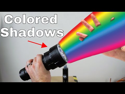
After years of reading about light and shadow, I decided to do my own experiment and share my results with you.
Ever since I began painting back in 2010, I've always heard 'warm light, cool shadows', but I never knew the truth. Whenever I would look at a regular white light inside, the shadows just seemed dark. Even a warmer bulb just seemed to produce a dark shadow and not a colored one. Although, outside I could see more color in shadows. The results I came across in this video with these experiments were quite interesting.
When daylight was present, the 'warm light, cool shadows' theory was true. But without daylight, all shadows were just black. Observation is your best friend when it comes to painting. Don't follow a rule all of the time. See them as guidelines only. Have fun.
With this Channel, I explore a variety of concepts regarding learning to draw or how to draw almost any subject, learning to paint landscapes & still lifes in acrylic paint or oil paint, and many other topics involving art, painting, technical aspects, and life.
#LightAndShadow #PaintingExperiments #PaintingLesson
 0:25:18
Understanding Shadow Colors (Ambient Light Part 2)
 0:03:03
understanding shadow colors
 0:11:19
How to Paint Light and Shadow
 0:14:39
This Is Amazing - Shadow Colours Aren't What You Think
 0:10:22
Light and Shadow - 10 Minutes To Better Painting - Episode 6
 0:05:15
What Color Is a Shadow? The Colored Shadow Experiment
 0:03:43
Light & Shadow Colors | Experiment
 0:08:42
Light & Shadow | Art Basics
 0:26:55
Flux E-Commerce Product Photography: Backgrounds, Lighting, Detail Sync, Color, Video Generation
 0:10:18
Quick Tip 151 - Shadow Colors
 0:23:10
Quick Tip 283 - Cast Shadow Colors
 0:03:49
How To Determine Shadow Colors
 0:19:02
LIGHTING THEORY in 20 minutes // the fundamentals of lighting and shadow
 0:10:44
Shadow Colors | Ask David Bergman
 0:10:21
The Effect of Light & Shadow On Your Landscape Painting
 0:12:02
Make painting easy by starting with LIGHT and SHADOW
 0:18:28
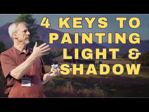
4 Keys to Suggesting Light & Shadow in Your Landscape Painting -Tutorial
 0:04:31
Blending Light and Shadow Colors The Right Way
 0:12:03
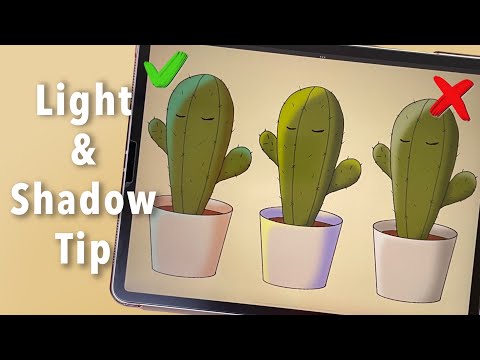
Digital Art for Beginners: Light and Shadow Color Tip for Drawing
 0:21:29
How to Paint Intense Shadow Colors in Watercolor
 0:16:58
Finding light and shadow with value studies in watercolor
 0:16:45
Unlocking Light and Shadow: Fixing Flat Paintings with Correct Values
 0:17:36
How to paint LIGHT & SHADOW in watercolours
 0:09:53
How to Shade Like Japanese Artists - The 1/2/3 Shadow system【TUTORIAL】
Комментарии