NEVER TOO SMALL: Ceramicist’s Vintage Furniture Apartment, Warsaw 33sqm/355sqft

preview_player
Показать описание

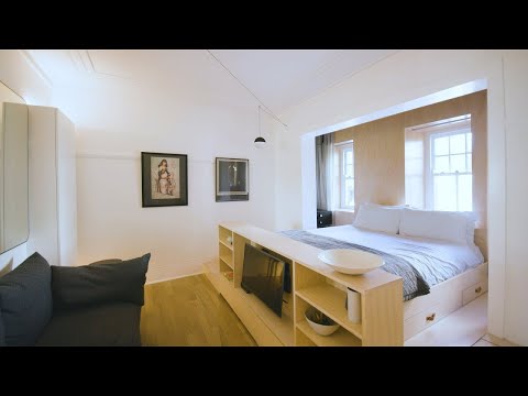
Home to a hobby ceramist with a growing vintage furniture collection, the vibrant Koka Studio was designed by architects Kalina and Robert Juchnevic of blok585m2, for Kalina’s sister, Katarzyna. Key elements of post war apartment renovation included opening up the dark and segmented floor plan and introducing era-appropriate materials such as terrazzo tiling and herringbone parquet flooring. The hero of the new open plan living space is the full size kitchen characterised by a combination of oak veneer and pink cabinets, Katarzyna’s favourite colour. A round dining table sourced at a local flea market features three original Bruno Rey chairs upcycled by Katarzyna herself and painted a bright green that mimics the green flecks of the terrazzo tiles. A striking openwork wire structure inspired by Alexander Calder’s mobiles separates the entrance from the living room whilst still allowing light from the double balcony doors to pass through.

#smallapartment #architecture #interiordesign

Ep 143
Project Name: Koka Studio

Produced by New Mac Video Agency
Creator: Colin Chee
Director: Nam Tran
Cinematographer: Mariusz Gajdzik
Producer: Lindsay Barnard
Editor: Jessica Ruasol
Рекомендации по теме
Комментарии
Автор

I can't believe it's just 33 sqm, they made a miracle here! I love it

cpav
Автор

How lucky to have a sister who is an architect/designer. Client has what she wants and needs and it turned out so well!

conniebruckner
Автор

This is such a great design, everything was so carefully chosen, and that room divider! Wow. Looks so much more large than 33sq meters!

quirkynation
Автор

Uncluttered & airy, but cosy & comfortable. Wonderful.

SN-szkw
Автор

One of the best designs for 30 - 35 sq. metres I've seen. The feeling of spaciousness is remarkable.

ulusguy
Автор

Finally my city! The housing estates in most of Warsaw neighbourhoods really look like the before-renovation condition of the flat and it's very awesome to see the transformation of this flat whilst the vintage element is still there to keep the history of it alive with a dash of fun and colour here and there. The architect did such an amazing job with the redesigning, making the flat so cosy and warm by the usage of the sunlight (since we don't have a lot of sun in Warsaw once summer is gone); needless to say, I'm so SO happy to see my city here on NTS, it makes me wonder how many more flats in Warsaw could be featured here to get the inspiration going!

isabellaellaellaeheheh
Автор

The Calder inspired room divider, wow it stole my heart. What a great way to incorporate all the client's preferences elements in an open, minimalist space. Pd: Stunning color palette.

karlamejiajimenez
Автор

Very wise and optimal distribution to those 33sqm! 👌It looks much bigger with the positioning of the main elements, furniture and rooms divisioning. One of the best designs so far that not only includes an independent resting space for the owner but also a different one for socializing! Congrats to the team for such smart second life apartment design! 👏

AlNusuk
Автор

This is beautiful! I like so many elements : the Calder inspired wall divider, the togo armchair and the pink cabinets that go together so well with the colors of the lamp and the armchair. Good job, very feminine also❤

bastelkiste
Автор

this one's sick. video production is great as usual. small note to the production team--really tiny thing here but i would find it helpful if the blueprint cutaways included some kind of "glow" on the part being discussed, as sometimes the architect narrates about changes and i don't know where to look, and the lines change or disappear so subtly that by the time the blueprint segment ends i'm not sure what happened. just a small thing, as i said. but i love these videos and they look great

yeenar
Автор

Excellent floor design that made 33sqm look huge! Everything looks like it belongs and the apartment is cosy yet bright and airy. Bravo 👏

kpkxgtj
Автор

Absolutely beautiful! Thumbs up for Kalina and her presenting skills - well done girl :)

mariot.
Автор

Nicely done. Love the sculptural divider and the materials. Good to see something more feminine and soft than the norm.

catemoon
Автор

Jak miło zobaczyć wnętrza z Polski. Bardzo ładne, jasne mieszkanie. Gratulacje :)

adapass
Автор

And another one from Poland! Yes, our cities are full of small apartments ;-) This particular apartment is amazing! Full of beautiful colors and their combinations with the perfect amount of plants and storage space. Great idea with opening the bedroom. I congratulate the project and admire it!

zielonakota
Автор

This is really beautiful. Absolutely gorgeous apartment with so many thoughtful design features ❤

fandacooking
Автор

Aw man I wanted to see the balcony as well!
Great apartment tho! Love that color coordinated crockery!

literal_metaphor
Автор

Beautifully thought out, this apartment is airy, comfortable and unpretentious. The designer is very skilled!

lucylou
Автор

I love how there's always a variety of interior decor styles with each new episode, from totally minimalistic to colorful and maximalist to the in-betweens, it's really brain-stimulating

desertbloomke
Автор

I love those green chairs!

Add a pocket door to the extra opening to the bedroom. A bedroom that closes off completely is a must IMO.

christinabrown