NEVER TOO SMALL Buenos Aires Architect’s micro apartment - 32sqm/344sqft

preview_player
Показать описание
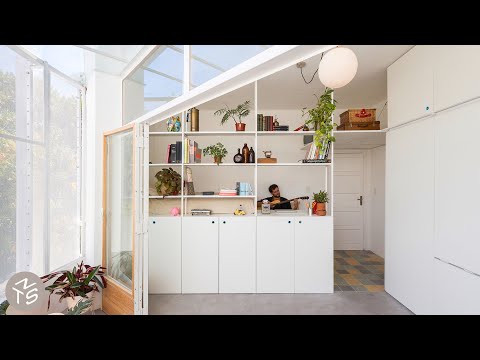
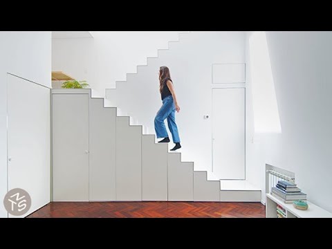
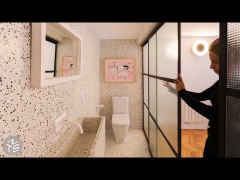
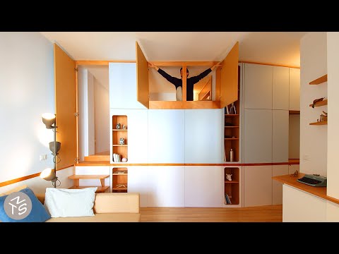
Originally the site of a single story derelict house on roughly 200sqm of land, Quintana 4598 now contains 12 small apartments ranging from 32sqm to 44sqm, with a focus on affordability and fostering of community. Each apartment is designed with flexibility and comfort in mind. The kitchen, bathroom, storage and sleeping area are condensed into a cleverly designed multifunctional joinery unit on one side, freeing up a larger area for the resident to personalise and furnish as they desire. Each also features a large balcony with a full size sliding door, allowing access to the outdoors, whilst a window above the door brings in even more natural light. The rooftop of the building, with it’s green space, swimming pool and common area, is designed to promote interaction between the residents and build community. In a city like Buenos Aires where the cost per square metre is really high, Quintana 4598 allows access to affordable housing in a central area, and the decision to build small apartments creates more generous community areas to make life better for its residents.

#smallapartment #architecture #interiordesign

Project Name: Quintana 4598

Produced by New Mac Video Agency
Creator: Colin Chee
Director/Camera Operator: Fernando Schapochnik
Producer: Lindsay Barnard
Editor: Jessica Ruasol
Thumbnail photography: Federico Cairoli
Music: Draw Close by We Dream of Eden
Рекомендации по теме
Комментарии
Автор

As a long time follower of this channel, I've come to understand the importance of a strong separation between living and sleeping space, especially in small spaces. This design sort of goes apart from that notion by blending the bed with the living room and tucking the kitchen away into the darkest corner. This is probably best suited to those who don't cook much, and love waking up to the sun.

hoica
Автор

I would not add any doors to a dark kitchen. But its still a charming apartment!

tricialow
Автор

Would switch the kitchen and bedroom nook location. Personally I'd rather have natural light and be fully connected to anyone else in the apartment if I was using the kitchen opposed to be tucked away. Feels like being near the balcony there would be more ease of naturally venting smells from cooking.

The bedroom relocated to the kitchen wouldn't be on show if you had guests and be darker in the mornings so you don't get the sun abruptly waking you up.

CDN_Store
Автор

Having spent time in Buenos Aires in the summer, I feel that the bed is positioned by the window to increase ventilation through the night. Summers there can be brutally hot and humid.

GrumpyPhotographer
Автор

I would prefer the kitchen open and positioned nearest to the balcony for ventilation so that the odors won't stick to the linen and clothes, also for good illumination. The toilet stays the same but with exhaust fan and a louver door for ventilation. Bed is on the darkest part (conducive for sleeping) but with a curtain instead of a folding door for easy ingress and allows more inflow of air since it's farthest from the balcony/air source.

josephtiomico
Автор

A balcony makes such a huge difference to the apartment, makes it feel so much bigger when the doors are open. Nice to see apartments that are actually lived in!

AM
Автор

I disagree with people complaining about the bed placing, where it is you can lay there during the day looking outside and also you can have one tv for both the living room and bedroom and if you have visits, you have additional place for them to sit appart from the couch. I do agree that the kitchen could use stronger lights and a pop of colour

micazn
Автор

It would be cool to hide the bed nook for when guests are over by making a pull-down canvas screen and setting up a projector

kalki
Автор

I don't like (giant) open kitchen in the living room area (especially in small appartments) and I'm quite annoyed how popular and standard this has become. I even built an extra wall in my 30sqm flat to have it seperated. So I really like how the kitchen is tucked away here. If it's too dark, switch on the light. The bed makes a great cosy lounge area. Overall a good result for a rectangular one-room appartment.

unefemmelibreaberlin
Автор

Its utilitarian but in a good way. I just wish he did something about the mould in the tiles. Its giving me the shivers.

joselito
Автор

I really like this apartment. It's intended mostly for singles, or couples, and for people that are spending more time either in the living room, balcony, or in the common area. I really like the amenities of it. Yes, the kitchen and bathroom are on the darker sides and aren't as modern as some like, but that can be fixed if it is you living there. I appreciate all that was done. A well thought out design, especially if it was done throughout the building!

Jadeleath
Автор

The Cats of NTS will be the next coffee table book. They’re like little Easter eggs for some episodes lol

Sssssssssssssandy
Автор

In almost every shooting there is the orange cat in different positions! Love it :)

Alessandro-nqtm
Автор

Guys, this is one way to manage a small area. It s not about: I would do this or that. Please respect and apprieciate the concept as a whole. He is not selling the house to you!

somerset
Автор

It's a nice size and I like the concrete + general idea but division and execution... idk, kind of unpleasant/careless? Looking at the tiles and bottom edge of the mirror *it seems like moisture and mold are an issue both in kitchen and bathroom – adding effective ventilation is crucial with only one window even if the sliding door panels had ventilaton holes.

YT-GuestAccount
Автор

I really like this. It's so rare to see a small space with a seperate kitchen - and it has a full sized cooker / worktop space. I disagree with everyone saying the bed and the kitchen should be swapped. The bed is a nice cosy little nook - I can see myself curling up and reading. Also, for everyone saying the kitchen would be better open - why do you want everything to smell like cooking? It's impossible in open plan spaces to stop cooking smells getting into your clothes and soft furnishings. Life is too short to cook without onions or garlic!

MusicalSari
Автор

Wow! What's a surprise find Lucho in this video! He was my teacher at university, i've nice memory from him. That apartment is amazing!

carlitecta
Автор

This appartment reminds me of my old university. Not sure if it's in a good or a bad way though. There are many aspects of this that I like, but as others have already mentioned: switching the sleeping and cooking area would help a lot. A pop of color would make this more lively as well.

Naitorokkusu
Автор

Day starts fantastic with coffee and your video. Love the apartment!

Kotchilla
Автор

It has their benefits and weak points too but its always good to see diferent solutions, I would like they show the parking area. Great video thanks

condevon