filmov
tv
8 advanced rules of minimal Web Design

Показать описание
Do your designs look unrefined, raw, like they were lacking a level of sophistication that you cannot figure out how to get to? In this tutorial I’ll explain 8 rules along with a 3 step process that you can apply starting today. If you listen carefully and follow through, I can guarantee you will see INSTANT results, and you will be able to design more sophisticated and minimal websites. The main goal of minimalist Web Design is to reduce and simplify your websites to the bare minimum. In this digital era, it’s easy to add. Add typefaces, add colors, add hierarchies, add graphic elements. The tricky thing is that everything is at our disposal, so to really create minimal websites, you need to have a lot of discipline and self constraint to reduce the excess, and learn to do more, with less. The great thing about minimalism is that the more you practice it, the less time it takes you to achieve high quality results because you have less variables to chose every time you are designing a new page or module. Hope this video helps you create more minimal websites. Happy learning!
______
______
FREE GOLDEN CANON GRID COURSE
Download the Golden Canon grid and join thousands of students in learning 5 secrets to design beautiful websites with the Golden Canon Grid with this free course:
READY TO JOIN THE BONT CLUB?
If you are ready to peak your Web Design skills & learn how to monetize them so you can have more freedom to do the things that you love, then click the link below to apply to my signature mentorship program, the BONT Club. If you’re a fit, I will schedule a call with you so we can chat and decide if my program is the right fit for you:
SUBSCRIBE TO MY NEWSLETTER
Join my newsletter to stay up to get tips and tricks on your email, stay up to date with my latest videos, and be the first to know about new free resources I put out.
DM me on social media:
Check out my works:
—
TIME STAMPS
0:00 Intro
0:53 Rule N°1: Reduce visible elements
2:48 Rule N°2: Master a few typefaces
4:53 Rule N°3: Reduce typefaces
6:33 Rule N°4: Reduce type hierarchies
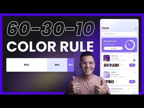
10:33 Rule N°5: Reduce colors
13:04 Rule N°6: Reduce graphic elements
14:23 Rule N°7: Reduce illustration styles
15:36 Rule N°8: Reduce image treatments
17:50 Step 1: Explore the variables on the homepage
18:44 Step 2: Zoom out & audit the rules
18:59 Step 3: Simplify the variables & set clear rules
#BONT #WebDesign #MinimalWebDesign
______
______
FREE GOLDEN CANON GRID COURSE
Download the Golden Canon grid and join thousands of students in learning 5 secrets to design beautiful websites with the Golden Canon Grid with this free course:
READY TO JOIN THE BONT CLUB?
If you are ready to peak your Web Design skills & learn how to monetize them so you can have more freedom to do the things that you love, then click the link below to apply to my signature mentorship program, the BONT Club. If you’re a fit, I will schedule a call with you so we can chat and decide if my program is the right fit for you:
SUBSCRIBE TO MY NEWSLETTER
Join my newsletter to stay up to get tips and tricks on your email, stay up to date with my latest videos, and be the first to know about new free resources I put out.
DM me on social media:
Check out my works:
—
TIME STAMPS
0:00 Intro
0:53 Rule N°1: Reduce visible elements
2:48 Rule N°2: Master a few typefaces
4:53 Rule N°3: Reduce typefaces
6:33 Rule N°4: Reduce type hierarchies
10:33 Rule N°5: Reduce colors
13:04 Rule N°6: Reduce graphic elements
14:23 Rule N°7: Reduce illustration styles
15:36 Rule N°8: Reduce image treatments
17:50 Step 1: Explore the variables on the homepage
18:44 Step 2: Zoom out & audit the rules
18:59 Step 3: Simplify the variables & set clear rules
#BONT #WebDesign #MinimalWebDesign
Комментарии
 0:21:38
 0:06:18
 0:04:49
 0:04:11
 0:56:55
 0:09:39
 0:00:27
 0:06:56
 0:16:42
 0:13:25
 0:00:38
 0:02:34
 0:21:04
 0:11:06
 0:06:02
 0:01:21
 0:04:27
 0:10:35
 0:03:05
 0:04:22
 0:04:36
 0:05:56
 0:01:26
 0:15:10