filmov
tv
Create A Column Chart That Shows Percentage Change In Excel - Part 1

Показать описание
Learn how to create a column chart that displays the percentage change between each column. This is an Excel chart that uses error bars and some formulas to show the variance between each time period (month, quarter, year, etc.)
Download the Excel file:
-- LINKS --
*** JOIN OUR COMPREHENSIVE EXCEL TRAINING PROGRAM***
~I've also published another video with a 2nd iteration that includes color bars & data labels (conditional formatting), slicers, and is more dynamic. Here is a link to that video:
One request we almost always get with our column or bar charts is to see the variance or percentage change between each column. This is especially true when the chart displays a trend over months, quarters, years, etc.
The solution uses a regular clustered column chart in Excel. The second series is made invisible with No Fill on the column, and then uses error bars to display the variance between amount columns.
**Excel 2010 & Earlier**
If you are using Excel 2010 or earlier you will not have the Value from Cells option for the data labels. However, you can use the free XY Labeler add-in from AppsPro to create the labels. This will save you a lot of time. Here is the link to download the add-in.
Related articles & videos:
00:00 Introduction
01:08 Source Data
02:05 Error Bars
04:38 Subscribe
04:50 Add Data Labels
06:44 Formatting Tips
09:31 Outro
 0:05:51
How to insert a Column chart in Excel Tutorial
 0:09:52
Create A Column Chart That Shows Percentage Change In Excel - Part 1
 0:02:12
How to create a Column Chart in Excel
 0:06:43
MS Excel - Column Chart
 0:00:44
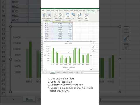
📊 How to create and design a Clustered Column Chart in Excel using Quick Styles
 0:03:11
How To Combine A Line And Column Chart In Excel
 0:05:14
Making a Simple Bar Graph in Excel
 0:00:43
Excel create bar chart with trend lines | 30 seconds
 1:48:17
DAY 9 || FREE DATA ANALYSIS TRAINING USING EXCEL, SQL, POWER BI, TABLEAU 09-08-2024
 0:05:31
How To Create A Bar Chart In Excel (Super Easy!)
 0:01:04
How to create a graph that combines a bar chart with two or more lines in Tableau
 0:03:31
How to Make Bar Chart Race Video | Tutorial
 0:11:05
Excel Column Chart - Stacked and Clustered combination graph
 0:02:28
Making a Bar Chart
 0:03:20
How to Make a Bar Graph in Excel
 0:04:44
Creating a Column Chart or Bar Chart in Excel
 0:02:15
How to create a Clustered Stacked Column Chart in Excel
 0:01:31
How to create a column chart in Microsoft Access
 0:05:01
Create attractive column charts quickly to make them presentation ready
 0:01:34
How to create 3D Column Chart in MS Office Excel 2016
 0:00:59
How to Create a Clustered Column Chart in Excel 2013
 0:04:28
Creating a Column Chart in Google Sheets
 0:05:27
Excel Visualization | How To Combine Clustered and Stacked Bar Charts
 0:05:50
How to Add Percentage in Column Chart in Excel | % Difference | % of Total | Display % and Value
Комментарии