How to Add Total Values to Stacked Chart in Excel
preview_player
Показать описание

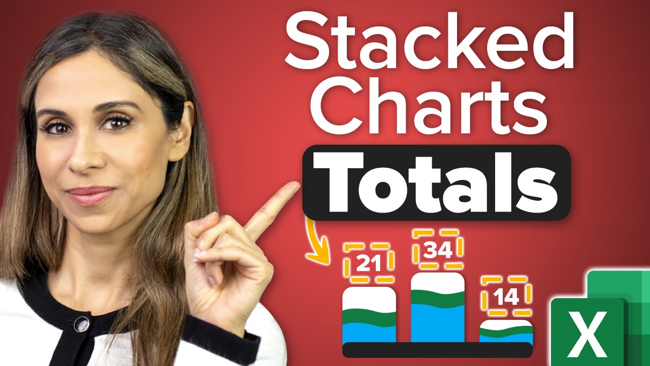
Learn how to enhance your stacked column charts in Excel by adding total data labels. This easy-to-follow tutorial is perfect for anyone looking to present comprehensive data in a visually appealing way. Ideal for users at all levels, including those not native in English, this video simplifies the process of displaying totals in charts.

🔑 Key Points:
- Creating a Stacked Column Chart: Start by selecting your data and inserting a stacked column chart directly from the Excel insert menu.
- Chart Customization: Adjust the chart to your preferences by modifying the title, legend position, and gap width for a more polished look.
- Adding Data Labels: Learn to add data labels to each stack in the chart for a clearer representation of values.
- Inserting Total Series: Discover the trick to include total values by adding a new series to your chart, transforming it into a useful visual tool.
- Switching Series Chart Type: Convert the total series from a stacked column to an XY scatter for precise marker placement.
- Formatting Data Labels and Series: Fine-tune data labels to display totals clearly above each column and hide the markers for a clean, professional appearance.

Stacked charts are great for when you want to compare different categories with one another and also show how much each category contributes to the whole.
The problem is that you can show the data labels for each of the stacks, but you cannot immediately show the total value of all the stacks on top of each bar. To do this, you need to follow the steps I show in the video.

🚩Let’s connect on social:

Note: This description contains affiliate links, which means at no additional cost to you, we will receive a small commission if you make a purchase using the links. This helps support the channel and allows us to continue to make videos like this. Thank you for your support!

#excel
Комментарии
Автор

To do this in a Pivot Tables, a work-around is to:

1. Make a calculated Field which is sums up the individual columns - This is your "Total" Column. Add that to the Pivot Table
2. Follow from 2:15, but instead of changing it to a Scatter, change it to a line chart
3. Add Data Labels as usual
4. Make Lines (and markers) transparent or white

Hope this helps!

siraatmedia
Автор

I have been struggling with this for work (we use excel only very occasionnally), thank you so much for the easy and straightforward tutorial! made my day !

Lessareve
Автор

omg finally someone was able to come up a workaround, not sure why a simple feature like this being made so hard

deetee
Автор

whenever I get lost or I look for something in Excel, I come to your page and I find it. Thank you for creating this amazing library Leila

Farisnb
Автор

Thanks madam very nice way you are teaching

jagmohansinghbhui
Автор

Thank you so much clear explanation. You saved my time .

SathishKumar-cldi
Автор

Leila, as always your clear and concise explanations have helped me get something done in less time! Love your tutorials. Thank you so much.

sharknado
Автор

You Rock!!! I love following your videos...thank you so much!

ShuttleV
Автор

Thank you for this! It's 2023, MS should just add this as a checkbox rather than us having to go through all these steps 😆

Kielyoutube
Автор

wow, you really know you excel charts. thank you

glastron
Автор

Excellent....exactly what I needed. Thanks

saurabh
Автор

Thanks Leila for a very useful lecture. Can you please tell me that how can we add Total values in a Pivot Table stacked Chart?
Best Regards
Shahid

sj
Автор

thanks for sharing this was of good use.

ivanfletcher
Автор

Thank you. This helped me finish a project for work.

jess
Автор

Just what I was looking for in a pinch. Well explained and easy to follow. Thanks!

John-urjn
Автор

Your presentations are excellent. Clear, to the point and very helpful. Thank you for sharing your knowledge.

juliomazzarella
Автор

This video is great, as always,
But
This technique doesn't seem to work with pivot tables.,
Thoughts?

contextmatters
Автор

Thank you, Leila. It's clearly understanding.

rienthongw
Автор

Nice tutorial Leila esp with bringing in the TOTALS on a XY Scatter. Thanks.

jamesperry
Автор

Thanks a lot Leila... It's really useful & helpful video.

mohamedmami