filmov
tv
Excel - Adding and Graphing Sine Waves with Any Amplitude or Phase
Показать описание
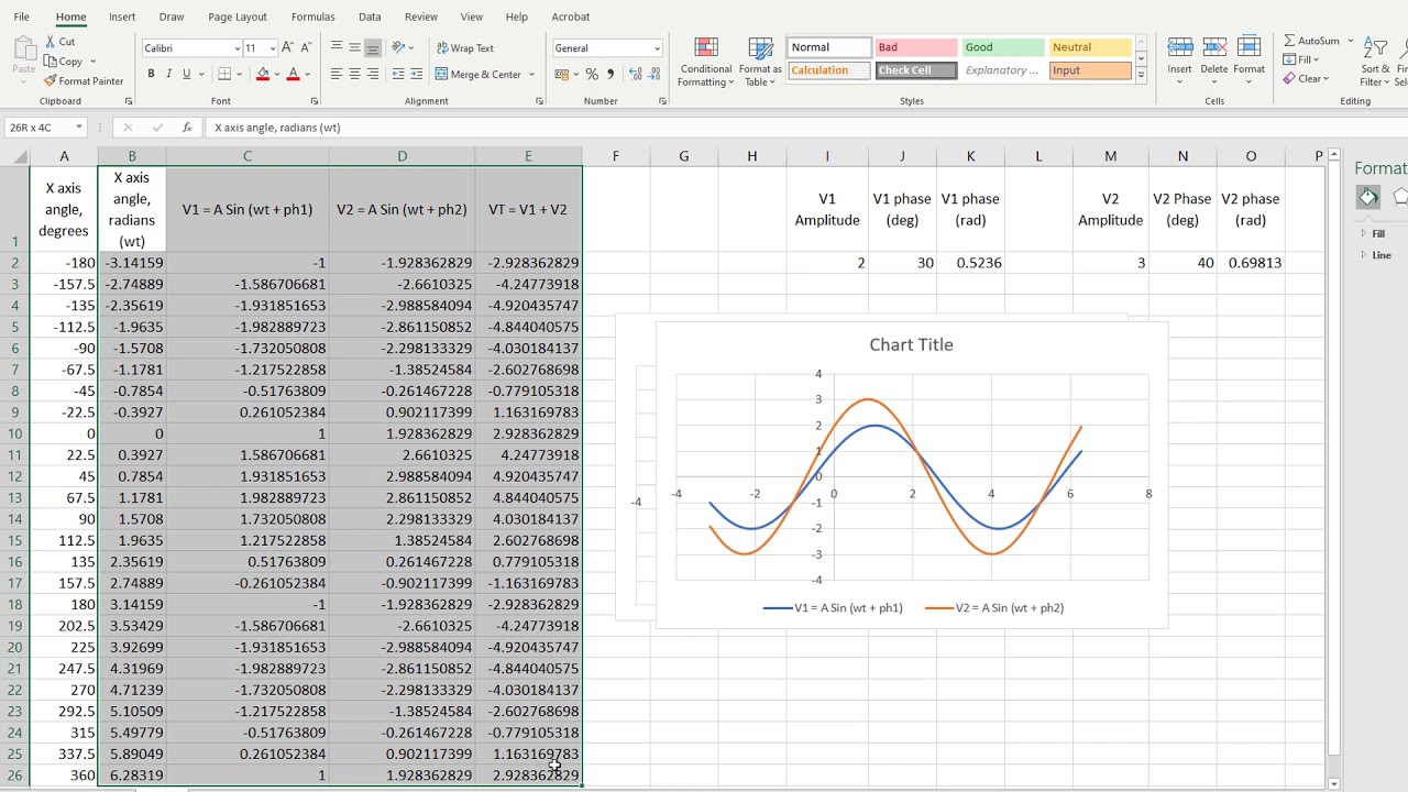
At Level 3 or HNC Electrical and Electronic Engineering you'll be asked to add sine waves together and graph them. You'll possibly also do this in AS or A-Level Maths.
Excel makes the process so much faster than using a calculator to find the sine of angles with or without phase shifts.
This video shows you how to create a dynamic graph of sine waves that changes as you change amplitude and phase data. It's saved me loads of time in the past.
For what it's worth, you can also type 'cos' or 'tan' instead of 'sin' to find the Cosine or Tangent functions.
I do it my way, but you could also type...
=sin(radians(x angle in degrees)+radians(phase shift in degrees)) [Enter]
Don't forget the = sign for Excel formulas and don't forget the two $ signs to force an equation to look at just one cell's data for all rows of the formula.
Happy graphing!
 0:02:36
How To Make A Line Graph In Excel-EASY Tutorial
 0:09:19
Excel Quick and Simple Charts Tutorial
 0:01:34
How to Create a Graph in Excel
 0:05:51
How to insert a Column chart in Excel Tutorial
 0:01:57
Plot Multiple Lines in Excel
 0:03:20
How to Make a Bar Graph in Excel
 0:05:25
How to Make a Line Graph in Excel
 0:14:10
Excel Charts & Graphs: Learn the Basics for a Quick Start
 11:54:59
R course full tutorials 6 hours
 0:03:16
How to Make a Pie Chart in Excel
 0:00:33
How to Add a Trendline to a Graph in Excel
 0:05:48
How to Add an Average Line in an Excel Graph
 0:08:56
MS Excel - Pie, Bar, Column & Line Chart
 0:04:34
How to Add a Target Line in an Excel Graph
 0:02:55
Excel Basics - Video Tutorial How To Graph Two Sets of Data On One Graph
 0:02:55
How To Add A Second Y Axis To Graphs In Excel
 0:21:14
How to Create Charts and Graphs in Microsoft Excel - Quick and Simple
 0:00:39
How to Set X and Y Axis in Excel
 0:07:09
How to make a scientific graph in Excel
 0:06:04
How to Plot or Graph a Formula/Equation in Microsoft Excel
 0:01:28
How To Add A Data Series To A Chart In Microsoft Excel
 0:01:06
How to Add Individual Error Bars in Excel
 0:00:47
Add a Legend to a Chart in Excel
 0:03:00
How to graph Multiple lines in 1 Excel plot | Excel in 3 Minutes
Комментарии