filmov
tv
How to Create a Graph in Excel

Показать описание
In this tutorial we will guide you to learn how to create a graph in Excel in few simple steps.
Microsoft Office is one of the most popular applications around the world. Microsoft Excel is a part of this package. Most of the people prefer to use Excel for official purposes due to three main reasons. These reasons are Storing, analyzing and displaying of data in a convenient form. You can present the stored information in the form of different graphs in Excel. There is also a chart wizard in Excel spread sheets which helps to create charts in a very easy way.
In this tutorial we will guide you to learn how to create a graph in Excel in few simple steps.
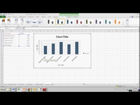
Step # 1 -- Create a Data Table
In the first step, open Microsoft Excel Sheet and create a data table. You can either enter the information by your assumptions or choose actual data records of any business. Now we will use the information available in this table and transform it in the form of a graph.
Step # 2 -- Open Chart Menu
Click on the "Insert" tab which is located at the top left corner of the window. Select the "All Chart Types" option from the chart's menu to open the list of graph and chart designs.
Step # 3 -- Select Chart Style
A chart window will open in front of your screen in which you can see various types of charts and graph available in different categories. Choose a "Line chart" style from the menu and click on the "OK" button to proceed.
Step # 4 -- Select Data
Now a blank chart will appear on the worksheet. Right click on the chart to open its menu and click on the "Select Data" option.
Step # 5 -- Fetch Data into the Chart
A new window will open which allows you to insert the information into the chart. Now click on the first cell of the table and drag a selection mark towards the last cell. Once it's selected, information in the table will automatically appear in the Data Source window. You can further switch rows and columns or edit the information according to your requirements.
Step # 6 -- Add or Remove Information
You can insert or delete additional information in your chart by clicking on the "Add" or "Remove" buttons. The "Hidden and Empty Cells" button allows you to hide the empty spaces or blank cells in your chart. Once you're done, click on the "OK" button to continue.
Step # 7 -- Choose a Design
After inserting the information in your chart, move over to the "Design" tab. This option allows you to apply predefined layouts or themes to your chart. Click on the desired colored theme and chart layouts from the menu to apply them.
Step # 8 -- Select a Layout
After applying the theme, click on the "Layout" tab which is located next to the "Design" tab. The "Layout" option allows you to adjust the Chart's Main Title, Axes Titles, Legends Placing, Data Labels and Table Options. Choose these options according to your preference and move over to the next step.
Step # 9 -- Appearance and Formatting
The "Format" tab allows you to change the format of your chart. The format option consists of the Fonts style, its size, spacing, alignment and other settings.
Microsoft Office is one of the most popular applications around the world. Microsoft Excel is a part of this package. Most of the people prefer to use Excel for official purposes due to three main reasons. These reasons are Storing, analyzing and displaying of data in a convenient form. You can present the stored information in the form of different graphs in Excel. There is also a chart wizard in Excel spread sheets which helps to create charts in a very easy way.
In this tutorial we will guide you to learn how to create a graph in Excel in few simple steps.
Step # 1 -- Create a Data Table
In the first step, open Microsoft Excel Sheet and create a data table. You can either enter the information by your assumptions or choose actual data records of any business. Now we will use the information available in this table and transform it in the form of a graph.
Step # 2 -- Open Chart Menu
Click on the "Insert" tab which is located at the top left corner of the window. Select the "All Chart Types" option from the chart's menu to open the list of graph and chart designs.
Step # 3 -- Select Chart Style
A chart window will open in front of your screen in which you can see various types of charts and graph available in different categories. Choose a "Line chart" style from the menu and click on the "OK" button to proceed.
Step # 4 -- Select Data
Now a blank chart will appear on the worksheet. Right click on the chart to open its menu and click on the "Select Data" option.
Step # 5 -- Fetch Data into the Chart
A new window will open which allows you to insert the information into the chart. Now click on the first cell of the table and drag a selection mark towards the last cell. Once it's selected, information in the table will automatically appear in the Data Source window. You can further switch rows and columns or edit the information according to your requirements.
Step # 6 -- Add or Remove Information
You can insert or delete additional information in your chart by clicking on the "Add" or "Remove" buttons. The "Hidden and Empty Cells" button allows you to hide the empty spaces or blank cells in your chart. Once you're done, click on the "OK" button to continue.
Step # 7 -- Choose a Design
After inserting the information in your chart, move over to the "Design" tab. This option allows you to apply predefined layouts or themes to your chart. Click on the desired colored theme and chart layouts from the menu to apply them.
Step # 8 -- Select a Layout
After applying the theme, click on the "Layout" tab which is located next to the "Design" tab. The "Layout" option allows you to adjust the Chart's Main Title, Axes Titles, Legends Placing, Data Labels and Table Options. Choose these options according to your preference and move over to the next step.
Step # 9 -- Appearance and Formatting
The "Format" tab allows you to change the format of your chart. The format option consists of the Fonts style, its size, spacing, alignment and other settings.
 0:01:34
How to Create a Graph in Excel
 0:02:36
How To Make A Line Graph In Excel-EASY Tutorial
 0:05:25
How to Make a Line Graph in Excel
 0:02:40
How to create a Graph in Microsoft Word 2019 (2020 Tutorial)
 0:24:31
Excel Charts and Graphs Tutorial
 0:05:14
Making a Simple Bar Graph in Excel
 0:02:12
How to Create A Line Graph on Word
 0:01:57
Plot Multiple Lines in Excel
 0:19:59
BUILD Your OWN Knowledge GRAPH RAG for FREE
 0:03:20
How to Make a Bar Graph in Excel
 0:00:53
Create Organization Chart in 2 Minutes | Power Point Tutorials
 0:05:39
Graphing Data by Hand
 0:11:00
How to Make Bar Chart in Excel
 0:06:12
How to make a line graph in Google Sheets
 0:00:53
How To Make A Chart In Google Sheets
 0:09:19
Excel Quick and Simple Charts Tutorial
 0:06:11
How to Plot a Graph on Word
 0:02:28
How to create graph in word 2016
 0:06:47
How to make a chart with 3 axis in excel
 0:06:36
MS Excel Charts & Graphs | How To Make A Pie, Bar, Column & Line Chart in Excel Hindi | Part...
 0:07:03
How to Create a Graph in Google Sheets
 0:07:09
How to make a scientific graph in Excel
 0:00:40
How to create a line graph with line for Total Sum of other lines in Tableau
 0:03:18
Make a Line Graph in Figma
Комментарии