filmov
tv
NEVER TOO SMALL Tasmanian bed-Sit Micro Apartment - 26.5sqm/285sqft
Показать описание
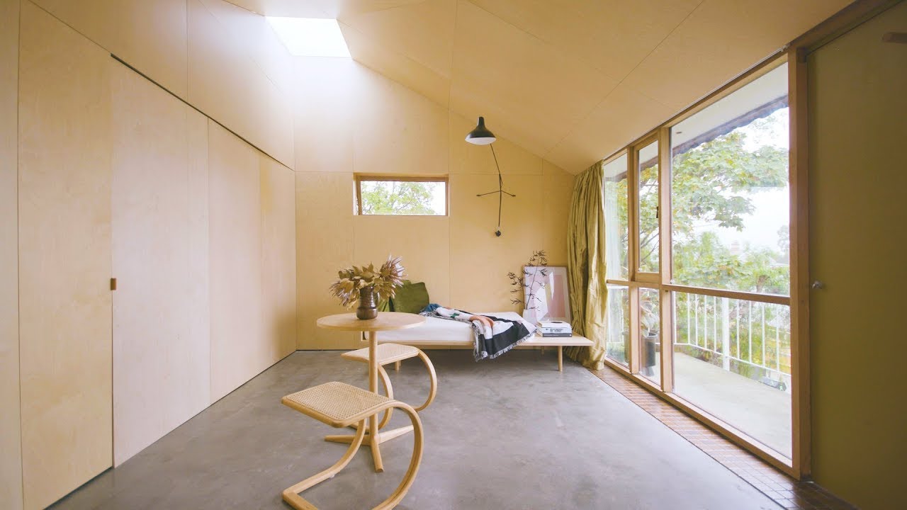
Architect team Alex Nielsen and Liz Walsh repurposed and upgraded an existing 1970s bed-sit apartment into a sleek yet functional micro-home. With the wall and ceiling wrapped in plywood, insertion of 2 skylights and variation in ceiling height creating a unique vaulted volume.
Subscribe our YouTube channel or LIKE our facebook page at:
Director: Colin Chee Instagram :colinchee_melb
Producer: Lindsay Barnard & Luke Clark
Camera: Colin Chee
Editor: Colin Chee
Subscribe our YouTube channel or LIKE our facebook page at:
Director: Colin Chee Instagram :colinchee_melb
Producer: Lindsay Barnard & Luke Clark
Camera: Colin Chee
Editor: Colin Chee
NEVER TOO SMALL Tasmanian bed-Sit Micro Apartment - 26.5sqm/285sqft
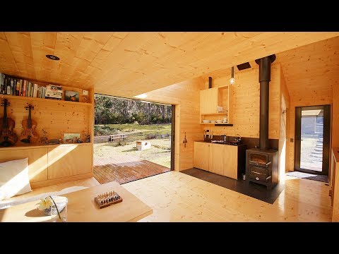
NEVER TOO SMALL Tasmanian Island Off-grid Tiny Cabin Hideaway - 28sqm/300sqft
NEVER TOO SMALL 40sqm/430sqft Tiny Cabin - The Pod
NEVER TOO SMALL 24sqm/258sqft Micro Apartment - Boneca
NEVER TOO SMALL Japanese 5S Micro Apartment - 24sqm/260sqft
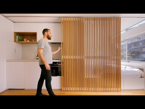
NEVER TOO SMALL Melbourne Toolbox Micro Apartment - 24sqm/258sqft
NEVER TOO SMALL Sydney Student Micro Apartment & Co Living Space - 19sqm/205sqft
NEVER TOO SMALL 40sqm/430sqft Tiny Cabin - Gawthorne's Hut
NEVER TOO SMALL Backyard Self-Contained Small Home - 20sqm/215sqft
NEVER TOO SMALL Australian Apartment Style Tiny Home -27sqm/291sqft
NEVER TOO SMALL Divided Melbourne Micro Studio Apartment - 28sqm/300ssqft
NEVER TOO SMALL Sydney Art Studio + Small Apartment - 49sqm/419sqft
NEVER TOO SMALL Experimental Small Sydney Apartment - 24sqm/258sqft
NEVER TOO SMALL 23sqm/247sqft Micro Apartment - The Cairo Flat
Tiny Apartment In Hong Kong | Micro Studio Apartment Tour | Never Too Small
NEVER TOO SMALL Melbourne Community First Small Apartment - 50sqm/538sqft
NEVER TOO SMALL London Heritage Loft Apartment Conversion 54sqm/581sqft
Tiny Apartment Ep28 | Micro Apartment 32sqm /344sqft) | Apartment Tour | Never Too Small
NEVER TOO SMALL - Micro Apartment stacks kitchen, bed, bath in 40 sq meter, Gift for Your Wife IDEAS
NEVER TOO SMALL New Zealand Backyard Flexible Micro Loft - 36sqm/387sqft
NEVER TOO SMALL Victorian Coast Tiny Family Apartment - 45sqm/484sqft
NEVER TOO SMALL 1970's Melbourne Tiny Apartment - 35sqm/370sqft
NEVER TOO SMALL Hotel-Home Hybrid Micro Apartment - 29sqm/310sqft
NEVER TOO SMALL, re-imagining small spaces - channel trailer
Комментарии
 0:05:00
 0:05:25
 0:07:40
 0:04:22
 0:02:45
 0:02:46
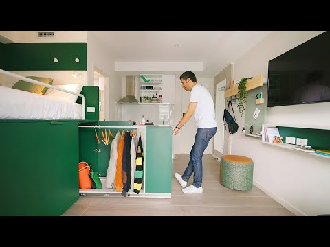 0:05:15
 0:07:13
 0:03:35
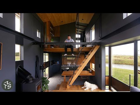 0:09:04
 0:02:33
 0:05:13
 0:07:14
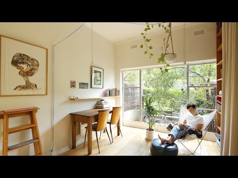 0:05:17
 0:02:57
 0:06:27
 0:07:42
 0:01:36
 0:10:56
 0:08:09
 0:05:31
 0:03:07
 0:03:07
 0:01:01