filmov
tv
How To Use Color Psychology In Marketing And Branding (Choose Your Brand Colors)
Показать описание
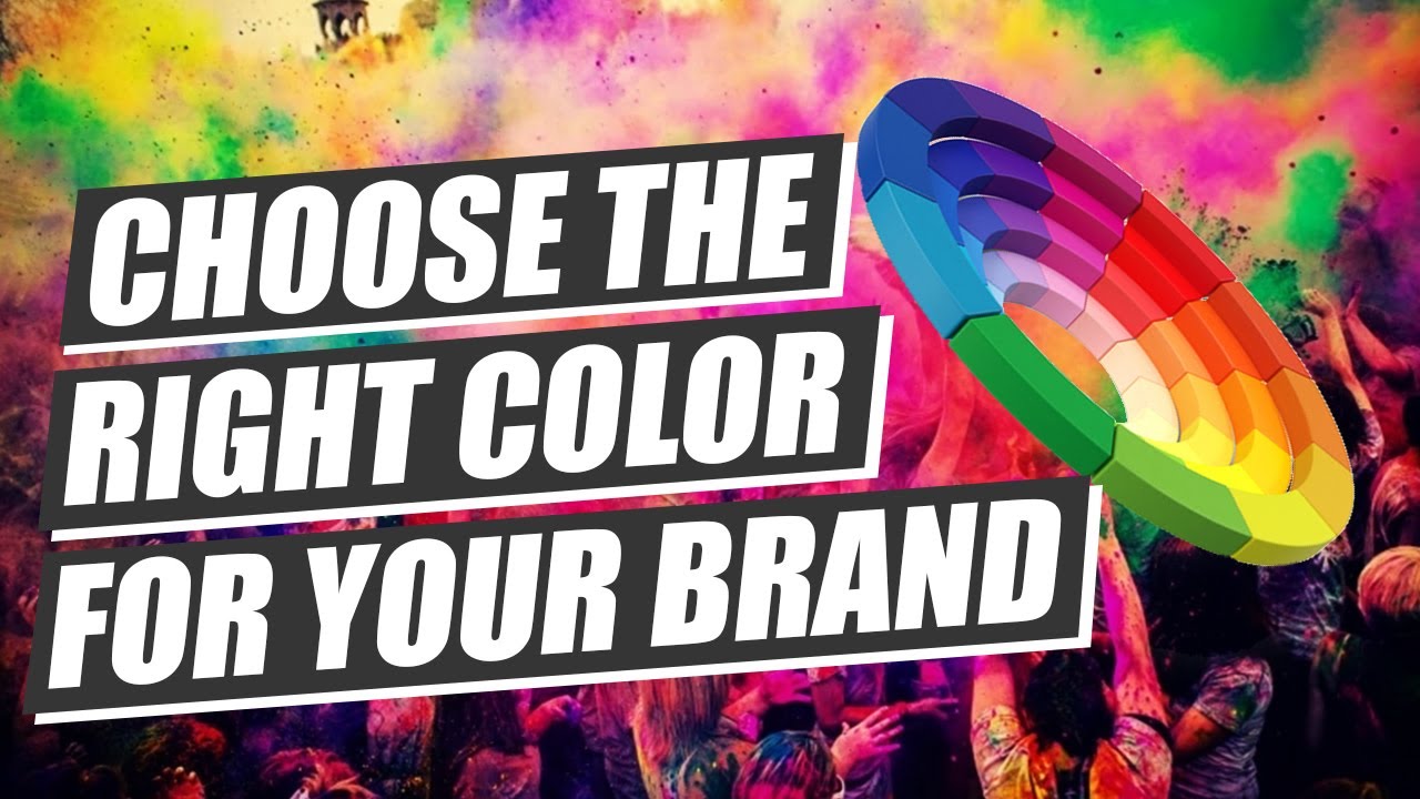
Learn how to use color psychology to pick the best colors for your brand personality, strategy and marketing
First, we’ll break down what color psychology is with an overview and how it applies to marketing, branding and consumer behaviour.
Next, we’ll break down each color, their psychological meanings, the attributes and personality they communicate and how they’re used in the world of branding and marketing.
For each color you’ll discover color psychology examples in branding and how the world’s biggest brands communicate through color
Then, you’ll learn how to use color psychology to pick the best color for your brand personality and strategy with step-by-step processes.
0:00 How To Use Color Psychology In Marketing And Branding
1:28 Brand Color Psychology: An Overview
2:32 Red
3:43 Blue
6:21 Yellow
7:49 Green
9:32 Orange
11:14 Black
12:32 White
13:39 Purple
14:48 Magenta
16:11 How To Use Color Pyschology In Your Brand Strategy
16:56 #1: Understand The Audience
18:30 #2: Define The Brand's Position
19:41 #3: Craft The Brand's Personality & Attributes
21:04 #4: Match Attributes To Colors
21:49 #5: Create A Color Palette
25:21 #6: Apply Your Brand Colors Consistently
#colorpsychology #colorpsychologyinmarketing #colorpsychologyinbranding #marketingcolorpsychology #brandingcolorpsychology #colorpalettes #colorpallette #colorharmony #colormeanings
----------------✅ FREE BRAND STRATEGY RESOURCES ✅--------------------
✅ FREE PRO BRAND STRATEGY BLUEPRINT:
✅ 101 Dynamic Brand Strategy Questions
✅ BECOME A BRAND STRATEGIST
Our flagship training “Brand Master Secrets” - Everything you need to become an in-demand brand strategist, raise your expert profile and grow your branding revenue and business.
✅ FACILITATE BRAND STRATEGY WORKSHOPS LIKE A PRO
Learn the techniques, systems and delivery tools to develop brands WITH your clients, to build brands they believe in and are invested in.
✅ INSIDE BRAND MASTER SECRETS
✅ BRAND MASTER ACADEMY
The brand strategist training ground
--------------- ✴️ LEARN FROM OTHER STRATEGISTS IN THE COMMUNITY ✴️ --------------------
✴️✴️ BRAND MASTER ACADEMY ON SOCIAL
✴️✴️ JOIN THE FACEBOOK COMMUNITY
Join in the conversation with other experienced and budding brand strategists to enhance your brand-building systems.
✴️✴️ EXCLUSIVE TIPS & TECHNIQUES
Get on the list for exclusive brand strategy tips and techniques
---------------- 🎧 LISTEN TO THE PODCAST 🎧 --------------------
🎧🎧 LISTEN TO THE BRAND MASTER PODCAST
----------------🙏 SUPPORT THE CHANNEL 🙏--------------------
AFFILIATE LINKS
Support Brand Master Academy by purchasing through our affiliate links.
We get a small commission with no extra cost to you.
Комментарии
 0:27:11
 0:14:39
 0:11:35
 0:08:14
 0:04:13
 0:05:08
 0:00:56
 0:12:38
 0:00:38
 0:03:26
 0:12:58
 0:07:52
 0:12:05
 0:24:46
 0:09:21
 0:31:46
 0:03:41
 0:08:54
 0:06:58
 0:05:21
 0:07:23
 0:07:14
 0:08:43
 0:41:27