filmov
tv
Power BI: Using Folders as Data Source, and Parameterizing Folder Paths to use Dynamic Data Sources

Показать описание
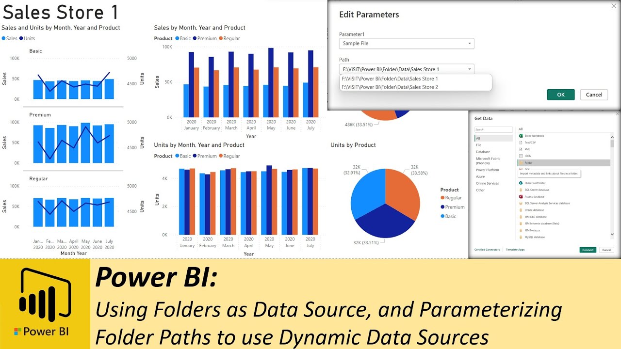
Welcome to another Power BI tutorial where we'll dive into the world of folder parameterization and dynamic dashboard connections. We'll show you how to leverage folders as a robust data source, allowing you to effortlessly load various files, such as CSV or Excel, into your Power BI reports. With folder connections, you can automate the inclusion of new files without reconfiguring your data source settings.
In this comprehensive tutorial, we explore the power of parameterizing folder paths, enabling users to easily specify different folder locations, thus enhancing report flexibility and reusability. Additionally, we'll guide you through setting up scheduled data refresh for reports using folders as data sources, ensuring your data stays up to date.
To illustrate these concepts, we'll use a practical example involving dummy sales data from multiple stores. We'll create a single dashboard that serves both stores, eliminating the need for separate dashboards. Our step-by-step walkthrough covers everything from connecting to folders, creating parameters, and updating your dashboard with new data.
Join us as we unlock the full potential of folder connections in Power BI. Be sure to like and subscribe for more tutorials and updates. Thank you for watching, and we hope you find this tutorial helpful in your Power BI journey!
#PowerBI
#DataVisualization
#DataAnalytics
#BusinessIntelligence
#DashboardDesign
#DataSources
#FolderConnections
#DataParameterization
#DataTransformation
#ScheduledDataRefresh
#Tutorial
#PowerQuery
#DataReporting
#Excel
#CSV
#DataIntegration
Комментарии
 0:08:01
 0:10:18
 0:08:14
 0:11:25
 0:15:04
 0:05:28
 0:09:58
 0:05:35
 1:21:45
 0:09:14
 0:03:32
 0:09:30
 0:08:44
 0:05:28
 0:05:53
 0:05:19
 0:12:56
 0:03:11
 0:04:33
 0:19:14
 0:12:50
 0:09:39
 0:06:00
 0:05:08