filmov
tv
Excel 2013 - Manually adding multiple data sets to scatter plot

Показать описание
This will show you how to manually add multiple data sets to a scatter plot. The model uses position-time data and adds some linear trendlines. This is especially relevant for those taking my Physics course.
 0:08:52
Excel 2013 - Manually adding multiple data sets to scatter plot
 0:00:27
Axes options in Excel
 0:05:49
Microsoft Excel 2013 Tutorial - 5 - Inserting Rows and Columns
 0:01:16
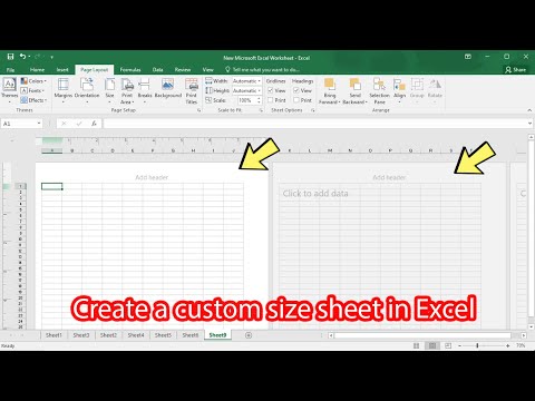
How to add custom paper size in excel 2016 2013 2010 2007
 0:00:39
How to Set X and Y Axis in Excel
 0:01:03
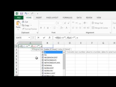
How to Enter an Automatic Time Stamp into Microsoft Excel
 0:01:25
How to Install the Data Analysis Tool in Excel
 0:01:28
How to add a Footer in Microsoft Excel 2013
 0:01:28
How To Add A Data Series To A Chart In Microsoft Excel
 0:02:27
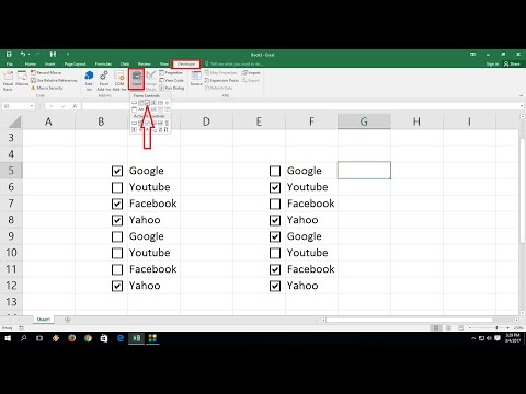
How to Add Check Boxes In MS Excel Sheet (Easy)
 0:01:23
How to Insert a Row & Have Formulas Automatically Included in the Row in ... : MIcrosoft Excel T...
 0:03:16
How to Create Data Entry Forms in Excel - EASY
 0:01:25
How to Start Using VBA | Enable Visual Basic in Excel | Get Developer Tab | Programming in Excel
 0:01:25
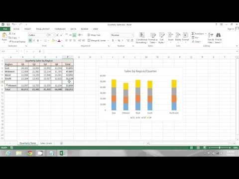
How to Make a Chart in Excel From Several Worksheets : Microsoft Excel Help
 0:01:40
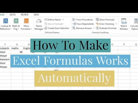
How To Make Formulas Work Automatically In Microsoft Excel | Make Formulas Calculate Automatically
 0:00:53
How to Calculate Attendance Automatic in Excel using Checkbox (Excel Tips) ||
 0:01:32
MS Excel auto fill options not showing. solving a problem
 0:01:04
How to make your gridlines disappear and reappear using Excel 2013?
 0:00:33
How to Add a Trendline to a Graph in Excel
 0:01:06
How to Add Individual Error Bars in Excel
 0:00:50
How to Get a List of All Worksheet Names Automatically in Excel
 0:00:37
How to Copy a Website Table Directly into Excel
 0:01:23
How to add draw tab in Microsoft excel?
 0:02:37
How to Automate Row numbers in Excel?
Комментарии