filmov
tv
Responsive Power Apps
Показать описание
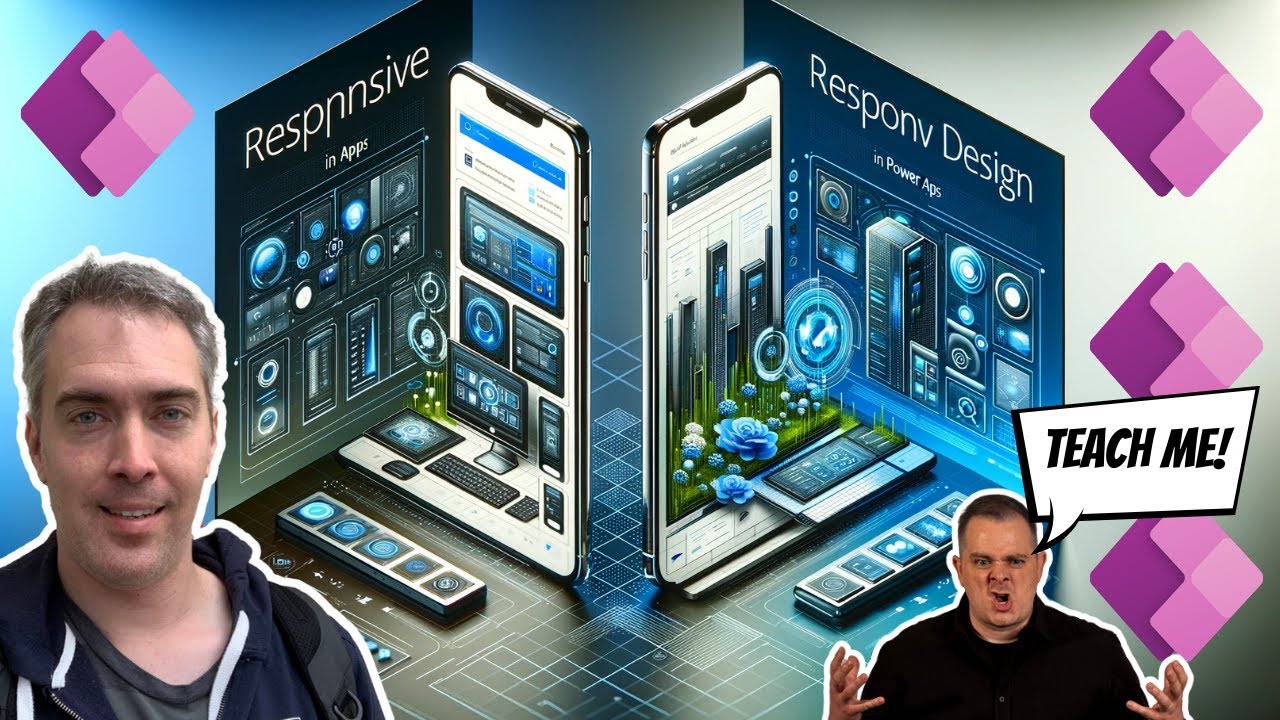
Power Apps using a responsive design look amazing on all devices whether they are on computer, a tablet or a phone. They are made possible by responsive containers. When a screen changes size, the responsive container also re-sizes itself and tell the controls inside of them their new position in the app layout. To demonstrate how to build responsive Power Apps I have come up with a tutorial where you will build a simple form form scratch.
➡️ Get access to our free Power Apps crash course (and our community) here:
🐘 Large monitors have more space to show more details in forms and galleries
🐁 Small phone screens must arrange their layouts vertically to accommodate a narrow width and take advantage of scrolling
You are going to see me build something live and unrehearsed. Figuring things out and improving it along the way. I've done it many times before. It's the best way to let you see my thought process. Let's have fun with it 🍿 🥤
 0:40:49
How to build Responsive Power Apps | Responsive Layouts, Tabs, Galleries & Forms
 0:28:53
Responsive Design: App automatisch an Bildschirmgröße anpassen! | Power Apps
 0:28:41
Add Responsive Design to your Power Apps | Make existing Canvas Apps Responsive
 0:14:57
Responsive FORM Design in Power Apps - Step by Step Tutorial
 0:34:23
Designing Real-world Responsive Apps In Power Apps - Part 1
 0:30:11
Power Apps Responsive Design
 0:21:33
The Ultimate Guide to PowerApps Containers and Layouts | Beginner to Advanced
 0:24:20
Power Apps Tutorial - Responsive Screen with Gallery & Filters - Beginner to Advanced
 0:14:26
Build your app the Responsive way in Microsoft PowerApps
 0:14:00
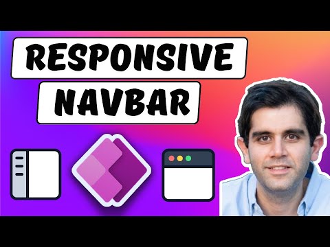
How to build a Responsive Navigation Menu in Power Apps
 0:22:26
Modernize your Power Apps with Theming, Responsive Gallery Designs & Modern Controls
 2:13:23
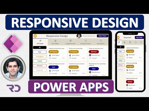
Responsive Power Apps
 0:22:27
Converting an App to Responsive in Microsoft Power Apps
 0:51:58
Cómo Crear una App Responsive en Power Apps Desde Cero
 0:24:01
Power Apps Responsive Design Containers & Screen Templates
![[Lern PowerApps] EP22:](https://i.ytimg.com/vi/dO-NPbsIrsw/hqdefault.jpg) 0:18:17
0:18:17
[Lern PowerApps] EP22: Die ganze App wird dynamisch! (Responsive Design)
 0:08:46
Fully Responsive Power Apps: Mobile & Desktop Canvas Apps in 9 Minutes!
 0:28:18
Power Apps Responsive Design Tutorial for Canvas Apps
 0:19:20
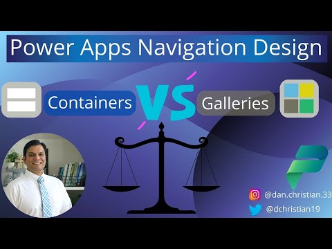
Power Apps Navigation Design: Containers Vs. Galleries
 0:57:42
Tutorial of Responsive UI in Canvas App - Browser, Mobile, Tablet
 0:01:05
Power Apps Responsive Design
 0:27:21
Use a Responsive Gallery to create tabs in Power Apps
 0:09:05
Power Apps Modern UI (For Beginners)
 0:19:28
¡Desata el Poder del Responsive en Power Apps con Contenedores!
Комментарии