filmov
tv
Power Apps Navigation Design: Containers Vs. Galleries

Показать описание
Power Apps Navigation Design: Containers Vs. Galleries
Hey Everyone,
In this video, we are going to do a side-by-side comparison of how designing of Power Apps navigation looks when using containers and galleries.
Table of contents
Introduction 00:00
History lesson 00:54
Review the canvas app 01:56
Container Vs. Gallery
1) Response design 03:53
2) How many controls are used 05:45
3) Adjust control level 07:58
4) Data source for navigation 10:06
5) Useful for navigation screen 12:23
6) Paste inside each other 14:35
Conclusion 18:07
Helpful link(s)
#PowerApps #PowerPlatform
Contact information:
Join this channel to get access to perks:
 0:19:20
Power Apps Navigation Design: Containers Vs. Galleries
 0:12:40
Power Apps: Container, Horizontal Container and Vertical Container - how to group and align things
 0:24:58
Power Apps Components - Mega Menu, Input, & Output
 0:18:24
How to create a Modern COLLAPSIBLE Side Menu in PowerApps
 0:14:00
How to build a Responsive Navigation Menu in Power Apps
 0:09:05
Power Apps Modern UI (For Beginners)
 0:00:26
Demo - Collapse Hover - Component Power Apps
 0:22:50
Expandable Navigation Menu in Power Apps
 1:16:23
INCREDIBLE HOUSEBOATS THAT WILL BLOW YOUR MIND
 0:20:20
Stop making useless Groups in Power Apps! Containers for the win
 0:24:01
Power Apps Responsive Design Containers & Screen Templates
 0:13:00
How to create a Modern MULTI-LEVEL Side Menu in PowerApps
 0:40:49
How to build Responsive Power Apps | Responsive Layouts, Tabs, Galleries & Forms
 0:13:10
Containers for Responsive App Design in Power Apps
 0:51:32
Modern PowerApps Screen/UI Design- Beginner to Advanced
 0:17:44
How to Create Left Navigation Component in PowerApps | Left Nav Menu in PowerApps
 0:31:56
How to Design MODERN looking PowerApps forms : Beginner to Advanced
 0:09:07
New Power Apps Layout containers make responsive app creation easier
 0:34:09
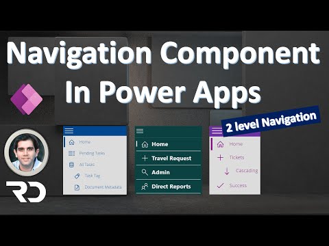
Power Apps Navigation Menu Component (2 level menu)
 0:12:29
Power Apps Container Series Part 1 - Introduction + Basic layout
 0:21:51
Power Apps Screen Designs (UI/UX) - Power Apps Tutorial
 0:28:01
Power Apps Responsive Layout Design - Horizonal and Vertical - Part 1
 0:16:18
Build Power Apps Navigation & Flyout Menus with Modern Tab List control 🚀
 0:30:34
How to Create a Custom Page for Model-Driven Power Apps (TUTORIAL)
Комментарии