filmov
tv
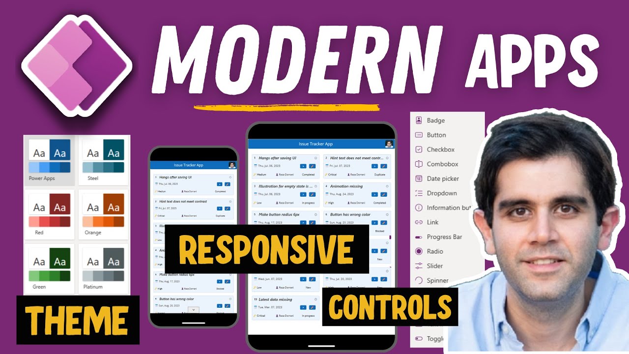
Modernize your Power Apps with Theming, Responsive Gallery Designs & Modern Controls

Показать описание
Welcome to the Power Apps Modernization Tutorial video! In this tutorial, we're taking your Power Apps development to the next level by exploring modern theming, responsive modern gallery designs, and more. This video is a step-by-step tutorial on modernizing your Classic Power Apps.
Classic Power Apps Gallery Design Experience:
We revisit the traditional gallery design approach in Power Apps, discussing its limitations and the need for a modern update.
Introducing Modern Power Apps Themes
Explore the potential of modern Power Apps themes to create visually appealing and cohesive user interfaces and see how we can apply these themes to classic controls & modern controls.
Modern Controls in Power Apps Galleries
Discover a variety of modern controls that can be seamlessly integrated into Power Apps galleries, adding interactivity and dynamism.
Building Responsive Modern Power Apps
Explore the art of designing responsive Power Apps that adapt seamlessly to different devices and screen sizes.
Responsive Power Apps Gallery & Controls
See how responsive design principles and modern controls come together to create intuitive and engaging gallery interfaces.
⬇️ Download sample Power App showcased in the video:
Exclusive for Channel Members (Silver 🥈 & Gold 🥇 Club)
Find the download link in the Community Tab for Members.
#PowerApps #PowerPlatform #ModernUI
Table of Contents:
00:00 - Introduction to Power Apps Modernization Tutorial Video
00:40 - Classic Power Apps Gallery design experience
01:17 - Modern Power Apps with Theming & Responsive Gallery design
02:52 - PowerApps themes
04:02 - Introducing Modern Power Apps Themes
08:00 - Modern controls in Power Apps Galleries
13:05 - Building Responsive Modern Power Apps
17:24 - Responsive Power Apps Gallery & controls
22:18 - READY to subscribe to Reza Dorrani’s channel
🤝 Let’s connect on social:
Комментарии
 0:22:26
 0:23:49
 0:19:34
 0:03:48
 0:49:58
 0:22:37
 0:15:33
 0:23:06
 0:19:41
 0:23:06
 0:04:31
 0:07:14
 0:26:39
 0:01:17
 0:18:12
 0:08:25
 0:57:21
 0:17:39
 0:04:45
 0:08:24
 0:06:30
 0:42:49
 0:17:59
 0:32:24