filmov
tv
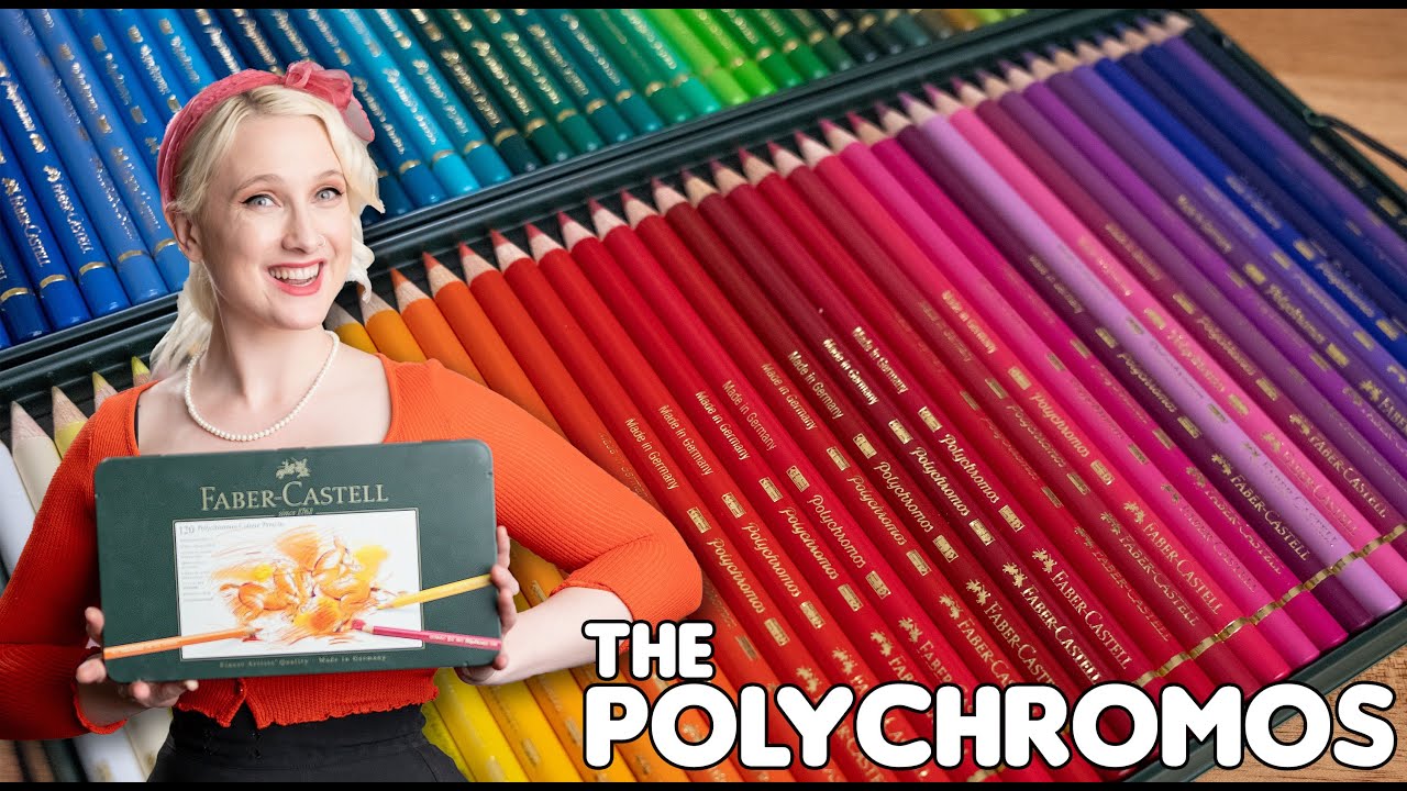
Reviewing The Faber Castell Professional PolyChromos Pencils - Are they the best? Lets test them!
Показать описание
Today I sat down to do The big review, on the Professional Polychromos Pencils By Faber Castell.
How good are they? Are they worth the money? Are they the worlds best?
We'll you'll just have to watch and find out.
This is the first of a new series i have done, where we take pencils (and art supplies) and throw a series of tests at them. Some scientific, some opinion based, but through it all i've tried to give you enough information that you can make your own mind up about them.
The good, the bad AND the ugly lets check out The Faber Castell Professional Polychromos Pencil.
0:00 - The Introduction
1:05 - The Design of the Polychromos Pencil
6:19 - Test 1 - Saturation and Vibrancy (How Saturated and Vibrant are the Polychromos?
15:44 - Test 2 - The Straight Gradient (How well do the Polychromos Gradient?)
19:46 - Test 3 - The Blending Test (How well do the Polychromos Blend?)
22:09 - Test 4 - The White Factor (Whats that white pencil do?)
24:21 - Test 5 - Color Accuracy (How accurate the pencil barrel is to the pigment)
26:14 - Test 6 - The break factor (We break some pencils!)
30:56 - Test 7 - The Joy Factor (My opinions using the pencils)
33:05 - The End and the Big Score
Hope you enjoy!
Sunshine
🥰Bio:
Sunshine Is an Australian Childrens book Illustrator, live Streamer and very bad game player. She currently has over 30 books to her name and live streams almost daily.
Sunshine loves art, loves stories and is driven with a passion to bring that love to other people.
If you'd like to talk to sunshine about illustrating your project, please reach out below. Or if your in Australia and would like her to come to your school to visit then click below:
Thankyou for checking out my stuff :)
🎵Music By: Epidemic Sound
🦄 ALL THE SOCIALS:
________________________________
#fabercastell
#polychromos
#fabercastellpolycromos
#pencilreview #review
 0:34:33
Reviewing The Faber Castell Professional PolyChromos Pencils - Are they the best? Lets test them!
 0:05:50
Are these pencils as good as they say?
 0:06:56
THESE PENCILS ARE NOT WHAT I EXPECTED.. Faber Castell Polychromos Review & Test
 0:09:58
CHEAP FABER CASTELL PENCILS REVIEW! | FABER CASTELL PENCILS UNDER $7!
 0:13:09
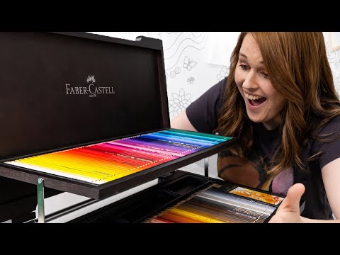
FINALLY Unboxing the 120 Polychromos Colored Pencils!
 0:15:42
Derwent Vs. Faber Castell - Which pencils win?!
 0:01:28
250 years of Faber-Castell - Art & Graphic Anniversary Case
 0:12:18
Best graphite pencils for drawing? Pencil review: Staedtler, Faber-Castell, Derwent and Koh-I-Noor
 0:05:00
Faber Castell Polychromos 120 Piece Wooden Box Set Stunning Review
 0:11:53
Battle of the BEST Colored Pencils! Faber-Castell vs Prismacolor vs Caran d'Ache
 0:06:33
Test and Review Faber-Castell Pitt Graphite Matt pencils
 0:37:20
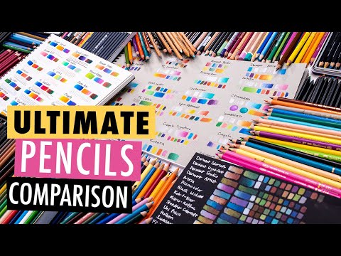
Testing ALL the BEST COLORED PENCILS for adult coloring: 26 Brands! Faber-Castell Prismacolor + more
 0:00:53
Colored Pencils Aren't Cheap... But I Am! (An Ode to Pencil Extenders)
 0:28:30
I Tested EVERY Colored Pencil in the WORLD!
 0:16:39
A Class Act - Graf Von Faber Castell Tamitio
 0:06:16
AMAZING Pencils! Faber-Castell Polychromos Colored Pencils Review | Pros and Cons
 0:10:02
Prismacolor Premier VS Faber Castell Polychromos Colored Pencils - Which is better?
 0:09:51
Review - Faber Castell Perfect Pencil
 0:09:26
FABER CASTELL POLYCHROMOS COLORED PENCILS REVIEW | THE SHORT VERSION
 0:14:55
Faber Castell Polychromos Colored Pencil Review
 0:10:25
Soft Pastel Review - Faber Castell
 0:05:45
FABER CASTELL STARTER KIT WATERCOLOUR REVIEW | TEACUP PIG
 0:11:04
SOLUTIONS To Your WATERCOLOUR Pencil Problems! // Faber Castell Albrecht Durer Review
 0:11:13
MOST POPULAR WATERCOLOR PENCILS? (Let's see which one wins!)
Комментарии