filmov
tv
The Basic Principles Of Graphic Design | Free Masterclass Course

Показать описание
🎟️ Use Promo Code KITTLONYT25 To Get 25% Off A Pro Subscription!*
🎟️ *Promo Code Details:
Promo Codes apply to first time subscribers only. 25% Coupon code will apply to either monthly or yearly plans for the first time payment only. (Either your first month, or first full year).
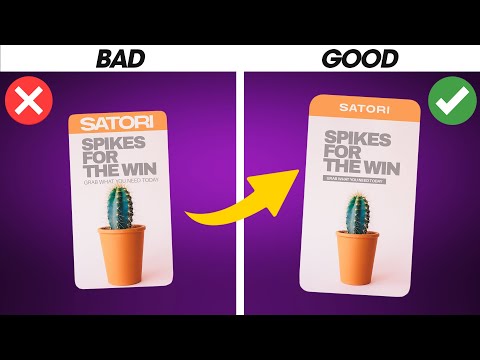
In this mini-masterclass, we're covering the most important basic principles in graphic design. We're going over what each principles is, showing you examples, and even going into Kittl to show you what happens if a different decision had been made. So make sure you watch through so you don't miss anything! Be sure to check out these other helpful details below.👇
🗝️ Checkout these Kittl tutorials next:
👥Join the Kittl Discord Group!
🕰️ Timestamps For This Video:
0:00 The Basics Of Graphic Design
1:30 Typography Basics
5:25 Balance
8:25 Contrast
11:30 Hierarchy
14:25 Unity
17:55 Repetition
19:40 Pattern
22:05 Rhythm
24:30 Movement
27:15 Variety
29:45 Color
📱 Follow Kittl On Social:
🔴 Subscribe to @Kittl
More about this video:
It is important that you understand the basic principles of graphic design, whether your making a t-shirt, a label, or a logo. So in this design course, we're teaching you how to utilize these principles in your designs, showing your real examples from within Kittl made by some of the master's of design.
Thank you so much for using our platform, and for watching this video. Don't forget to subscribe and follow along with the tutorial on the channel.
If there is anything I missed, or if you have more questions, drop a comment below and we will respond asap! Let me know more tutorial ideas as well!
#kittl #graphicdesign #designcourse
Комментарии
 0:35:05
 0:09:56
 0:07:41
 0:03:57
 0:21:47
 1:03:05
 0:18:45
 0:06:26
 1:05:41
 0:26:23
 0:17:34
 0:36:35
 0:07:07
 1:43:00
 0:34:01
 0:00:54
 0:06:23
 0:08:31
 0:05:15
 0:26:08
 0:17:09
 0:02:01
 0:59:46
 0:19:14