filmov
tv
🔸 Master ADVANCED Hierarchy In Under 7 Minutes! (Important)

Показать описание
These are some of the most powerful techniques that designers can use when it comes to visual hierarchy, but also which many people forget or don't use properly.
As one of the fundamental graphic design principles, visual hierarchy is crucial for creating designs that are easy to understand and yet also visually appealing. By using hierarchy, you can guide the viewer's eye through your designs with ease, highlighting the most important elements and creating a clear visual path for the viewer to follow.
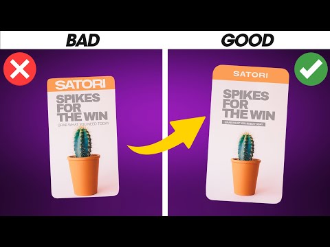
One of the most effective visual hierarchy techniques is to use size. By making elements stand out visually, you can create a clear hierarchy that guides the viewer's eye through the design. For example, using bold and large text for the headline and a smaller font for the body copy can create a clear contrast and emphasise the headline.
Another effective technique for creating visual hierarchy is to use colour. By using a consistent colour scheme throughout the design and emphasising certain elements with bold or bright colours, you can create a clear hierarchy that guides the viewer's eye.
In addition to these visual hierarchy techniques, layout and composition play an essential role in creating a clear hierarchy. By arranging elements in a way that guides the viewer's eye through the design, you can create a clear hierarchy and ensure that the most important elements are emphasised.
To use hierarchy effectively, it's essential to start by identifying the primary message or purpose of your design. We also make use of the '3 flow rule' alongside our hierarchy techniques.
Throughout the video, we will provide examples of how to use hierarchy in different types of designs, from posters and flyers to websites and social media graphics. We will also demonstrate how to use layout and composition to create a clear hierarchy and guide the viewer's eye through the design.
If you found todays video on the design principle of hierarchy enjoyable or useful, let me know in the comments section and drop a like on your way out. Subscribe to stay updated to all of my uploads and until next time, design your future today, peace ✌️
Satori Graphics®
📌📌📌📌📌📌📌📌📌📌📌📌📌📌📌📌📌📌📌📌
The above links are affiliate links, most of which I personally use on a daily basis 👍
📌📌📌📌📌📌📌📌📌📌📌📌📌📌📌📌📌📌📌📌
⏯️ PLAYLISTS
********************************************************************
🐦 Join Me On Twitter!
📸 Here's My Instagram!
********************************************************************
©️ Copyright
The work is protected by copyright, produced by Satori Graphics®
This is applied to the video recording of itself as well as all artistic aspects including special protection on the final outcome. Legal steps will have to be taken if copyright is breeched. Music is used from the YouTube audio library and or sourced with permission from the author
Комментарии
 0:06:23
 0:05:47
 0:17:13
 0:08:31
 0:00:19
 0:00:23
 0:00:35
 0:05:14
 0:04:57
 0:11:59
 0:00:57
 0:01:00
 0:06:13
 0:18:45
 0:03:28
 0:14:00
 0:08:52
 0:00:56
 1:27:37
 1:16:24
 0:00:29
 0:09:56
 0:03:12
 0:11:09