filmov
tv
Create Dashboard with cards and KPIs indicators in Plotly Dash
Показать описание
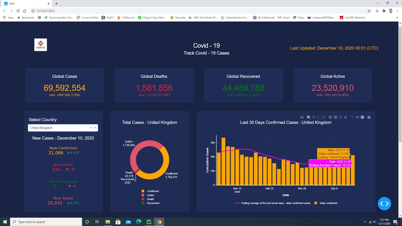
This dashboard is created in python using plotly dash library. There are cards in this dash web app. Cards display global cases and data is updated on the cards once in a day. Plotly indicators display new cases values for each country and any country is selected from the dash core component drop down list. Plotly donut chart displays total values for each country in this dash web app. Plotly combination of line and bar chart displays last thirty days daily confirmed values and rolling average of the last seven days for daily confirmed cases. Plotly scattermapbox chart displays total values for all countries in this dash web dashboard.
Download the code using the below GitHub link.
Download the code using the below GitHub link.
 0:32:41
Create Dashboard with cards and KPIs indicators in Plotly Dash
 0:08:22
8 Dashboard Cards For Next Level Home Assistant Dashboards
 0:35:37
How to Design a SICK Dashboard UI in Figma
 0:17:40
Create a Pro-Level Dashboard in Home Assistant!
 1:06:50
HTML CSS JavaScript Tutorial for Beginners | Build Admin Dashboard From Scratch
 0:38:47
Creating a Beautiful Home Assistant Mobile Dashboard Easily!
 0:37:23
How to create Dashboard with HTML and CSS | Create Finance Dashboard with HTML and CSS
 0:11:31
Make an AWESOME Tableau Dashboard in Only 10 Minutes
 0:13:30
Deploy and Mint 100 ERC-20 Tokens on Swisstronik with Hardhat
 0:34:11
React Responsive Admin Dashboard with Source Code | Build Your Own Admin Panel in React JS
 0:16:42
Create Stunning ANIMATED MUSHROOM CARDS On Your Dashboard NOW!
 0:04:13
How to create a dashboard in Home Assistant
 0:35:57
Figma Tutorial Dashboard Design Tips Auto Layout Components Variants
 1:14:17
HTML CSS JavaScript Tutorial for Beginners | Build Admin Dashboard From Scratch
 0:18:47
Employee Performance Rating Card and Dashboard in Excel
 1:30:57
Build Admin Dashboard App using React and Ant Design with Sidebar, Statistics Cards, Chart & Tab...
 0:02:17
Power BI Card Visuals | Enhanced Dashboard Look | Round Edged Cards
 0:20:35
How To Make Your Dashboard Smaller And More Efficient
 0:25:34
Simple and powerful Home Assistant dashboard
 0:48:33
Dashboard UI Design in Figma: Detailed guide on how to design a dashboard UI from scratch.
 0:40:32
Create interactive excel dashboard in 5 simple steps #exceldashboard #exceltutorial #pivottable
 0:44:14
Build THIS! Report DESIGN in Power BI | FULL TUTORIAL
 0:06:07
How to Create Easy Cards in Excel using Charts for Dashboard | Card Visual In Excel
 0:22:13
Make an Incredible Finance KPI Dashboard with Power BI in 20 minutes
Комментарии