filmov
tv
Build THIS! Report DESIGN in Power BI | FULL TUTORIAL

Показать описание
Come and build this report with me step by step! It is a full tutorial for report design in Power BI :)
In this video I show you the steps I take to make your Power BI report look like an app. In this complete walkthrough you not only learn about app like design called Neumorphism, but many other visualization tricks around bookmark navigation and kpi cards.
Enjoy this video and subscribe to always stay updated on my favorite Power BI tricks :)
--------------------------------
📊 TRAININGS 📊
---------------------------------
---------------------------------
⏱️ TIMESTAMPS ⏱️
---------------------------------
00:00 Intro
01:23 Building the main visualizations
07:04 Adding dynamic welcome text
08:46 Creating a summary panel with user images
14:18 Designing the background and placeholders in Power Point
26:10 Using the APP like design in Power BI
28:42 Creating a bookmark navigator to switch between date hierarchy levels
39:24 Finishing touches
43:58 End
---------------------------------
😍 JOIN 😍
----------------------------------
---------------------------------
👇 CHECK THIS OUT! 👇
---------------------------------
* Above are affiliate links, which means at no additional cost to you, if you make a purchase using these links we will receive a small commission. It supports us and helps us to continue making more How to Power BI videos!
Thanks for being a part of this channel and all your support! 💪 🙏
#HowToPowerBI #PowerBI #DataTraining
#powerbidesktop #powerbitraining #powerbideveloper #DAX
 0:44:14
Build THIS! Report DESIGN in Power BI | FULL TUTORIAL
 0:00:20
Power BI Design | Build it with me!
 0:15:57
💡 How Design Thinking Can Help You Build Better Power BI Reports
 0:15:25
Create your first Power BI report (2021)
 0:00:06
Building Structure Design. #etabs #structuredesign #building
 0:01:39
Demystifying Design Principles and Building Impactful Report with Reid Havens
 0:14:08
Van build design report for how to convert a promaster transit or sprinter for vanlife camping and b
 0:00:49
Split the Power BI VISUAL into PAGES 😱
 0:06:18
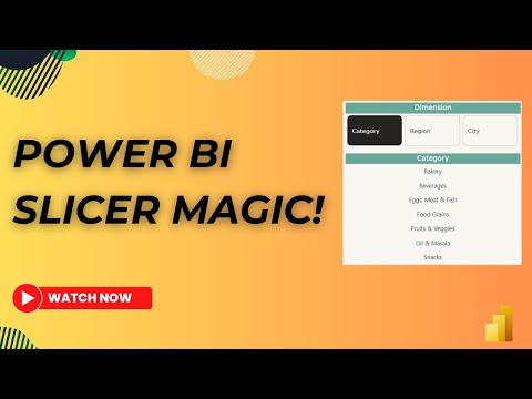
How to create multiple Dynamic Slicers in Power BI using Field Parameters | MiTutorials
 0:00:16
Teak Door Design Ideas for Residential Building।।
 0:00:16
Design of Reinforced Concrete Building using Prota structure.
 0:02:31
Build a better FUNNEL CHART with me in Power BI
 0:00:16
New commercial Project at Boudha. #Design #build #supervision #construction #commercial #ksmservices
 0:14:37
AX2009 SSRS 40 Building a Precision Design Report (part 1)
 0:04:25
Design and build reports
 0:02:18
DashLabs - discover, design & build CRM reports 5x faster!
 0:00:21
new front valuation#building #design #skhome
 0:00:16
TG building deshuttering work.#technology #engineering#structure #design#industrial#civil #industry
 0:04:14
Learn How to Build and Design this in Power BI Table
 0:00:12
#house #hous #home #propery #property #design #interiordesign #propertylover #architecture
 0:01:10
DESIGN - BID - BUILD | LET'S TALK CONSTRUCTION
 0:08:01
5 . Basic Report Design - Demo Building a Dataset and Grouped Table Report with Report Builder
 0:14:03
ChatGPT x Power BI: The Game-Changing Tutorial for Data Wizards
 0:13:07
Building Analytics Dashboards Using Value Based Design Methodology
Комментарии