filmov
tv
Should Counter Strike be so BRIGHT AND COLOURFUL?

Показать описание
CS2's levels are suspiciously bright and colourful. But does light REALLY bleed like this? I could have gone outside to take a look, but instead HACKED CS 1.6 to display raytracing. As for whether it should be... feel free to discuss whether it should be in the comments section :P
0:00 - BRIGHT
0:24 - CS 1.6 raytracing?!
1:31 - History of CS lighting
4:01 - Dust2 compared
5:29 - Italy compared
6:32 - Other maps
8:34 - Office
0:00 - BRIGHT
0:24 - CS 1.6 raytracing?!
1:31 - History of CS lighting
4:01 - Dust2 compared
5:29 - Italy compared
6:32 - Other maps
8:34 - Office
 0:10:02
Should Counter Strike be so BRIGHT AND COLOURFUL?
 0:18:13
How Counter-Strike Solved FPS Games
 0:07:20
Should Counter-Strike Have Destructible Environments?
 0:01:10
Counter Strike Co-Creator Reveals How Actually Stupid Players Are
 0:08:13
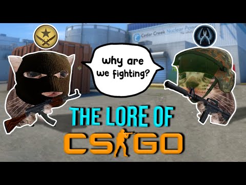
Why Exactly Are We Fighting In Counter-Strike?
 0:09:16
6 Huge Mistakes NEW CS2 Players Make | Counter Strike 2 Beginners Guide
 0:05:40
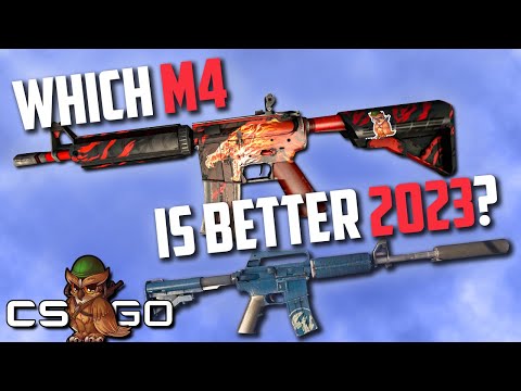
Should You Use M4A4 or M4A1-S in 2023?
 0:15:01
Counter-Strike 2 Pro Tips and Secrets...
 0:00:16
The CS:GO Sniper Showdown Challenge
 0:08:24
Follow Recoil in Counter Strike 2 is Broken
 0:09:58
Can A Cheater beat Counter-Strike Pro?
 0:10:03
Should Your Boyfriend Play Counter-Strike?
 0:00:39
Counter-Strike 2 will be the TOP tac shooter??
 0:00:59
❓WHY IS CS2 VERTIGO SO HATED❓ #cs2 #csgo #counterstrike #shorts #recommended #reels
 0:00:54
Will 'Counter-Strike 2' DELETE your skins??
 0:00:31
Why don't PROS use THIS gun? 🤔#cs2
 0:22:48
DINGE, die nur Counter-Strike-Gamer von FRÜHER kennen
 0:00:29
Why is this so hard 😭 #cs2 #cs2memes #cs2moments #counterstrike #cs2clips #csgo
 0:00:39
CS2 TRAIN IS ALMOST HERE!!
 0:09:26
COUNTER-STRIKE 2 ... For Noobs
 0:00:54
The Most Insane Trade I've Ever Done
 0:00:54
Skins ruined by CS2 #1
 0:00:57
The CS2 Armory is (almost) DEAD
 0:10:38
Counter-Strike's Cheating Phenomenon
Комментарии